This essay is part 4 (the other parts can be found here) of Chapter 5 in Alain’s second book
Mastering Composition, Inspiration and Personal Style
9– Memorizing colors in the field
The act of painting is not a duplication of experience but the extension
of experience on the place of formal invention.
Stuart Davis
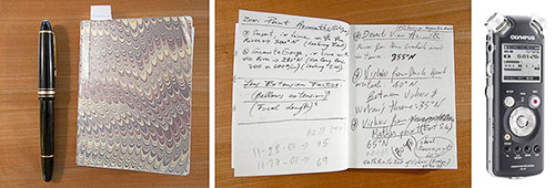
Notebook and pen Olympus LS 10 Digital Voice Recorder
The tools I covered in the previous section are all very useful in helping you visualize color and compose with color. However, there is one more approach, one more tool that I want to cover, one important enough to have its own section. This tool is taking notes in the field when you are photographing.
Why is this such an important practice? Because at no other time will you have better access to the colors in the scene that you are photographing.
You might say, “but I have the photographs and in them are all the colors of the scene as they were when I photographed it.” Well, no, not exactly. A photograph is indeed the most accurate representation of a scene that we have available today. However, this photograph is not a fully accurate record of the colors in the scene. For one, as we saw previously, getting an accurate color balance is not easy. For two, films and sensors introduce their own color and contrast bias. There are other issues, all affecting how a photograph differs from the way we perceive the world with our eyes. I cover all of these in the chapter titled The Eye and the Camera so I won’t go over them again here.
All this to say that eventually the most accurate record of the scene is what you see with your own eyes and what you remember in your mind, in your memory. But memory is fleeting and so taking notes about what you see guarantees that you will not forget what you saw.
You can take notes mentally, but as I said memory is fleeting. However, if you can reliably record what you have seen this way then go for it. Otherwise, I recommend that you take notes in writing or that you record spoken notes. I have done all three, and personally I find that written notes work best. With audio notes I have to transcribe them before I can use them, and this ends up taking longer than if I write them directly.
So what do I take notes about? I take notes on the color of the light, on the color of objects in the scene, and on the contrast of different areas of the landscape. I may, for example, describe the differences between the colors of different trees. While trees are green when they have leaves and fall is yet to come, no two trees are the same exact shade of green. Juniper leaves for example are a bluish-dark green which has a low to normal saturation level. Aspen leaves on the other hand are a moderately saturated light green. Pine trees, ponderosas for example, tend to have medium saturation, dark green needles. Grasses have yet other shades of green. Eventually, no two plants that have chlorophyll –the substance that produces the green color in nature—are of a similar green color. The variations are incredibly large, and yet to the untrained eye all these plants are green.
For each scene that I want to remember, I take notes in which I record the three variables of color --hue, saturation and lightness—for the different objects in the scenes. These notes do not have to be complicated. Often, they simply read as such:
Aspens: light green with high saturation. Pure white trunks.
Medium contrast overall. Medium lightness in shaded areas. Bright light in open areas.
I may take notes on how I will process the image later on, such as;
Reduce overall contrast so that transition from light to shade is soft and progressive, not harsh and sudden.
I don’t take notes on everything. Certain things I know I will remember, while others I want to make sure I can go back to my notes in case I have a question. Eventually, I know I am the only source of reliable information about the light, contrast and color in the scene that I photographed. Going back to the location to check contrast, light and colors is not a viable solution. While certain elements do not change –for example Junipers in the Southwest stay pretty much the same green year round—the light would be different and, unless I time my visit precisely, the time of year would not be the same.
Plus, going back to all the locations I photograph just to check the color of things would be a wasteful use of my time. Taking notes about these things is a much more efficient use of that time. I know I will need this information, so I gather it while I am there. By making information gathering and note taking an inherent aspect of my photographic work, I save myself time and increase the amount of data that I am bringing back from a shoot.
We live in the information age, and we have all learned that reliable data acquisition and processing is a fundamental aspect of success. Taking notes in the field about light, contrast, color, etc. is nothing more than data acquisition, and use of this information in the studio while processing my images is nothing else but data processing. Doing so is certainly more work, but this extra work provides me with information that other photographers not willing to do this extra work do not have and this gives me a competitive advantage. Following this approach will give you the same advantage. I strongly recommend it.
10-Composing with Color Examples
A work of art is a world in itself, reflecting senses and emotions of the artists’ world.
Hans Hofman
Playa Reflections: controlling the color palette
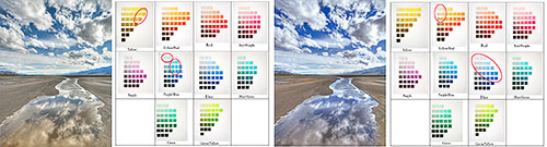
Original raw conversion Original color palette Final version Final color palette
Defining a color palette for a photograph can seem a daunting task. However, there are ways to make it easy. What I do is let my inspiration guide me. I let myself be inspired by the scenes I photograph and I draw from this inspiration when I process and optimize the photographs in my studio and when I define the color palette for a specific photograph. To me defining a color palette is an artistic process, not a technical endeavor.
There is little you can do to define a color palette in the field. Certainly, you can choose to photograph in a certain type of light and you can choose to include or not include certain objects or certain colors.
All this can help. However, the real work, for me at least, in regards to defining the color palette for an image, starts in the studio. What I do is work on the colors of the photograph to emphasize certain colors and de-emphasize, or remove altogether, other colors.
The way I do this is through the use of the Hue/Saturation, Curves and Selective Color controls in Photoshop. Desaturating a color will turn it to grey, or to a very pale hue, effectively neutralizing this color. Changing the color balance can also be helpful. Finally, I use Curves and Selective Color, both on adjustment layers, to modify individual colors accurately.
In the image above I decided to create a color palette that consists of three colors: blue, white and a light, desaturated yellow. At left above, you can see the original raw conversion. This conversion has a lot of yellow in the whites and in the blues. The blues are pale and either over saturated, as with the mountain in the background on the right side, or too light, as in the sky at the top of the image and also in the reflections at the bottom of the image.
In the final version, at right above, I removed the yellow from the whites. By doing so I made the white clouds the neutral color in the image. It is always nice to have a neutral color in an image, when possible, because it gives a point of reference to the viewer against which all the other colors are compared to. Neutral tones make colors seem brighter, cleaner and more saturated, even if the saturation level is actually fairly low.
I also darkened the blues and shifted them from light cyan to a dark cerulean blue. Finally, I warmed up the yellows, changing them from a pure yellow to a yellow-orange-brown, which I find to be more suited to this image. Blue and yellow are opposite colors, and balancing the colors of an image with two opposite colors has to be done carefully. In this instance I decided to saturate one of the two opposite colors, the blues, and desaturate the other color, the yellows. The result is a photograph in which these two colors co-exist happily instead of clashing with each other, as would be the case if both were equally saturated. The fact that the area of yellow sand is quite large and continuous, helps balance it with the smaller and discontinuous, areas of blue sky and reflections.
On the Munsell Color Tree panes above, I circled in red the patches of color that make up, respectively, the color palette of the original raw conversion and the color palette of the final image. Doing this allowed me to visualize precisely which colors are present in these two images, as well as how these colors were modified when I went from the original conversion to the final version.
Sandstone Buttes: working with a specific color palette
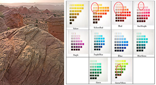
Sandstone Buttes Sandstone Butte Color Palette
In this photograph I used a color palette that was very different from the palette of Playa Reflections. The color palette in this image is the result of the type of light present on the day I took the photograph and of the color balance settings I used when converting the photograph. Therefore, I did not need to modify the colors of this image very much.
This photograph was taken during a series of sandstorms on the Colorado Plateau, in Northern Arizona. The storms caused sand to be suspended in the air. This airborne sand filtered the sunlight and gave it a light brown-yellow color. This photograph was taken at sunset, and because the sun was setting in front and to the left in the photograph, the buttes are backlit. This means that most of the image is lit by open shade, and has therefore a very low contrast. The mesa in the background is rendered as a smooth silhouette and its appearance contrasts sharply with the detailed foreground buttes. Some of the backlit buttes have moderately saturated orange light, coming from the light bouncing off the buttes in front of them. However, besides these, most of the colors in the scene have a medium saturation.
Again, I circled the colors present in this image on the Munsell Color Tree panes. Notice the presence of medium-saturation and medium-lightness greens. These greens are found in small trees located in the middle ground of the image. These trees are easy to miss on a small version of the image, so I wanted to point them out. At first, it seems that greens would not fit within this warm yellows and soft red-purples color palette. However, after consideration the low saturation reds and greens look good together. This is because reds and greens are opposite colors, just like blues and yellows as we saw in the previous example.
Reds and greens would clash if they were both highly saturated and made to compete with one another. However, here we have small patches of green and large areas of reds, and neither color is very saturated. Therefore, instead of competing with each other, these two colors complement each other. The small areas of green provide just enough color contrast to create an opportunity for a visual comparison of reds and greens. Sometimes, having two opposite colors in one image makes each color appear more colorful than if it was shown by itself.
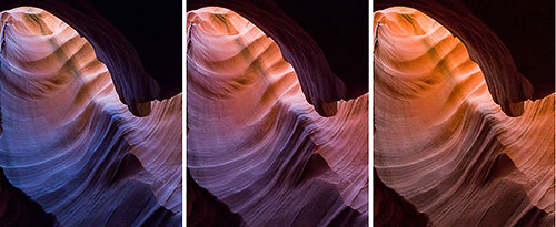
Antelope Light Shaft: global desaturation
Original Image Saturated ima Desaturated image
Saturation is one of the most challenging aspects of composing with color. Adjusting saturation is necessary with just about every photograph captured in raw format. However, increasing saturation is not always the best choice. Sometimes, decreasing saturation is what the image needs.
In this instance the original image was naturally saturated. I tried increasing saturation but when I did the colors veered towards a yellowish red that I found unpleasant. I visualized this image as having delicate tones and the increased saturation made it look gaudy rather than sophisticated.
An alternate approach would have been to make the image black and white by desaturating it totally. However, this was not the direction I wanted to go.
I wanted to retain some color, therefore desaturating the image was the solution. It achieved the goal of retaining some color while giving the image delicate tones. It also made the light shaft the dominant feature in the image. When the colors were saturated, color competed for attention with the light shaft. After the colors were desaturated, color took a secondary role and the light shaft took center stage.
In turn, the composition of the image changed, prioritizing the light shaft and making color a secondary source of interest. The eye goes first to the area of highest contrast as well as to the brightest area. However, the eye also goes to the colors that are the most saturated. When a photograph has a bright area and saturated color, the eye jumps back and forth between these two areas, not sure which one to look at. By desaturating the image I re-arranged the order in which the eye explores the image and created a well-balanced composition.
Zabriskie Point: global saturation
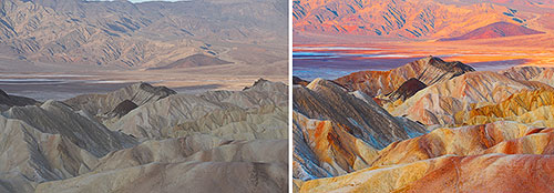
Original raw conversion Final version
Sometimes increasing saturation is necessary. This is exactly what happened in this example. The color in the original conversion was extremely flat and uninteresting. Therefore, increasing the global saturation of the image was necessary. However, in this instance I decided to saturate the image more than I normally would because I wanted to compose an image with color as the primary source of interest.
The resulting photograph is a departure from reality. While the original scene did not look as colorless as the original conversion, it did not look as colorful as the final version either. The color of the “real” scene, if there is such a thing, lies somewhere in-between the two photographs above.
Extreme saturation increases do not always work. Two factors made this extreme saturation increase work with this photograph. The first factor was the light in which this image was made. The photograph was taken at sunrise, and only the background –the mountain on the other side of the valley—was in direct sunlight. The rest of the scene –the foreground and the middle ground—were in the shade. Shaded areas saturate far better than directly lit areas, because of the soft contrast characteristic of shaded areas. However, because this was sunrise, the direct light was still soft and warm in color, making a global saturation increase possible.
The second factor was the semi-abstract nature of the location. Death Valley has unique features, terrain and colors not found anywhere else. This uniqueness means that we are unlikely to compare photographs of Death Valley with photographs of other places. Death Valley has its own reality, and even when you have been there it is difficult to remember the exact color of each location. The lack of a reference point means that we look at the landscape of Death Valley as it is, without trying to compare it to other places. While the colors in this image may be considered “over the top,” they are still acceptable because we are not comparing them to other places we are familiar with. If I had applied the same saturation increase to a scene familiar to most people, a beach photograph for example, the image would have lost its believability. Here, while some may question whether the image is real or not, it does retain a high level of believability.
I often say that my goal is to create believable images and not “real” images. Believability is different from reality. Something can be believable while being a departure from reality. Most fiction writing is that way. Things in fictional stories may not be real –indeed they are often made up, either in whole or in part—but to be successful with the readers they have to be believable. One has to believe that these things can happen, even if one knows that they did not happen.
My favorite definition of fiction, given to me by Alan Woodman, my creative writing teacher at Northern Arizona University, is: “Is it real? No. Did it happen? Yes.” I like this definition because it points to the fact that in fiction writing believability is more important than reality. For fiction to be successful the reader needs to believe that something can happen. However, the reader does not need to believe that something is real. A photograph meant as a departure from reality can be seen as a work of fiction, a work in which believability is more important than reality.
Zabriskie Point Sunset: local desaturation
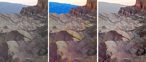
Original conversion Saturated image Saturated image + local desaturation
In some instances global saturation is not the perfect answer. While it may be necessary to saturate the image globally, doing so sometimes results in some areas of the image being oversaturated while other areas of the image are properly saturated.
This is exactly what happened with the photograph above. While the image did need global saturation, one area of the image –the mountains in the background at top middle—became overly saturated. The deep blue color of the mountains simply does not work with the color palette of this image. The composition of this image is based on a low-saturation, brown-red-yellow color palette. Not only is blue not part of this color palette, the high saturation level of the blue mountain causes it to become the focus point of the image. The viewer’s attention is captured by the blue mountains, away from the areas of the image where I want the viewer to focus on.
The solution is to desaturate the blues, something that I did in the third image at right above. Notice that I desaturated this area further than it was in the original. I did so to remove all the blue color so that the color palette is exactly what I wanted it to be. As I mentioned, blue is not part of this palette and therefore blue should not be present in this image.
To desaturate the blue area I selected only the blues in Photoshop’s Hue/Saturation dialog box and lowered the saturation significantly. I also adjusted the hue to make the mountain brown instead of blue.
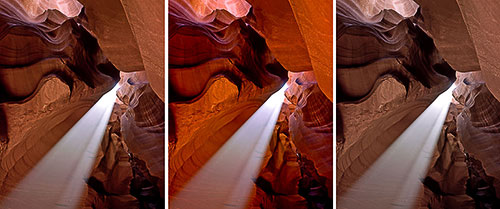
Antelope Canyon: changing color balance settings
 Tungsten Fluorescent Shade Tungsten Fluorescent Shade
This example shows how different color balance settings can transform the colors of a photograph. In the example above, the only difference between these three images is the color balance settings. A different color balance preset was used for each image: respectively tungsten, fluorescent and shade, from left to right. All the other conversion settings are similar for the three images.
The results are three photographs that, to the untrained eye, look as if the colors had been modified in Photoshop using Hue/Saturation, Curves or Selective Color to name a few of the many ways color can be altered digitally.
Which of these three images you like best is a matter of personal taste. Personally, I like the one at left (the tungsten color balance) the most because of the contrast between warm and cool colors. The blues are very beautiful and the presence of yellows and pinks create a stunning color contrast.
The blues are created by air light and are particularly visible when a cool color balance setting is used. Because the tungsten preset favorises cool colors I often use it when I want to show air light in a photograph. The air light color is partly visible in the image where the fluorescent preset was applied. However, air light disappears totally when the shade preset is used because this preset warms up the image so much that the blues are no longer visible.
On the composition side, the shade preset creates an image that is more uniform in tone and in composition. Warm colors dominate, with yellows, oranges and blacks composing nearly the entire color palette of the image. The tungsten preset on the other hand creates an image in which different zones of color --blues, pinks, blacks, purples and yellows-- contrast with each other and create a rich color environment. There is a lot of differentiation between colors in the tungsten image. However, the color palette is coherent, meaning the colors are harmonious and do not clash with one another.
Indian Paintbrush: photographing color in open shade
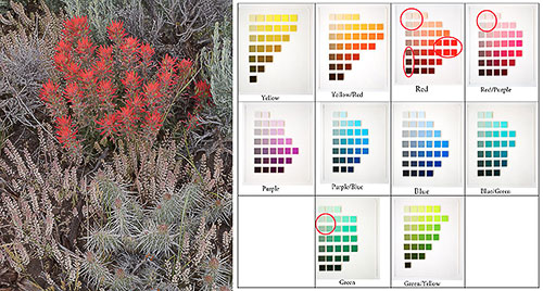
Indian Paintbrush Indian Paintbrush color palette
Open shade is one of the finest lights for photography, so much so that a number of photographers use open shade exclusively for their work.
Open shade is characterized by low contrast, absence of shadows and saturated colors. The colors are so saturated in open shade that, depending on the subject, they sometimes require very little saturation to look good.
Such was the case with the image above, Indian Paintbrush, taken in Northern Utah with a Canon 1DsMk2 and a Canon 50mm f1.8. I saturated the image about 10% and this was all that the image needed. Besides careful color balancing, hardly anything else was done to the image besides sharpening it prior to printing.
The reason for the very low level of saturation was two fold. First, the most colorful part of the image, the Indian Paintbrush flowers, was naturally very saturated. Even with a low level of saturation added the flowers were just about ready to clip the color space. They were so saturated that any further increase in saturation would have caused the reds to exceed the boundaries of the color space. When that happens the color is clipped and the clipped areas lose all detail. These areas look as if the color was bleeding, meaning the color looks as if it was spreading onto neighboring areas of the image. Bleeding is particularly visible on fine art prints because a fine art print is where the largest number of colors is reproduced. Bleeding is less visible on the web or in a book because a smaller number of colors are reproduced.
The second reason why a low saturation increase was used is because I wanted to maintain a soft color quality in the other areas of the image. The composition of this image is based on a visual relationship between low saturation and high saturation elements. The red paintbrush flowers are the high saturation element while all the other plants in the image, as well as the soil, are the low saturation elements. Pushing the saturation of the image any further would have caused this relationship to fail by over saturating all the elements, including the ones that I wanted to keep at a low saturation level.
San Juan River: composing with colors
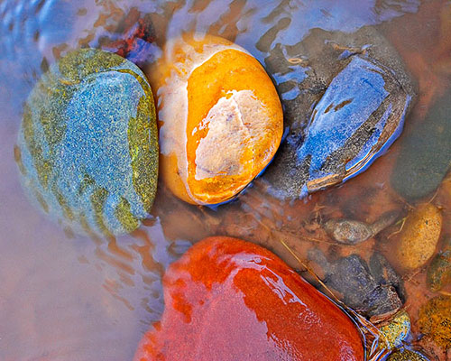
Four River Rocks
We have seen many examples in which color plays a role in the composition. In this last example we are looking at an image in which color was the reason for the image to be created. In other words, this image was not composed with color, it was composed for color.
I saw the color of these four rocks first and I saw the composition of the image second. The rocks were arranged this way. When I first saw them, walking along the river’s edge, they were facing me sideways. I stepped into the water to face them the way I wanted to compose them. I liked the composition with three rocks on top and one at the bottom composition. If they had not been arranged this way I may have arranged them like this, although I don’t know if I would have thought of it.
The rocks were naturally of these four different colors. However, I did increase the color saturation significantly in Photoshop. I also increased the saturation of some colors more than others. If I remember well the yellow saturated the most immediately, the red was next, and I had to give extra saturation to the blues and greens individually. It was important for the composition of the image that the saturation level of all four rocks was equal. Since this rarely happens in nature I had to make it happen in Photoshop. Equal saturation was necessary so that the four rocks had equal importance in the image. The composition is based on the four rocks sharing “center stage” so to speak, without one taking precedence over the other.
This essay is part of Chapter 5 in Alain’s second book Mastering Composition, Inspiration and Personal Style. You can find more information about this book, and sign up for Alain’s pre-announcement list, at this link.
Alain will be teaching composition and color at the Digital Fine Art Summit this fall in Zion National Park together with Uwe Steinmueller and R. Mac Holbert. A detailed description of the Summit, together with information on registration, is available at this link. |