| Digital Outback Photo - Photography using Digital SLRs |
|
 |
|  |

|
 |
Printing Insights #004My Printing Diary |
| Since about 3 weeks I mostly concentrate on how to print a couple of exhibition photos. This "Printing Insights" will follow my journey over time in for of a diary. |
| Preface |
| Most of the recent events are covered in my article "Inkjet Cibachrome" which also fueled some very helpful discussions. |
| 08/18/2001 |
| I am now more and more leaning into getting an Epson 2000P printer as the process for the "Inkjet Cibachrome" would require an Epson 7000 printer (about $4400 with stand, big, heavy, ...). Also the discussion about matte versus glossy prints made me think. |
|
Kodak DCS 760 |
| Today I received a 20x30" print from Greg Governale on canvas. This print really looks very good and I am thinking to use this print for our submission next month. Thank you Greg! |
|
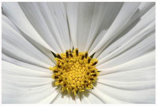
Kodak DCS 760 |
| Then in the afternoon we checked some 2000P prints of the above shown Cosmos flower and the prints looked pretty good on Epson watercolor paper. During this session at the dealer we followed Michael Reichmann's advice to use the printer "Image Enhanced" mode and we got pretty good prints of the Cosmos. |
|
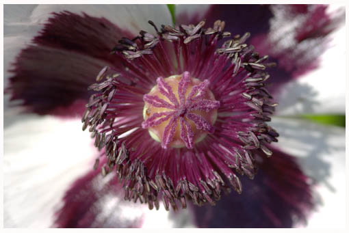
Kodak DCS 760 |
|
Based on all the experience so far we decided to give the 2000P a try. The above poppy was more of a real test for the 2000P as the reds are very intense and also the photo requires some good contrast. Using the Reichmann trick did not work at all for this poppy. Setting the printer to sRGB and also in Photoshop 6.0 the printer profile to the same sRGB color space got us a lot lot closer but still the reds are more orange, not good enough saturated and the contrast could be stronger. |
| Overall I was quite impressed with the 2000P so far. |
| 08/18/2001 |
| Bettina compared our 2000P prints with the "Inkjet Cibachrome" and she still has a hard time to make friends with the new 2000P prints. Especially the red poppy needs a lot of improvement. It is not only the problem of the watercolor paper as we have also one poppy print from Jim Collum made on watercolor paper and it has good deep reds and also better contrast. |
| What is needed? Profiling! We will follow two different paths. One will some own color profiling without use of and the other will be done by Jim Collum as described here. |
| 08/25/2001 |
| So far I did not have too much luck with any profiles. Even Jim's profile for the watercolor paper worked fine for some prints and not so good for others. The best success so far we had with some manual printer corrections inspired by Jon Dokken. Here are the advanced settings we currently use (you might also try some higher values for yellow). In Photoshop we select sRGB as the printer profile. |
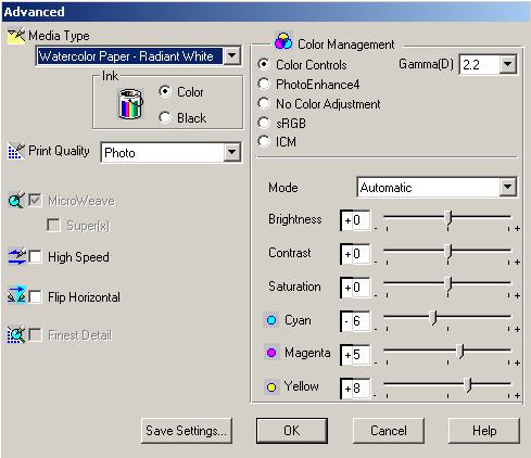 |
| 09/18/2001 |
| The more we use the Epson 2000P the more we like it. Metamerism is not such a big deal for us with matte and watercolor papers (and these are our favorites right now). The real downside is the enormous ink consumption of this printer. |
| I try to tweak the printer settings a bit. Here are my current settings: |
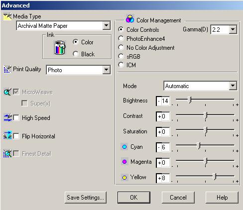 |
| Here is a news group for discussing the Printing Insights articles. |
|
|
| For Comments post in our News Group |