| Digital Outback Photo - Photography using Digital SLRs |
|
 |
|  |

|
 |
Photoshop Corner #013"ICorrect EditLab (by Pictographics)"by Jim Collum
|
| Overview |
 |
| iCorrect is a Photoshop plug-in that allows you manipulate contrast and color balance of your image. The plug-in works with both 8 and 16 bit images. There are four tabs that allow you to manipulate different areas of the color/tonal range of your image, Color Balance tab, White/Black point tab, Brightness/Contrast/Saturation tab, and Selective Hue Edit tab. The order of the tabs is important, as changing one can have effects on the remaining tabs. The tabs should be utilized from left to right. This review was done under Photoshop 6.0, on a Windows 2000 system. |
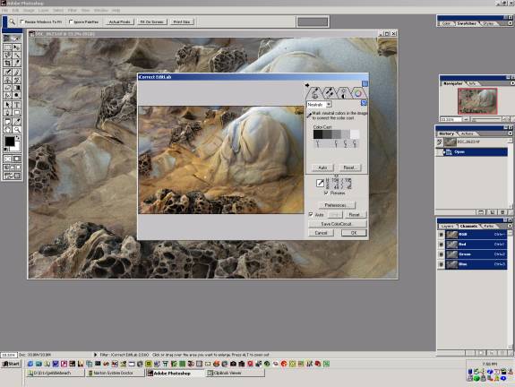
| General Operations |
| After loading an image, iCorrect is accessed via the Filter pulldown in Photoshop. It will bring up a dialog box with a smaller version of your image. The quality of this image is dependent upon Preference settings, ranging from 8(best) to 1(Fastest). It is possible to zoom in for more detail by hitting the Alt key. |
 |
| By default, iCorrect comes up in Auto mode. This allows the filter to intelligently analyze your image and choose what it considers the most appropriate color balance, saturation and contrast of your image. This was one of my few issues with the filter. Most of my images are considered to be high contrast and have high color saturation. The Auto function chose a much more saturated image that I would have edited. In all cases, I chose not to use the Auto function. The annoying thing is, there's no way to disable it as the default action when you start the filter. Each time you must unselect the Auto check box and then Reset the values. A minor nit, but it did become annoying after using it for a while. I'd recommend that this be a setting in the Preferences. |
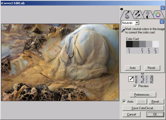
| Color Balance Tool |
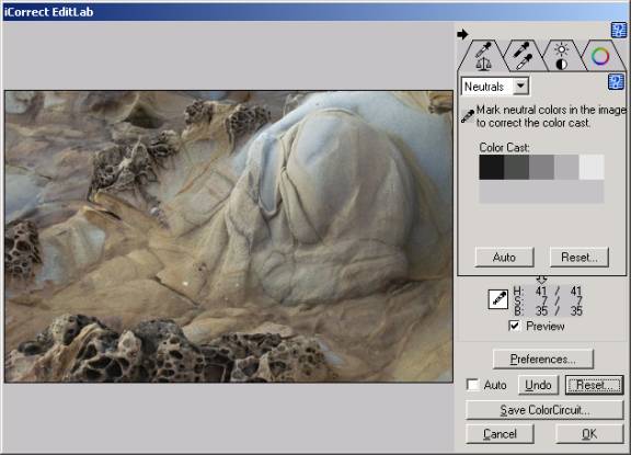 |
| The Color Balance Tool is one of the two tabs I find myself using the most. You have two ways of using it, Neutrals or Sliders, each way being mutually exclusive of the other. Neutrals allows you to use an eyedropper to find neutral grays, blacks and whites (5 shades of them) and will neutralize color casts for you. For my use, this is the easiest way to clean up color balance. After using it a couple times, the color balance can be neutralized within seconds. The other method is the more traditional, Sliders. This allows the manipulation of global color cast using CMY/RGB sliders. |
| White Point/Black Point Tool |
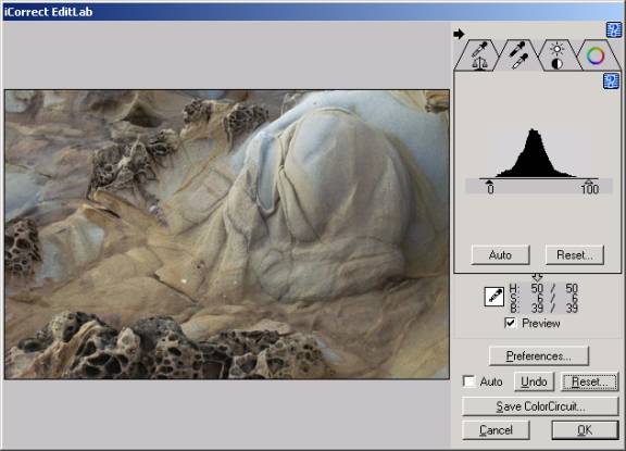 |
| This tab brings up a histogram with sliders allowing you to change the white and black points of the image. You can also use the eyedropper to select them (it will automatically figure out which you want to set, based on the the intensity of the color selected.). I found myself skipping this tab. It didn't seem to offer me anything more than the standard Photoshop histogram did. |
| Brightness/Contrast/Saturation Tool |
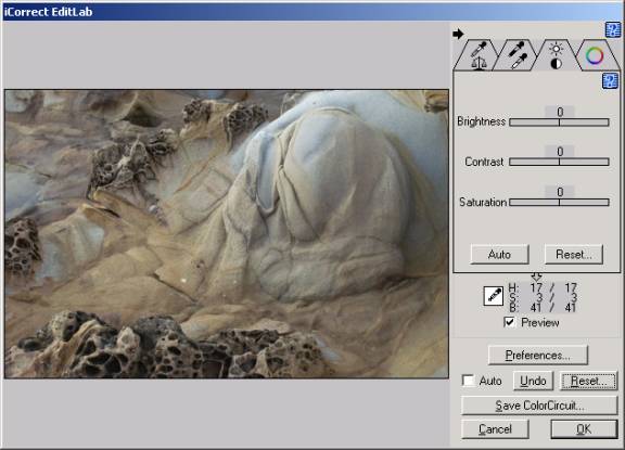 |
| This tab brings up sliders that allow the manipulation of Brightness, Contrast and Saturation. Again, I didn't find this one very useful. Most of my contrast manipulation is done via the Curves menu in Photoshop. It does, though, allow the convenience of doing the work under one filter. |
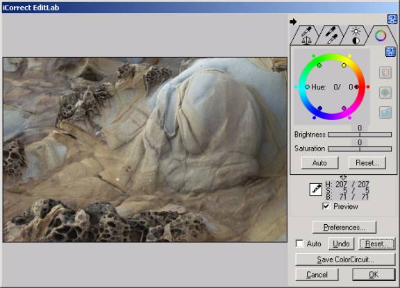
| Hue Selective Editing |
 |
|
This tab has been the most useful, but is the most complicated. With it, a hue can be selected with the eyedropper. It will appear on a color wheel as a handle with a black dot in the center. Each of the handles adjacent to the one just select act as limits when changing the hue. Once you select a specific hue, you can modify the brightness and/or saturation of it, or you can change it to another hue altogether. As an example, I have an image from Egypt that contains a daylight color balance. Illuminating one of the columns in the temple, was a mercury vapor light. This caused that column to glow with a green cast. Within seconds, I was able to change that green to the hue of the rest of the column. This tab may take a few tries to figure out, but once done, it becomes very quick, and very useful. |
| Conclusion |
|
iCorrect has become one of the integral steps in my workflow. As stated earlier, the only issue is the default Auto mode. The Auto mode may interpret other images correctly, but I'd prefer to have it off and make my own decisions about the color balance of my images.
|
| Other reviews: |
| If you want to discuss this review post you comments in NPN Digital Forum |
| Here is a news group for discussing the Outback Photo Essays. |
|
|
| For Comments post in our News Group |