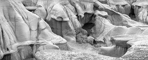
Bluffs And Bush - 2003 - 5 images stitched, Canon 10D
Those
of us who have been early converts to inkjet black and white have
had to face a fairly steep learning curve - a curve that looked like
a cross section of the Himalayas - hard scrambles to acquire a skill
followed by disaster as all we achieved went for naught - in a computer
crash - green prints - poor shadows clogged printers or any number
of other problems. I have been fairly successful selling my inkjet
black and white prints including getting them published in "Lenswork" and
"Black and White Photography" on the
basis of my print quality. I think I have some routines which make
for good quality inkjet prints.
Perhaps relating the results of my struggles can simplify life for
a few others.
In coming to a working solution to quality black and
white inkjet prints I have found that the entire photographic
process has to be considered, from camera to printer, and the computer
in-between. I therefore propose to describe in a three part series
of articles, my own pathway to quality black and white inkjet prints.
Where important, I will deviate long enough to tell you of some of
the pits I fell into, in the hope you can step round. To my surprise,
there are more ways to "get there" in digital than
I had ever thought possible, so rather than a how to, this is
a personal journey. The
Camera
How many pixels?
My rule of thumb is to have 300 real pixels (not uprezed)
per inch of black and white print when the print is to be held in
the hand or inspected from a few inches away. Its been my experience
that in the process of throwing out colour information from a digital
file, I lose information which means I have to compensate
by making smaller black and white prints (which is ok - after all,
the biggest standard print Edward Weston made was an 8X10 contact print),
or I have to use more pixels to produce your previously successful
colour print size. I generally plan on using twice as many pixels
for black and white, or print 2/3 size.
Stitching
Without investing in a camera with more pixels, the simplest
solution is to limit print size or to stitch images, panorama
style. Since I'm a landscape photographer, I use stitching to
add pixels. With a 35% overlap of images, two frames results in 5/3
as many pixels, three frames is 7/3 as many pixels. With my previous
Canon 10D, this meant 10 megapixels for two images, 14 megapixels for
three, etc. I found that in black and white and a 6MP DSLR, I could
mount the camera vertically and swing it horizontally which meant an
image that was 3000 pixels high by whatever wide. This produced perfect
8 inch high prints and pretty darn good 10 inch prints,
so a 3000 pixel sensor will make a 10 inch print by the 300 ppi formula.
With stitching, that's 10 inches x whatever I want, as opposed
to the 7X10 a single image would produce from a single frame. Think
of stitching even for square images. Remember that if you crop you
throw out 1/3 of the pixels, if you stitch two images, you add 50%
more pixels - 2000X2000 pixels becomes 3000X3000 (with a 10D 6 MP camera).
For details on the stitching process, see my web site and the links
there
to stitching software.
I now use a 1Ds2 which is approx. 5000 pixels
max. dimension resulting in approx. 11X17 inch prints (ie. a print
on 13X19 with a reasonable border). Some images can be printed
larger but you can't count on it - fine detail will suffer.
Oddly faces can stand larger prints quite nicely - but then
you didn't want super fine detail,
the subject won't appreciate seeing every pore
in detail. In colour I will make 24X36 inch prints
but wouldn't
go bigger than 14X20 in black and white. The Exposure
For exposure, don't even consider using anything
but raw - the loss of highlight detail in jpeg conversions is downright
painful.
I rarely increase the ISO of the camera, it's
my impression the quality of the shadows isn't
much different whether you increase the camera sensitivity
(increased ISO) or whether you simply underexpose and
open up the shadows subsequently in Photoshop. The
former is what is usually recommended but the latter
hangs onto the highlights better and I don't
think the quality of the shadows is any worse.
As has been discussed in Luminous Landscape, exposing
to the right of the histogram generally works best.
Where in colour I can't
afford to clip one out of three channels, in black
and white, the other two will almost always record the detail I want.
The degree to which
I can rescue highlights with Camera Raw (and presumably other
raw processing programs) continues to amaze me. Even when the camera
flashes overexposed highlights on the LCD screen, I can often save
the image in the raw processor. I'll
discuss in the next article the actual computer technique
I use in saving highlights without losing shadows.
In order to make highly detailed
large prints in black and white, I find I need good lenses adequately
stopped down. While conventional wisdom would indicate that this requires
prime lenses and expensive ones at that, my experience doesn't
entirely support that argument. For example, although the far corners
on my Canon 17-40 mm. zoom are a bit soft, the rest of the image is
darn sharp and cropping to an 8X10 ratio loses the somewhat soft corners.
Some time ago I did
a test with my 10D, my Canon 28-105 f3.5 - 5.6 (the mark II
model), and my old Pentax Takumar 55 mm. lens and a Canon to screw
thread adaptor, I found that while the Pentax lens was a bit sharper
than the zoom, the contrast on the zoom was substantially better, such
that overall it was a tossup which was better (at 55 mm. of course).
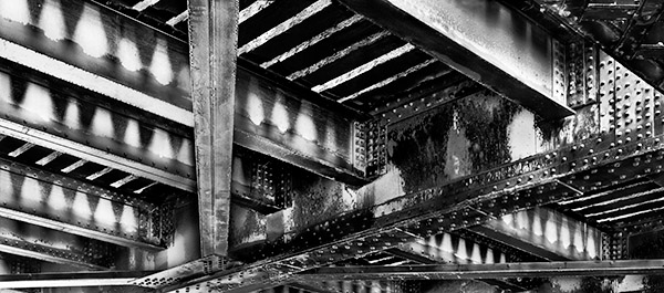
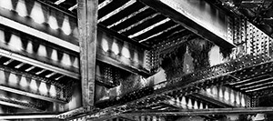
Horizontal Railway Bridge - 2004-5 images stitched,
Canon 10D
For landscape work, cable release and mirror lockup
are S.O.P. This of course mandates a tripod. My 70-200
f4 doesn't
need a lens collar but I use one since it better balances
the rig and reduces vibration.
Previewing Black and White
I continue to use a wratten 90 black and
while viewing filter (Zone VI from Calumet) when shooting black and
white. With some consumer cameras its possible to convert the
camera to black and white and use the lcd screen as a preview device
but this doesn't
work with DSLRs at this point, and you
don't want
the camera to throw out the colour information,
you are planning to use it to filter the
image in Photoshop. You might though consider carrying
a compact digital camera with a large LCD screen
(say 2.5 - 3 inches) and leave it in black and
white mode and use it strictly as a previewer for
your real camera, the DSLR.
For people photography and non DSLRs
then I'd
just live with the colour and learn to think in black and
white.
Blending Exposures
If on looking at the histogram I find that
the dynamic range exceeds the ends of the graph on both ends,
then I will shoot more than one exposure, setting one for the highlights
and the other for the shadows - both look horrible on the lcd screen
but the information I need is recorded. Of course
if I am stitching, I could in theory do both a blend and a stitch but
that's just more trouble than it's generally worth in
which case I will see if I can possibly record the range of tones in
a single exposure and stitch, or if not then not bother with stitching
and shoot multiple exposures, I confess, this latter choice happens
a lot more often since I got the 1Ds2 which makes very nice black and
white 13X19 prints.
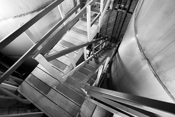
Stairs - 2006 - single image Canon 1Ds2, 17-40 mm.
@ 17 mm.
Shooting For Both Black And White And Colour While
not strictly a trick for successful black and white inkjet prints,
I have to say that the ability to decide
after the fact to go with black and white or colour
has dramatically increased my success rate of shooting and therefore
increased the fun of what is still mostly a hobby. About 70% of my
images stay in colour. I like to think that only the exceptional
images get to be black and white.
Truth is it's hard work
to find really good black and white subject matter. In general,
industrial subjects tend to work well, though even here, rust is
a lovely colour. Look for shadows - shadows are generally wasted
on colour and terrific in black and white.
Next Time
I'll take you through my technique in Photoshop for
getting the best possible black and white image.
You can find George Barr's website here. |