Since over 5 years we were using Adobe RGB as our color
space. Today we switched over to ProPhoto RGB. Here is why?
Note: We followed the discussion about ProPhoto
RGB for quite some time. Yesterday we had a conversation with
a friend
who
understands
color
management and this made it pretty clear to us.
We would never claim to be experts and do not even intend to get any
expert status. But the arguments we heard were just too convincing.
All what we write here matters if your main goal is the fine art output
(most likely prints).
What is Color Management (CM) all about?
Here is a very short definition we got:
"The purpose of color management is to translate the
device-specific numeric values (colorant percentages) so as to keep
the resulting actual colors the same as you move an image from one
device to another. Each device will then display the correct color
as best it is able to."
Very important is the phrase: " best it is able to".
Often the main purpose of color management is explained (we must confess
we did that partly too) as:
CM helps to get exactly the same image printed that
you see on your monitor.
Unfortunately this is not what you should expect from
a proper color management and it is not even possible today.
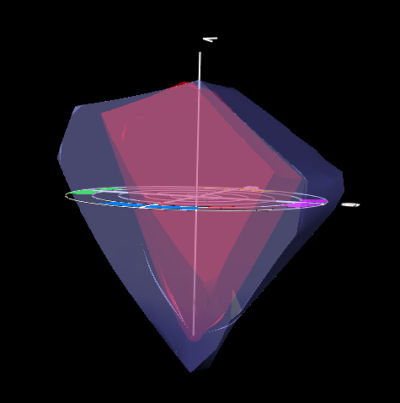
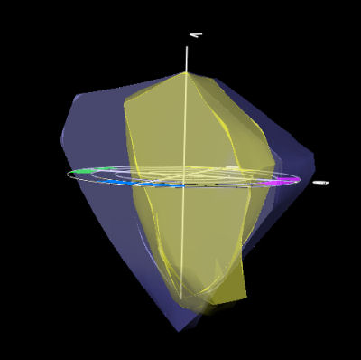
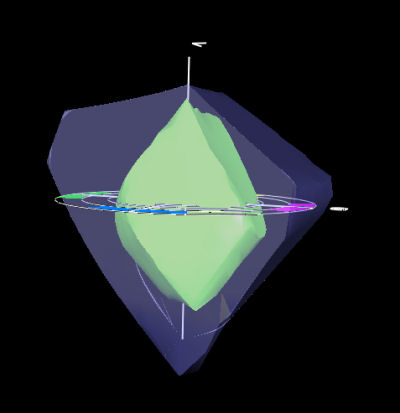
In the following diagrams (all made with the profile editor of GretagMacbeth
ProfileMaker 5.0) the colors mean:
- light pink: Artisan Monitor profile
- green: Epson Premium Semimatte paper with Bill Atkinson's profile
- red: Adobe RGB (1998)
- blue: ProPhoto RGB
- yellow: Profile for Canon 1Ds II + Capture One made with the Camera
Module of Profile Maker 5 using the new Color Checker SG target.
Note: We do not claim that this is a perfect profile
but we like it in our work.
We provide the diagrams to show how much one color space includes
a different one.
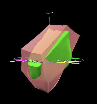
Artisan vs. Paper
You can see that the monitor can display
colors that cannot be printed and also the paper can render colors
the monitor
does not show. This mean if you want the print to look exactly like
the image on the monitor you would not use the full capabilities of
your printer.
You probably agree that it is not a good
idea to limit the printed colors just because your monitor cannot display
them.
Here is a better goal:
Print
as much as possible of the gamut that was captured by the original
image (especially digital cameras)
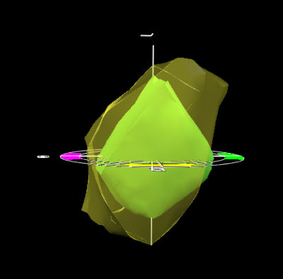
Paper vs. 1DS II
We can see that the camera can create a way larger gamut
than the Epson printer but even here the printer has areas where the
camera falls short.
You probably ask: what about the monitor? A good
monitor will be used as a soft proofing device and will minimize
trial and error printing.
The final proof
is always only in the print.
Why is Adobe RRB a problem?
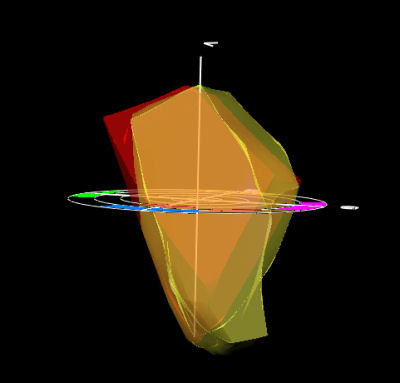
aRGB vs. 1Ds II
As you can see Adobe RGB does not preserve
all the colors you got from the camera. Once the file is converted
to Adobe RGB these extra shades of color are gone. Forever! 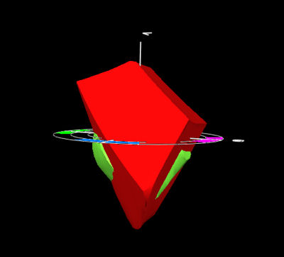
aRGB vs. Paper
Even the paper can render some colors
that aRGB cannot show. Also think of future printers that may have
broader gamut Adobe RGB would limit your data or other output to
future projectors.
You can experience that Adobe RGB is
a limiting factor in saturated colors like yellows where Adobe RGB
would just level all kind of
different shades of saturated yellow to a few limited yellow colors.
Why is ProPhoto RGB a better solution?
ProPhoto RGB vs Adobe RGB
ProPhoto RGB is a much larger gamut
than Adobe RGB. Get us right we don't want to argue the "bigger
is better" route here.
ProPhoto RGB vs. 1Ds II
ProPhoto RGB can hold nearly all the
camera colors and more. Where the camera profile shows data outside
of ProPhoto RGB we have probably some more or less profiling artifacts.
ProPhoto RGB vs. Paper
Here we have a situation that
we can utilize all the paper colors from ProPhoto RGB. Colors
that are outside the paper gamut need to be mapped using a "perceptual" rendering
intent. If the colors of your photo mostly are in the the range
of the paper you can also use the "relative colorimetric" rendering
intent.
Paper vs. 1Ds II
Nearly all colors of the paper are
inside the camera space. What does this mean? We don't want to
give up any colors the printer can render by clipping data to a
smaller
color space like Adobe RGB.
How to get images into ProPhoto RGB?
Most raw converters will allow you
to create files in 16bit that can be converted to ProPhoto RGB.
Actually the native color space for Adobe Camera Raw is ProPhoto
RGB.
Any Downsides of using ProPhoto RGB?
The
main issue with ProPhoto RGB is that you need to use 16 bit images
all the time or otherwise risk
posterization.
Clearly
16 bit is the way to go anyhow although the performance and more
storage requirements hurt. Since
Photoshop CS and most tools work
in 16 bit today there are only few arguments against using 16bit
all the time.
Note: It does not
make sense to convert JPGs to ProPhoto RGB. Why?
1. They were already clipped to 8 bit
2. Also there color space will be mostly
sRGB or AdobeRGB. So the clipping of data is already done and cannot
be reversed.
Why not use the native Camera Space?
This would be a valid alternative.
This would even involve only one profile conversion from the camera
space to the printer. The downside is that every image would have
a different color space. We believe that a color space conversion
to ProPhoto RGB will hardly change data and also prefer to have
all
the
images
in the same color space.
Here is also a second opinion on using
camera spaces for your standard master images:
"Leaving your master image file in
the camera RGB or Scanner RGB color space is usually a bad idea because
those spaces are not gray balanced and not equal gamma for R,G,B.
As you edit the master image file and raise or lower all RGB values
the same percentage, you may unintentionally introduce a color cast
or color crossover because the camera or scanner represents neutral
colors as non-equal amounts of R,G,B. Much better to first use the
camera profile or scanner profile to convert into a well-behaved
editing space such as Lab or ProPhoto RGB."
What about the old Pictures in Adobe
RGB?
If you like the printed results from
these pictures in Adobe RGB just leave them.
PS allows you to keep any image in its own color space. If you want
to transfer older images to ProPhoto RGB then start with the original
(e.g. raw files) and stay in 16 bit all the time.
Final Note on Monitors
Still the monitor is your main soft
proofing device and needs to be as good as possible to make your
life easier. LCD monitors are to be expected to improve in quality
still over the next years.
All color spaces in 2D overview
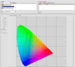
Here you can view a 2D view of all
the color spaces used in this article.
Some related links
|