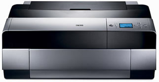
Today I received one of the first models of the new Epson
3800.
Everybody reading at this diary knows what this printer
is all about: an incremental improvement (print-quality wise) over
its predecessors
(to be verified!), matte
and photo black ready for use without costly swaps, no roll support and 37" of
max paper length using the standard Epson driver.
Many people will probably
spend a few sleepless nights pondering whether they should replace they
current printer with the Epson 3800.
Do I really need the roll feeder?
How many times a year would I switch the black inks on the 4800?
Interesting price tag, isn't it? Yes, but why
only
37"? What if I print panoramas? And so on...
This article will not
cover any of those arguments. This article will focus solely on the
printer itself. I'll do my best to review it in-depth
and
in a timely manner, so that you can have a source of good information
to help
you decide if this printer is for you.
Having an Epson 9800 for all
of my big prints and knowing what a pain is feeding it with sheet
paper, I knew I needed a 17" printer with cut-sheet handling
capability. Also, the claimed better print quality (due to the redesigned
screeening algorithm) was something I couldn't resist trying, therefore
the Epson 3800
had my name on it since it was announced.
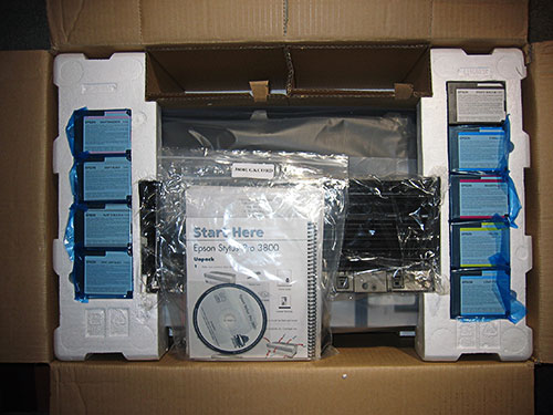
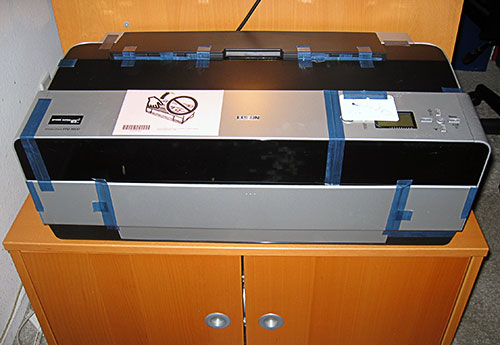
The shipping box measures 31"x16"x21" and weights 55lbs. I was
able to load it in and off the trunk of my car without any help. Compared to
the Epson 4800, it is definitely a manageable beast. Here is the first look
into the cut open box.
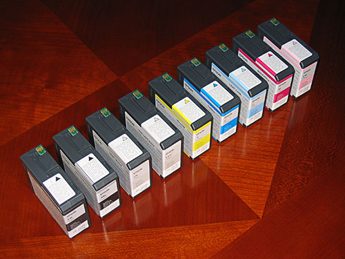
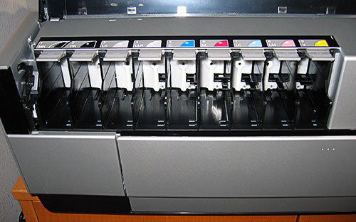
The new 80ml ink cartridges look exactly for what they are: something
in between the small and un-economical small cartridges of the 13" Epson
printers (the 2200 and R2400 for instance) and the more substantial
110ml and 220ml ink tanks used on the Epson 4800/7800/9800 series.
You can view here the entire ink set.
And a close up of one of them.
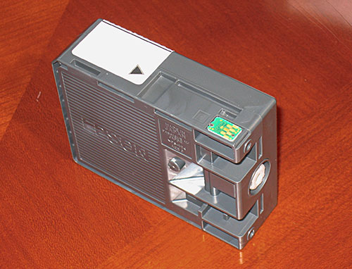
In case you ever dreamed about the green microchip disappearing,
wake up, it's still there to prevent you from buying the 220ml cartridges
and use them to refill the Epson 3800 80ml cartridges for better
ink economy.
Though not quite as big as the 4800, the 3800 is still a big printer. After
placing it in a temporary location, I removed the usual large amount of blue
tape and foam spacers that the good guys at Epson seem to enjoy placing everywhere
outside and inside the printer.
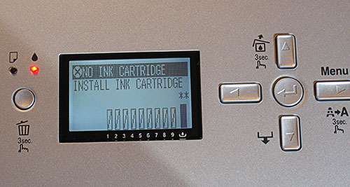
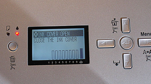
After removing all the tape, my first instinct was to take a look
inside the ink compartment, but this is impossible at this time because
the ink cover is locked and can only been released by turning on
the printer.
After turning the printer on (as the manual says, do not connect the printer
cable yet), the ink cover is automatically released...
... and the printer LCD panel will guide you through the ink installation
process.
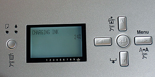
Running a Printer Status report on the ink level soon after bringing
the printer to life, shows the following levels of ink left in each
cartridge:
90% - Matte Black
87% - Photo Black
80% - Light Black
80% - Light Light Black
80% - Cyan
80% - Magenta
80% - Light Cyan
80% - Light Magenta
80% - Yellow
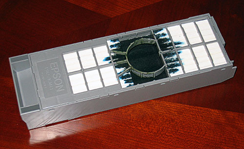
The maintenance tank remaining life is reported at 64% and the tank
looks like this.
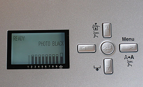
At this point I run a nozzle check with my finger crossed. It came
out perfect and quite honestly, a clogged print head within the first
10 minutes of operation would be considered a very bad sign, but
so far so good!
I also run an automatic head alignment and the printer is now ready for some
real testing that will be performed in the next few days. Stay tuned!
12/17/2006
Today I intended to write a second entry to
this diary, but after hearing the news about Bruce Fraser's passing
away, I simply couldn't focus my mind and I felt it was pointless
forcing myself to do something that appeared meaningless.
Today's entry will therefore be limited to a few words to express
my deep sadness for the loss that Bruce's death represents
for all of us photographers, color
management experts and readers of his books.
Thank you Bruce. We'll all miss you.
12/18/2006 Print Head Alignment
Today I turned the printer on, after about 36 hours
of inactivity.
I printed a nozzle check and it came out neat and
clean.
There has
been a lot of debate about the best way to avoid ink clogs
after long periods of inactivity. Some people suggest to
leave the printer ON all the time,
while others recommend the exact opposite.
It appears that Epson's official
recommendation is to leave the printer OFF when not it use, so
that the print head can rest in its parking position which
results
in the print head being capped.
Epson's recommendation makes perfect sense
to me and unless a general consensus is reached indicating that the opposite
is true, I'll keep the printer OFF
when not in use.
Today I also re-printed a few print head alignment tests. The user manual,
at page 87, says:
"Although you can align the print head using the printer utility software,
it's best to align from the printer's control panel. This will do the most
thorough job in the shortest time...".
This claim is quite obscure and
I tried to dig a bit into it.
I printed two (to check pattern repeatability)
automatic alignment charts from the printer utility software and
another two from the printer's
control panel.
Although it's impossible to know what the printer is actually doing
during these routines, I noticed that the printed charts show some
subtle differences.
You'll have to look very close but the pitched alignment
target printed from the printer utility software is slightly different
from the one printed through the printer's control panel, therefore
it's possible that the two alignments are not exactly the same and
that the one driven by the printer firmware is more accurate than
the one performed by the printer driver.
My priority for the next days will be custom profiling
the printer for color printing and checking it's quality compared
to the Epson 4800/780/9800series.
12/19/2006 Paper Transport Issue
Third day without print head clogs! But the problem
today comes from the way the printer handles (or I should say -mishandles-)
the end of the print sheet.
With the Epson 4800, Epson introduced a vacuum system
that helps keeping the paper pressed down (and flat) during printing.
On the Epson 3800 this system was eliminated (to save costs?) and,
as a consequence, I experienced again the same problem that plagued
most of my prints with the Epson 2200.
During normal printing the paper seats perfectly
flat on the bottom bed of the printer and is kept flat by two sets
of printer rollers (see picture below).
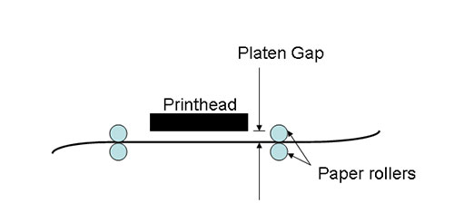
The distance between the paper and the print head
is controlled by the Platen Gap setting, which should normally
be set to Standard, unless a very thin or very thick paper is used
(I have mine set to Standard).
The problem arises sometimes when the paper reaches
its end and is no longer engaged by the two printer rollers opposite
to the paper feeding direction (which, in the two images shown
here is from right to left). In this case, if the paper is not
perfectly flat along its edge (and corners) it can easily get in
the way of the print head movement, which results in color smearing
and possible damage to the print head.
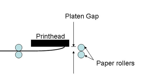
I've found that this problem is more likely to happen with large
sheets of paper.
I remember having this problem with the Epson 2200
almost constantly. I resorted to setting the adjust lever to
the "thick
paper" setting even for
normal papers.
It's quite annoying to see that this problem is back after
two generations of printers. Please let me know if you are
having the same problem!
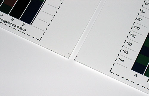
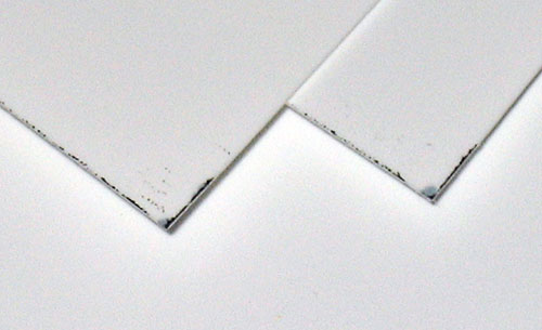
The unhappy end result of this problem is seen below.
Of course setting the Platen Gap to a wider setting will fix the
problem, but the problem shouldn't be there in the first place!
Next entry to this diary will be about Advanced B&W printing.
12/23/2006 Paper Transport Issue Update
I received a few emails from other users confirming
that the paper transport issue I'm experiencing with my Epson 3800
is a common issue that is likely here to stay.
The only easy solution
to this problem is to increase the Platen Gap setting from Standard
to Wide or Wider.
The question with this solution is: will increasing the printhead-to-paper
distance result in reduced print quality, as the inks might not hit the
paper as precisely?
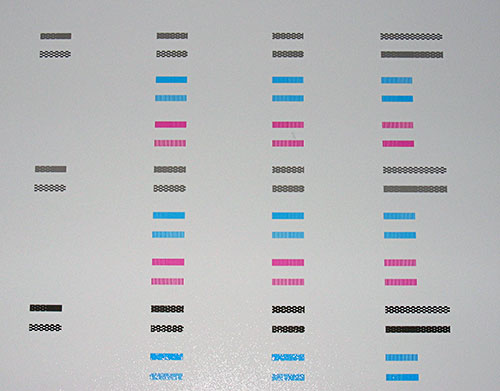
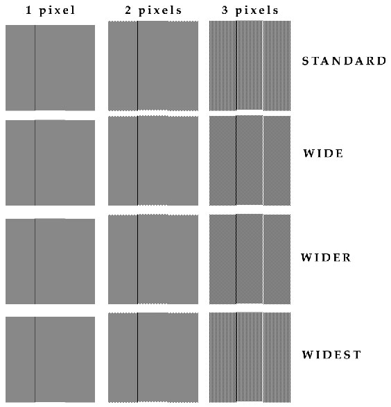
To verify this I created a test print based
on the resolution target shown below.
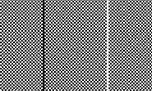
The target is a checkerboard of
black and white squares -1, 2 and 3 pixels wide- on a 360dpi document.
Each row was printed with a different setting of the Platen Gap:
Standard, Wide, Wider and Widest, using the SuperPhoto-2880dpi
Print Quality mode in the printer driver, High Speed OFF.
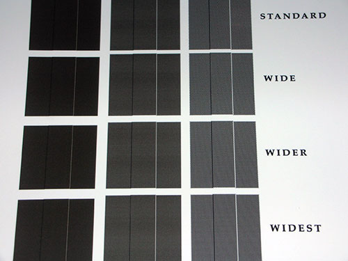
After printing four times the target using the four Platen Gap
Settings, from Standard to Widest, I inspected the print using a
high magnification eyepiece, in search of any sign of print quality
degradation, due to the increased paper-to-printhead distance.
RESULTS
As far as I can tell, there ISN'T any print quality degradation,
moving from the Standard to the Wider Platen Gap setting. I can only "guess" a
slight detail degradation using the Widest setting, but only on the 1 pixel
target.
Below is a picture of the actual target printed.
I'll try to have some high magnification pictures of the target
in the next few days.
CONCLUSIONS
Based on my test print and inspection,
it looks like there isn't any disadvantage in raising the printer
Platen Gap. All Epson 3800 users seeing color smearing
on the bottom corners and/or edge of the paper should increase the Platen
Gap. From Standard to Wider, there is no visible print quality loss. Some
caution is advised with the Widest setting.
I encourage anyone with an Epson 3800 to replicate my test and report his/her
conclusions.
Contact me (giorgio@gt-photography.com)
if you wish to get a copy of the target I used, without having to create
your own.
01/02/2007 Paper Transport Issue 2nd Update
I received quite a bit of emails from other users
complaining about the paper transport issue with their Epson 3800.
One of them is particularly interesting because it
mentions a printer replacement made by Epson that apparently fixed
all the problems.
"Just to confirm that I had the same problem
on my first 3800. I was encouraged to use "wide" or "wider" setting
by Epson Customer Service. Using either of those setting
eliminated the problem but created "smudges" along the right side
of the paper during printing. Thus, edge-to-edge photos were
unacceptable.
I reported the newer problem and Epson sent a second 3800 via overnight delivery.
This new printer does not have --at the moment, at least -- any of the earlier
problems."
I haven't had my printer replaced so far, but I'll
dig into the problem some more and I'll report if the above report
is pure coincidence or if there is more to it.
In the meanwhile I have posted the Platen
Gap Test target on my website (442KB).
01/03/2007 Advanced Black and White Printing
It's important to understand in depth the various
options offered by the Advanced Black and White printing mode.
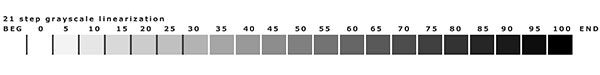
First of all I wanted to measure how neutral the "Neutral Tone" really is.
To do this, I printed the 51 steps grayscale target
provided with the Quadtone RIP program (thanks to Roy Harrington).
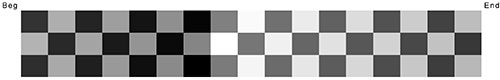
The target is a randomized stepwedge in Grayscale
color mode (untagged) with K ranging from 0 to 100 in steps of 2%.
The target was printed using the Neutral + Dark setting:

After printing, the target was measured using GretagMacbeth
ProfileMaker Measure Tool and the Eye-One Pro spectrophotometer.
In the CIELAB (Lab for abbreviation) color space
the axis a* defines the chromaticity of color varying from green
(negative values of a*) to red/magenta (positive values of a*), while
the b* axis defines colors from blue (negative values of b*) to yellow
(positive values of b*). A neutral color should have values of a*
and b* as close to zero as possible.
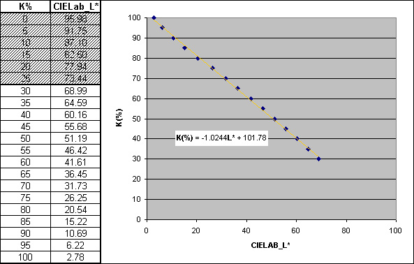
The measured Lab_a* and Lab_b* values of the target
gray patches are plotted below.
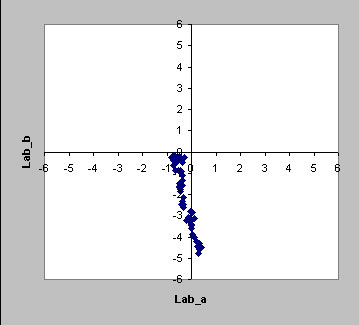
The above graph tells us some interesting
things.
On the a* axis (the green/red axis)
all the gray patches are contained within the +/-1 boundary. This
means that all the patches are extremely neutral showing virtually
no cast.
The analysis of the b* axis (the blue/yellow
axis) is less straight-forward and potentially tricky. From the graph
we can see that many patches have negative values of Lab_b* (as low
as -5). We could conclude that the printer is not neutral along the
b* axis and that the patches exhibit a strong blue cast, but we would
be wrong! The measured blue cast is not an inherent misbehaviour
of the printer, but the obvious byproduct of the Optical Brighteners
(OBs) present in the paper that the target was printed on. We can
verify this theory by plotting the Lab_b* values vs the
K% of the target patches. If the non-neutrality is an inherent quality
of the printer we should measure almost all the patches as non-neutral,
regardless of the amount of K. On the contrary, if the blue shift
is seen only in the lightest patches (where the amount of ink deposited
is not enough to cover the effect of the OBs), then we can conclude
that the non-neutrality is induced by the presence of the OBs.
The Lab_b* vs K% graph is shown below:
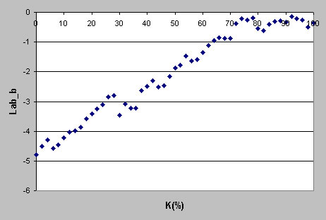
Lab_b* vs K% graph for the Ilford
Galerie Smooth Pearl paper
As we can see, non-neutrality increases
steadily as the amount of ink is reduced. For all patches with K
greater than 60%, the color shift is contained within the -1 limit.
This is a clear demonstration that the
measured non-neutrality is a direct byproduct of the OBs in the paper
(in this example: Ilford Galerie Smooth Pearl).
The same target printed using the same
settings on a OBs free paper (Breathing Color Sterling Rag) shows
a drastically different set of Lab_b* values.
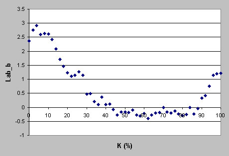
Lab_b* vs K%
graph for the Breathing Color Sterling Rag paper
In this case we can see that true neutrality
is achieved across a wider range of K values -from 20% to 100%- and
that below 20%, as expected, the yellowish color of the rag paper
starts surfacing, because at this low level of ink deposited, there
is not enough color to effectively cover the paper white (which in
this case, an archival OBs free paper, is quite typically a yellowish
color).
In conclusion, the Advanced B&W
printing mode exhibits amazing neutrality along the Lab_a* axis and
does the same along the Lab_b* axis with the exceptions, as expected,
of the highlights, where the OBs and/or the paper color start exerting
their influence.
Actually, the non-neutrality measured
on papers containing OBs is purely numerical, because our eye-brain
combination perceives the blue peak in the highlights as white. As
a result, the entire stepwedge looks perfectly neutral to the human
eye regardless of the blue cast picked up by the spectrophotometer
(this is why some spectrophotometers use UV filters to better match
the spectro's response to the human eye).
After verifying the excellent neutrality
of the Advanced B&W printing mode, I wanted to investigate the
actual difference between the Light, Normal, Dark, Darker and Darkest Tone
settings.
To do this I reprinted the same 51
steps grayscale target using the corresponding setting and
then I measured the resulting Lab_L* values. The results are shown
in the graph below.
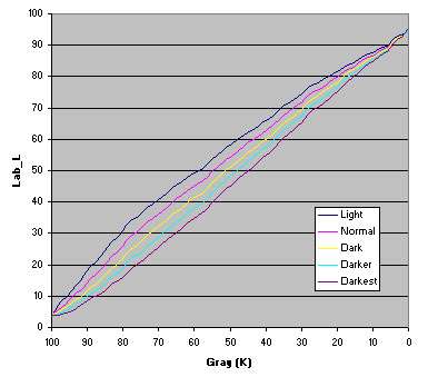
Dark: The Dark setting
produces the most linear result of all the settings. The K% is translated
into a linear L* line with K=100% corresponding to the darkest black
the printer is capable of producing (about L*=3.6 on the paper used
for this test, Ilford Galerie Smooth Pearl) and K=0% corresponding
to the paper white (about L*=97).
Normal: using the Normal mode
is similar to applying a gentle curve in Photoshop to increase shadows
separation at the expenses of some highlight details. The overall
lightness of the image is also increased a bit.
Light: the effect of
the Light setting is similar to the Normal setting,
only stronger. With this method you increase the overall lightness
of the image, increasing significantly the shadow details but loosing
separation in the highlights.
Darker and Darkest:
these settings work in the opposite direction, reducing the overall
brightness of the image and increasing highlights separation at the
expenses of shadow details.
Unless you have specific images that
will benefit from better shadow or highlight separation, the Dark setting
seems to be the best option for general printing.
01/23/2007 Advanced Black and White Printing
Mode Demystified
I'm certainly not the first one discussing B&W
profiles, but I feel this topic is still covered with a great deal
of mystery and misconceptions, and I hope I can bring some light
on the subject in general.
Until the introduction of the late Epson models (4800, 7800 and 9800) and the
new Advanced B&W printing mode, the only way of printing some decent B&W
was through the use of third party RIPs. Imageprint and Studioprint are
the very first two names that come to my mind.
Imageprint in
particular has done an excellent work at serving the photographers' community
with a venerable product for years. I used Imageprint
for most of my color printing due to its better dither algorithm and ink
economy.
I consider "micro banding" the most disturbing
artifact of inkjet printing and Imageprint offered a "micro
banding-free" driver long
before Epson managed to do the same.
As far as B&W printing, Imageprint
uses a proprietary profiling method. On their website they provide a
huge range of profiles for virtually any paper
on the market and different lighting conditions.
B&W printing through
Imageprint is nothing short than amazing! The neutrality is dead on and
their dither algorithm is very smooth but today's Epson driver
is a serious challenge to this long supremacy. I suspect they are having
hard times keeping their sales up considering that Imageprint has always
been quite
expensive, up to twice as much the cost of the printer itself.
I'm glad that today I can print stunning Black and
White images through the Epson driver, but to do this I felt the
need to study its secrets and uncover its "under the hood" functions.
We
all know that Epson printers are true RGB printers. This means
that they are designed to work with RGB inputs. If anything else
is thrown
at them, it
gets converted back to RGB by the driver before being sent to the printer.
It also means that the conversion between the RGB inputs and the actual CMYK
ink amounts is hidden in the printer driver, and the user has no control
over it.
This is certainly true for color printing, but I
wasn't sure about the Advanced B&W printing mode and I wanted
to verify this first hand.
To be able to tell if a printer behaves
as a RGB printer OR a
CMYK printer, there is a simple test to do.
In Photoshop create an untagged CMYK file (no color space embedded).
Then draw two black shapes, one inside the other, with the following CMYK values:
1st shape: C=M=Y=0% and K=100%
2nd shape: C=M=Y=100% and K=0%
Something like this:
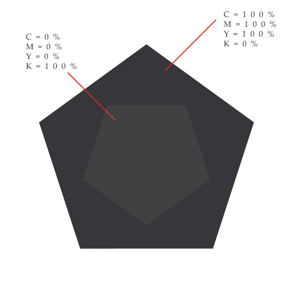
Now send the image file to the printer, using "Don't
Color Manage/No Color Adjustment" in Photoshop and the
Epson driver.
If your printer is a true RGB printer you WON'T see the small
shape inside the big one.
The reason for this is quite simple. With a true RGB printer the CMYK values
are converted to RGB prior to printing. In a non color-managed CMYK to RGB
conversion (with no information about the actual ink color etc.), both "C=M=Y=0%
+ K=100%" and "C=M=Y=100% + K=0%" are converted to R=G=B=0.
As a result both shapes are printed using the same RGB commands (zero!) and
they will look exactly the same.
On the contrary, if you are dealing with a CMYK printer, then "C=M=Y=0%
+ K=100%" and "C=M=Y=100% + K=0%" are NOT the
same color and the two shapes are printed with different ink formulations,
so much different that you will be able to see them individually.
I printed such a test pattern using the Advanced
B&W print mode and I was unable to differentiate the two shapes.
This means that in the Advanced B&W print mode the Epson printers
are still RGB printers, or at least they are not CMYK (which is a
wonderful thing in itself!).
Armed with this knowledge, I was ready to move on
to my next question.
Could the Advanced B&W print mode be a Grayscale mode?
I don't know of any quick and reliable test (like the CMYK vs RGB described
above) to discern a RGB vs Grayscale behavior of the printer driver, therefore
I had to design my own to further investigate the true nature of the B&W
print mode.
The first thing I wanted to know is this: if I print
a Grayscale step wedge and a RGB "gray" step wedge (obtained
by converting K% to RGB values with a linear conversion), will I
get the same output?
The formula for a linear transformation of K% into RGB values is the following:
I used this formula to create a RGB version of the
QTR-21-gray.tif file provided by Roy Harrington. Some rounding was
needed to be able to work with integer RGB values.
The following files were printed using the same driver
settings.
I then measured the resulting Lab values of each
target and I compared them using the Comparing function in GretagMacbeth
ProfileMaker Measure Tool.
The results are shown below:
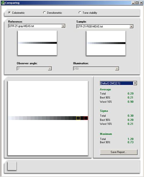
As can be seen form the above screen shot, both files
produced virtually the same Lab values. The small difference (dE=0.29
using the CMC (2:1) formula) is due to the combination of the rounding
errors, ink density fluctuations and most likely, variability in
the measurement process.
With the above experiment I demonstrated to myself
that both a Grayscale and a RGB image produce the same output as
far as their color modes are converted into each other using a linear
transformation.
The measurement data also establish a direct link between K% (or the equivalent
RGB) and the resulting CieLab_L*. We will need this information later. For
now we just take note of it, by plotting the set of data and letting Excel
find the trendline and displaying the equation of the data interpolation line.
Please note that I have intentionally excluded the
first 6 values, because in this area of low K%, the color of the
paper has a significant effect on the output. By selecting only mid-to-heavy
K% we obtain an equation that relates L* to K% independently (mostly)
of the paper being used.
Again, the conclusion of this simple investigation
is that the Advanced B&W print mode treats both a Grayscale and
a RGB file in the same way, producing the same output.
This is an important piece of information, but it's not the end of the story,
there is much more to know.
The RGB file I printed was actually a gray file, with R=G=B across the entire
0-255 range. What happens if we try to print a color RGB file using the B&W
print mode?
I made an assumption and then I tried to verify it.
The assumption is that a color RGB file will be converted by the driver to
Grayscale before being printed. This is almost obvious as you can't get any
color out of the B&W print mode (unless you tint the image in the driver),
but what type of RGB to K conversion is used by the driver?
There is no easy answer to this question, but I did my homework, and if you
bear with me through some simple mathematical stuff, we can learn something
interesting!
A common formula used to convert RGB (0-255) to K(0-100%)
is this:
- K(%) = (255-(0.3*R +
0.59*G + 0.11*B))*(100/255)
This formula mimics the response curve of the human
eye to the three primary colors under normal daylight conditions.
It's so popular that Photoshop uses it as the standard Image>Mode>Grayscale
conversion. This formula assigns different coefficients to each primary
color. Green, the color that our eyes are most sensitive to (no wonder...
we spent millions of years in the forest picking up fruit and being
on the lookout for predators before getting worried about color management),
gets the highest weight -0.59-, Blue has the lowest -0.11- and Red
something in between -0.3-.
Maybe also the Epson driver uses this formula for its hidden conversion from
RGB to Grayscale.
The assumption is that it does, and I wanted to verify it.
Let me go back to the formula.
This formula is quite simple (it's still linear at least), but has three variables,
and we'll have to dig a bit to find the individual weights. Let's start by
rewriting the formula in a more general format.
- K(%) = (255-(rR + gG + bB))*(100/255)
I wanted to find out the coefficients used by the
Epson driver, and in the above formula r, g and b are
the UNKNOWN weights for the R, G and B values. To make the life easier,
I separated the combined effect of the three coefficients by printing
three separate step wedges with only Red, Green and Blue color components,
like the ones shown below:
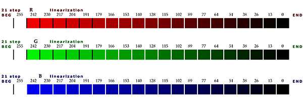
By doing this I simply separated the three variables
(r, g and b) and I was left with a set
of three separate equations in the following form (where R, G, B
and K are -or should be- known data):
- K(%) = (255-rR)*(100/255)
- K(%) = (255-gG)*(100/255)
- K(%) = (255-bB)*(100/255)
The problem with this set of formulas is that we don't really know
which K value is associated with each R, G and B values inside the
driver. We have no direct access to this information (at this point
at least, we'll know later), BUT we have an indirect measurement
of it from the previous exercise that come to rescue and can free
us from the enpasse.
By reading the above target with a spectrophotometer I measured the resulting
CIELab_L* of each individual value of R, G and B. Using the interpolation formula
previously found:
I could correlate each value of R, G and B to its associated K%
value.
At this point I knew which K% is associated by the driver with each individual
R, G and B value.
All I had to do was to plug these numbers into the following equations (same
as above, only solved explicitly for r, g and b):
- r = (100-K)*255/(100*R)
- g = (100-K)*255/(100*G)
- b = (100-K)*255/(100*B)
Excluding R=G=B=0 (we can't divide by zero!) I had 14 (21-6-1) independent
empirical computations of the RGB to Grayscale conversion coefficients
employed by the Epson B&W print mode.
The results I have found are summarized below (contact me if you are interested
in the actual measurement data and the Excel data analysis files).
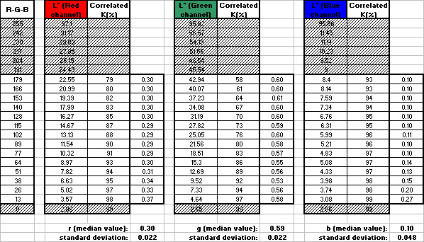
Within the experimental errors, I have found with good precision
the conversion coefficients that were assumed since the beginning:
0.3 for Red, 0.59 for Green and 0.11 for Blue.
SUMMARY:
The above analysis demonstrates that the initial assumptions
were correct.
First, the Epson driver in the Advanced B&W Print mode is a Grayscale driver.
If you send a RGB file with all R=G=B to the printer, then a linear
conversion to K(%) is used by the driver, according to the formula:
- K(%) = (255-RGB)*(100/255)
Second, if you send a RGB file with some color information (R, G
and B not equal), then the driver will convert to Grayscale using
the traditional formula:
- K(%) = (255-(0.3*R +
0.59*G + 0.11*B))*(100/255)
The lesson to be learned from all of the above is this: always print
in B&W using either Grayscale files or "gray" RGB files
(R=G=B). Both these formats will generate the same output and you'll
have full control over the tonal range of your images.
If you leave color information in your RGB files, you will still get a B&W
print, but you cannot control the grayscale conversion, you can only preview
it in Photo shop by converting a duplicate file to Grayscale.
You get much better results if you do your own conversion to gray by controlling
the mix of the individual color channels.
For a full color managed workflow, you can profile an Epson printer in B&W
print mode using a Grayscale target, which will give you a profile with Device
Color Space set to Gray.
If this profile has the two Tag Tables describing both the paper white and
the maximum black, you have all you need to be able to preview and print reliably
your images in Black and White mode.
Color-wise, or gray-wise I should say, it goes like this: when you
create a B&W profile you link the K% sent to the printer to their
corresponding CIELab_L* values. This information is stored in the
so called "B2A Look Up Table".
Your tagged RGB file (through its Color Space) contains information about the
Lab values of each pixel.
When you print the image, Photoshop takes the known L* values of each pixel
and "looks up" (through the B2A table of the printer profile) which
K values need to be sent to the printer to obtain those L* values. Then those
K values are passed directly to the printer which in turn, will print them
with no further modification and the output will be the one you expect. This
is really all there is to it.
Next entry will be about the practical profiling procedure.
02/01/2007 Profiling the Advanced Black and White Mode
After spending quite some time investigating the true behaviour of the Epson printer I think it's time to focus on the real thing: profiles and prints!
Compared to the previous models, the latest Epson drivers (3800/4800/7800
and 9800) are characterized by a vastly improved gray balance,
even when set to color mode.
With such a precise gray balance the advantage of the Black and
White mode is not really its neutrality, rather its linearity.
It looks like Epson made every effort to deliver a driver exhibiting
both excellent neutrality and linearity.
The following graph shows the data plot of RGB input values vs
their corresponding output CIELab_L* printed using the Color mode
and the Advanced B&W mode.
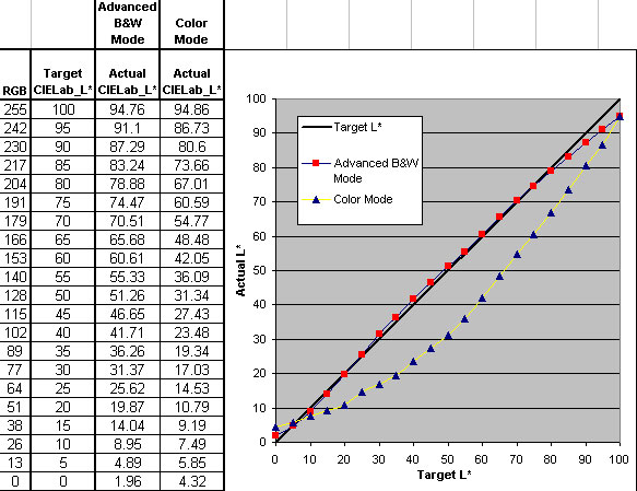
The evident characteristic of the Advanced B&W mode is the almost perfect linearity.
The target and output CIELab_L* values are almost identical, with the exception
of the black and white points, due to the obvious fact that no paper white
read Cielab_L*=100 and no printing process produces a dmax equal to CIELab_L*=0.
Quite
interesting is also the fact that the black produced by the Advanced
Black and White mode is much darker than the black produced by
the Color mode.
I didn't expect this result, and I initially thought I misread my targets,
but after re-measuring them several times I had to conclude that the
difference was not a measuring issue. In fact the dither algorithm
is different between
the two modes and the max black is "more black" using the Advanced
B&W mode.
Another interesting finding I discovered is that it isn't true
that the Advanced B&W Mode doesn't use the yellow ink. In the
old days disabling the yellow ink was Imageprint answer to bronzing,
gloss differential and metamerism for monochrome printing. The
yellow ink is more prone to fading compared to the other inks,
therefore a conservative use of it will improve the archival qualities
of the print. It's believed that Epson B&W Mode uses the same
trick to a certain extent, reducing the use of yellow, but it's
not true that the yellow ink is completely disabled in the Advanced
B&W mode.
I verified this by printing two color patches with
R=G=B=242 using both the Advanced B&W mode and
the Color mode.
As you can see from the pictures below,
(taken with a high magnification microscope and a CCD camera),
the yellow ink is used in both modes.
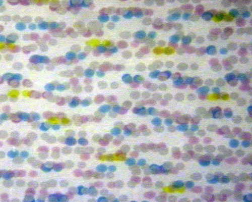
R=G=B=242 using the Epson 3800 Color mode (no color management)
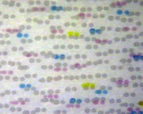
R=G=B=242 using the Epson 3800 Advanced B&W mode (Neutral-Dark setting)
Many photographers create B&W prints using standard color profiles.
I don't think this is a good idea.
Even if we can obtain good neutrality from a color profile, this method is less than ideal, for at least a couple of reasons.
First of all, as can be seen form the previous graph, the Color
Mode tends to favour highlights and midtones separation at the
expenses of shadow details. A good custom profile will try to compensate
for this characteristic and will deliver a more linear behaviour,
but the corrections built into the profile cannot be perfect and
it's much wiser to start off with a linear behaviour of the printer
itself.
With the driver set to Advanced B&W mode, the printer
is perfectly linear and the profile will have to do little to
none intervention to replicate on paper the image tonal range.
Second,
the black from the Advanced B&W mode is deeper than the black
from the Color mode and the print will look more vibrant. A grayscale
profile for the Advanced B&W mode is, in my opinion, the
best way to go.
There aren't many applications that one can use to create a grayscale
profile. The only one I know of (please let me know if I'm missing
something), is a small utility provided by Roy Harrington as part
of its Quadtone RIP application.
It's found under - QuadToneRIP\Eye-One
and it's called - QTR-Create-ICC.exe.
To use this application you need a measuring instrument supported by GretagMacbeth ProfileMaker. The Eye-One spectrophotometer, for instance, would be ideal.
In the QuadToneRIP\Eye-One directory you will find a ready to use Grayscale target, called: Step-51-gray.tif.
Open this target in Photoshop and make sure to read:
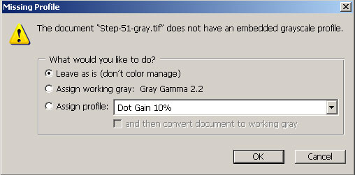
then choose: Leave as is (don't color manage).
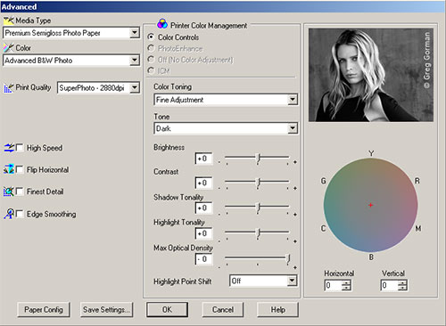
Proceed to printing using the Dark setting for better linearity.
Now you need to read the printed target and to export the measurement .txt file, using the LOGO (GretagMacbeth) format. You can do this using GratagMacbeth ProfileMaker MeasureTool. Luckily enough you don't need to buy this software because the MeasureTool module works in demo mode without a dongle. The QTR-Create-ICC.exe application will only digest a Lab measurement file, therefore you have to set your instrument to export Lab values, by leaving the Spectral toggle unchecked,
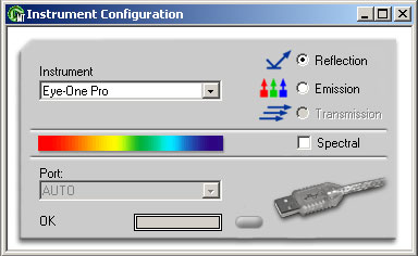
or, alternatively, you can measure Spectral Data (they are always useful and informative to look at) and then export the Lab values to a separate .txt file.
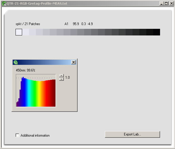
You will use the Lab containing values .txt file to
create the grayscale profile. It cannot be easier than just copying
the .txt file to the QuadToneRIP\Eye-One directory
and then dragging and dropping it onto the QTR-Create-ICC.exe application.
In just a few seconds the new *.icc profile will pop up in the same
directory. Note that the new profile will have the same name as your
measurement file thus, before creating the profile, I recommend you
rename the measurement .txt file to whatever you want your profile
name to be.
Last, you copy the new profile to one of the following directories, depending on your Operating System:
WIN 98:/ME: C:\WINDOWS\system\color
WIN NT/2000: C:\WINNT\ system32\spool\drivers\color
Win XP: C:\WINDOWS\system32\spool\drivers\color
MAC OS/X: User/Library/ColorSync/Profiles
MAC OS9.x: Systems Folder/ColorSync Profiles
In case you had Photoshop open when you copied the profile to the appropriate directory, you'll need to close and restart it. You can now use the profile to print and softproof B&W images.
The printing sequence is the same as with any color profile. You start with a tagged RGB (a RGB file with a Color Space embedded) or Grayscale file and you select File>Print with Preview.
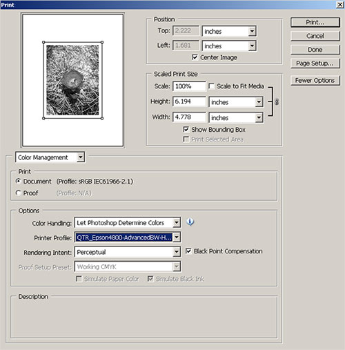
Under Options>Color Handling select Let Photoshop Determine Colors, then select your QTR grayscale profile.
Under Options>Rendering Intent select Perceptual.
Leave Black Point Compensation selected.
Now access the printer driver settings and make sure to select the exact same settings that were used to print the Step-51-gray.tif profile testchart.
Inspecting the QTR profiles:
If you are interested in seeing with your own eyes how your profile will interpret the image pixels and how it will physically drive your printer, you can do it by using a profile inspector.
There are different profile inspectors available and each one has its own merits, weaknesses and strengths. One of the most complete packages that I use on a regular basis is Chromix ColorThink.
Using the Profile Inspector function you can look inside the profile structure and verify many things.
In the screenshots below I highlighted the White Point and the Black Point Tags.
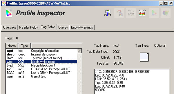
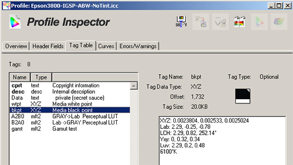
These two tags store the color information of the paper white (Lab: 95.52, 0.29, -4.8) and the max black (Lab: 2.29, -0.25, -0.78) inside the profile. These information are very important and can be used when softproofing the image in Photoshop (more on this later).
Another interesting feature of ColorThink is the ability to access the data contained in the A2B and B2A Look Up tables. These tables are used for the real printing and you can inspect them to troubleshoot printing issues or to simply get a feeling of what your profile is doing under the hood.
If you simply open a list of Lab (or RGB) values and apply your profile, ColorThink will show you the corresponding output data.
Again you will need a LOGO format file for this feature to work.
Let's start by opening a list of all the 255 gray RGB values:
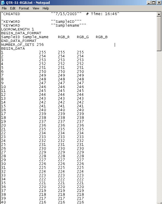
In ColorThink go to File>Open and select the .txt file with the RGB values.
A new window will pop up showing the RGB values under the "Device: RGB" column.
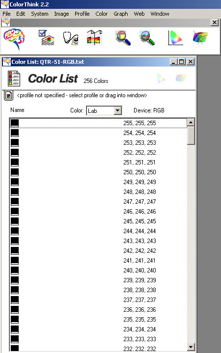
As you can see the "Color: Lab" column is empty because we haven't yet specified a profile.
When a profile is specified, the Lab column is populated with the Lab data stored inside the A2B table inside the profile.
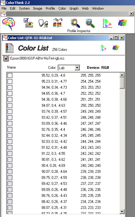
This is actually nothing more than the initial measurement file.
This table is used to softproof the image in Photoshop. The system knows that a RGB value equal to 233 (read the last row on the image above), will produce on paper a color with CIELab coordinates: L=88.07, a= 0.25, b=-4.31.
Through the monitor profile, Photoshop will display the exact same color on the computer monitor making possible a precise preview of the final output.
During the profile creation the above set of data is inverted to create the so called B2A table, which is used to drive the printer.
You can inspect the contents of this table by opening a Lab color list.
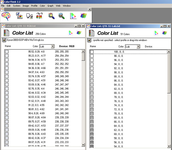
and specifying the profile, as we did before.
Now you can see how the profile REALLY works.
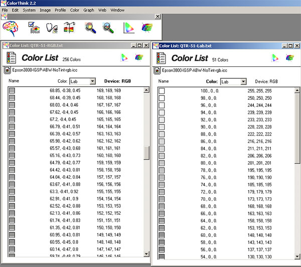
For example, from the table on the left (A2B table) the system knows that a RGB value equal to 147 (again, read the last row on the image above), will produce on paper a color with CIELab coordinates: L=60.14, a= -0.47, b=0.8.
All the pixels in your image with L=60, a=0, b=0, will be printed by the driver with the RGB values dictated by the closest match found in the table on the right, in this case RGB=148 (4th row from the bottom).
As you can see from similar examples the match is not always perfect. These differences are due to the fact that the B2A table on the right is calculated by inversion of the A2B table on the left and some rounding errors are introduced in the process.
Softproofing the image in Photoshop:
At the end of this long journey comes a little treat, the ability to softproof the image before printing it.
It should be always remembered that the accuracy of a printer profile can only be evaluated by comparing the final print against the softproofed version of the image, using a properly calibrated and profiled monitor. The profile cannot be evaluated using a monitor that is not calibrated or by comparing the final print with the non-softproofed version of the image.
The visual difference between the non-softproofed version of the image and the final print depends on the printing process and tends to be larger if the gamut of the printing process is small.
The gamut of a printing process depends not only on the printer itself, but also on the paper being used. This is particularly true for Matte papers.
Matte papers have an inherently small gamut compared to Glossy or Semigloss papers. As a consequence, one should recognize the inevitable color (or dynamic range) compression that occurs on Matte papers as a shortcoming of the paper, not necessarily the printer and/or the profile.
Also, the print should always be evaluated under a calibrated 5500K light source or under standard daylight.
When the image has been edited to its final state and is ready for printing, it can be softproofed.
In Photoshop select: View > Proof Setup > Custom.
Under Device to Simulate, choose the printer profile, under Rendering Intent choose Perceptual.
Note that this rule is not written in the stone, but it's absolutely true for all QTR grayscale profiles because Perceptual is the only Rendering Intent supported by these profiles. With different profiles it would depend on the paper and the image, rather than the profile.
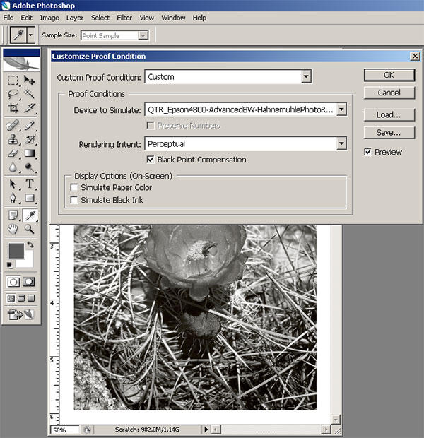
The Simulate Paper Color can be turned ON or OFF and it uses the White Point Tag described before. When this option is left OFF, then the maximum white (RGB=255) in the file is mapped to the maximum white of the monitor (MonitorRGB=255). In this case the white you see is not the actual white you'll see on the print, but the white of your monitor. If you want to eliminate this discrepancy you can turn the Paper Color Simulation ON.
The same reasoning goes with the Simulate Black Ink, which uses the Black Point Tag inside the profile.
When these simulators are turned ON, the result can often be scaring. You might even think you did something wrong, but in most cases this simulators work reasonably well.
It helps not to look at the screen when you activate them. Point your mouse, turn your eyes away, click, ...wait, ......wait, .........wait some more, look. This should be a good preview of your final output.
Whether to use these simulators or not, is a matter of personal taste. Some people find them too aggressive. I personally always check them, but I don't rely on them for tuning my images.
The best way to put them to test is to make a print, then come back to them and compare the actual print to the softproofed version of the image, using the different options.
You'll soon pinpoint your favorite softproof configuration.
02/06/2007 1400 DPI vs. 2800 DPI
According to Epson's claim, the new screening technology incorporated in the 3800 "compensates for various ink densities between resolutions - allowing for a single ICC profile to be used per media type".
In practical terms this means that you no longer need two separate custom profiles, one for printing at 1440dpi and one for printing at 2880dpi.
I never really liked the 1440dpi option of the Epson printers, other than for its speed. I always complained about it because to my eye it printed with some noticeable microbanding.
I therefore read Epson claim with much interest, and I was eager to verify it with my own measurements.
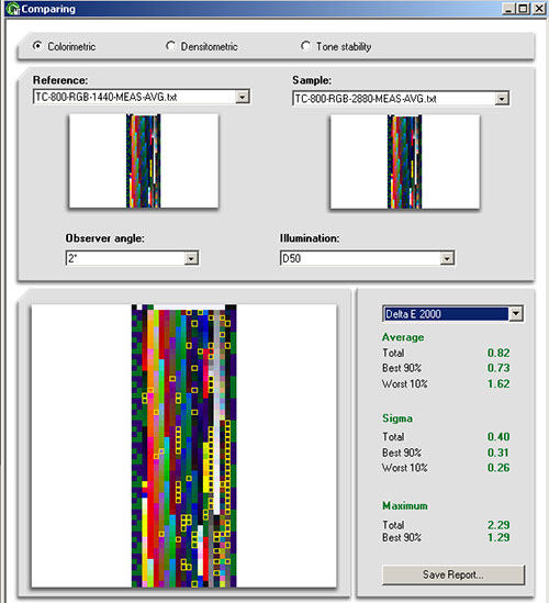
To do this I created a small color Testchart -283 color patches- and I printed it using both the 1440dpi and the 2880dpi resolution modes.
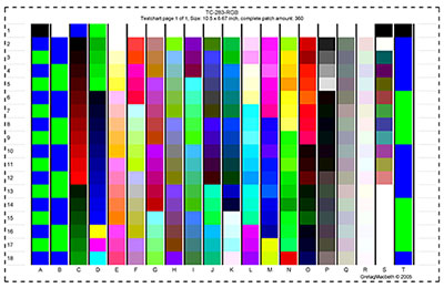
I then measured the Testcharts and compared the measurements files.
An acceptable correlation between the two measurements would be contained within delta E<1.
This limit is considered the (average) minimum distance that two colors must have for the human eye to be able to separate them.
The results are shown below:
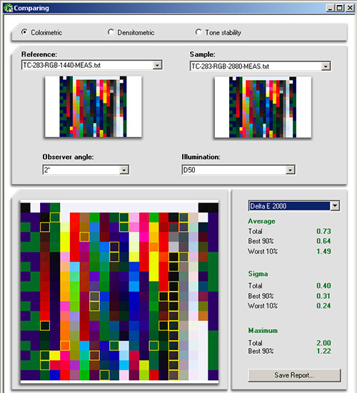
By using different delta E formulas the results varies but the best formulas to determine small colors differences are the delta E CMC (2:1) and the newest delta E 2000. With both these formulas the Total Average is well within the 1 limit (0.82 using delta E CMC (2:1). Also the distribution of the yellow boxes (which indicate larger color differences) seems reasonably random, with the exception of the vertical column on the right, which contains low chroma colors and their difference should not be as apparent to the eye as it is to the spectrophotometer used to measure the samples.
The conclusion of this simple test is that Epson claim is right on target.
It
is perfectly acceptable to use one ICC profile for both 1440 and 2880 dpi printing.
If quality is your goal, profile the printer at 2880dpi and use the same profile for the occasional 1440dpi print, or, if speed is what you need, profile at 1440 dpi and use the same profile for the occasional 2880 dpi print.
One good news about the 1440dpi print mode with the Epson 3800 is that to my eye, there is absolutely no difference between the print at 1440 dpi and the one at 2880 dpi. As far as I can see. literally, they look identical to the finest detail, and if I had forgot to write down which one is which I would not be able to tell them apart. It is so much so, that I started wondering what's the point of printing at 2880 dpi, given that the 1440 Testchart was printed in 3'05" and the 2880 Testchart in 5'30" (both High Speed OFF).
I cannot comment on ink usage because the Testcharts were printed on Letter size sheets, and at this size the ink consumption is below 1mL and the printer doesn't report it.
I'll have to print a bigger image and report the ink usage difference between the two modes later.
02/12/2007 High Speed vs. Uni-Directional Printing
1400 DPI vs. 2800 DPI UPDATE !
After I tested the 1440dpi vs. 2880dpi mode, I wanted to go back to this test and validate the initial conclusions by printing a larger Testchart. I could also determine more precisely the amount of ink consumed by the printer to print the Testcharts at 1440 and 2880 dpi.
The larger Testchart is a 800 color patches file.
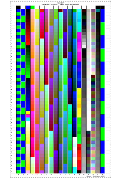
To eliminate random measurement variations, I measured each Testchart 3 times and I averaged the measurement files after verifying that none of the measurement contained errors (you do this by cross-comparing each measurement against all the others, the more the better, 3 being the required minimum).
The results are shown below:
Again, although with a larger Tetschart the overalldE is somewhat larger, the overall dE is still within the dE<1 limit, which confirms that the two printing modes are capable of producing identical (to the human eye) outputs.
The amount of ink consumed (in mL) for printing each Tetschart (a 13"x19" print) is shown in the following table:
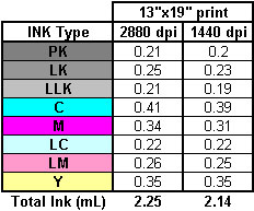
In my opinion, the above data show that there is no significant ink economy in printing at 1440dpi vs. 2880dp. The gain in print speed is probably more important.
Please keep in mind that my conclusions, so far, are based only on color Testcharts and measurement files. I have yet to compare two "real life" images to see if there is some subtle difference that might have escaped the numerical probing of the spectrophotometer.
Along the same lines I'm showing the results of a comparison between the High Speed (bi-directional printing) and the uni-directional printing. The general consensus is that High Speed should be avoided for quality printing, in that the ink drying time is cut by 50%, and during the second pass new ink is laid on top (or in close proximity) of partially dried ink.
I again printed the same 283 color patches Testchart using uni-directional and bi-directional printing modes. I did this experiment printing both at 1440 and 2880dpi, therefore I ended up with a total of 4 charts:
1-1440dpi-uni-directional printing
2-1440dpi-bi-directional printing
3-2880dpi-uni-directional printing
4-2880dpi-bi-directional printing
In order to screen possible reading errors I measured each Testcharts two times. After comparing the two measurement files and verifying that their dE was small enough (dE<0.1), I averaged the readings.
The results are very encouraging.
At 1440dpi the results are the following:

The difference is very small (dE=0.53) and I couldn't notice any difference in the prints, even using a magnifying loupe. Most noticeably there is no microbanding, in my opinion the worst inkjet quality foe.
At 2880dpi the overall difference is even smaller:
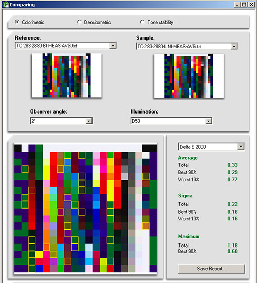
The fact that the difference at 2880dpi is smaller than that at 1440dpi could be an indirect indication that the dot placement is more precise at 2880dpi (this wouldn't be a big surprise) and that the same colors are obtained more consistently.
The worst case scenario would be comparing:
1440dpi-bi-directional printing vs. 2880dpi-uni-directional printing
From all what we have learned in the past about Epson inkjet printers, this would be like comparing the worst printing method vs. the best one.
But here we are dealing with a newly engineered driver and a surprise could be in order. Here it is:
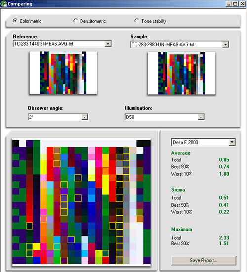
I'm pretty sure that many photographers will find dE=0.85 quite acceptable, considering the extreme increase in print speed that this mode incorporates.
I was quite surprised to be UNABLE to tell apart any of the Testcharts. I believe I have very discerning eyes when it comes to photographic prints and I was ready to proudly pinpoint the little devil in some detail, but NOPE, NADA, NIENTE!
These results are a big surprise for me and I believe many readers will be happy to hear about them. I wonder if these results will change my way of printing (which by default are 2880dpi uni-directional). I'll have to digest these news some more before deciding.
In the meanwhile I must commend Epson for the this new exciting driver, which doesn't seem to leave anything to be desired.
Next installment will be about color profiles. As usual I welcome your feedback. Feel free to post questions in the DOP forums of contact me privately if you prefer.