After I have done all
I want with multiple masked curve adjustment layers and the image is
looking pretty darn good, I finally am ready do do some subtle dodging
and burning. So that I can have better control of this, I flatten the
image, duplicate the image layer (drag the layer to the second icon
from the right on the bottom of the layers palette) and then work on
the duplicate layer on top. If disaster befalls me, I have the original
image underneath without having to save anything, and if I want I can
use a white mask for the duplicate layer into which I can paint grey
to tone down the dodging. It's been my experience that I dodge at least
10X as much as burn and almost exclusively in the highlights.
I want
those highlights to pop - I want liquid sunshine. Using dodging highlights
does this for me. I have to be very careful that I don’t overdo
the dodging of highlights. One extra stroke of a 5% opacity dodge
highlights will drive a chunk of image into unrelieved pure white.
I find that
it's really difficult to tell just how light they are getting on
the monitor (I don't get aggressive enough) so I use threshold adjustment
layers.
What you do is add an adjustment layer
by selecting threshold (instead
of curves) in the layer menu at the bottom of the palette. Photoshop
then asks you what level you would like to set it at. For highlights,
set it at approximately 250 (the number does depend a bit on your
printer so you can adjust this with experience - you are looking for
the point
at which highlights start to separate from pure white on the paper).
You then turn down opacity of the layer to about 70% so you have
a hint of the underneath layer. For working on burning, you do the
same thing
with a threshold set to 10 or thereabouts. Save time but creating
an action for each. It’s easy to create an action to create these
with a single click or even a function key.
You have choices in both
dodging and burning - for each you can apply the effect to highlights,
midtones or shadows. I virtually never
ever dodge shadows or burn highlights as both result in muddy looking
images.
I occasionally use midtone burning and dodging but for the most
part, I work with dodging highlights. I can control the opacity of
my brush.
If I am working with highlights that are already near white, I
will set the brush at about 5%. I didn’t mention
it last time but all work on masks and dodging and burning is done
with a brush
set at 0% hardness so I don’t leave telltale marks on the
image - if I want better control along an edge, then I use a smaller
brush.
The brush itself is the blurred circle. I haven’t even bothered
to learn what flow does.
OK, the threshold layer (highlights,
250) is on, I select the layer just below it (the dodging and burning
layer) and start work. If there are areas which are already light but
don't even show after the application of the threshold layer (ie. the
brightest point is still under 250), then translate this as DULL! Lighten
at least some of these areas if you want your print to sparkle. If,
on the other hand; there are no real highlights, this is your chance
to create some. Almost white areas will step forward, dark areas will
recede. Use this to your advantage. Were you working on a face ans
wanted a stronger chin, you could lighten it.? A forehead too prominent,
darken it a little. With rocks, follow the form of the rock so that
the nearest part of the rock steps forth. Sometimes it's edges that
need adjusted. In the image below, the dark rock in the foreground
blended all too well with the bluff behind it and I used a combination
of midtone burn and then highlight dodge to separate it from the background.
In this particular case I did in fact set the brush to about 30% hardness
to help define the edge.
35 mm. photographers seem to spend their
early darkroom years trying to open up shadows and burn in highlights.
Fred
Picker used to say
- take them the direction they want to go - darken shadows and lighten
highlights'. Of course this presuposses a properly exposed and developed
negative, or digital equivalent.
I think this does
more to produce a luminous print than just about anything,
but, and it's a big but - you have to do it at
the end
of image manipulation,
you have to be careful, and you have to practice.
There is a large element of creativity
here. It's possible to turn dull and flat into glowing but it's also
possible to absolutely destroy an image and end up with a cartoon.
Only practice and printing lots of cycles and going back to the beginning
and starting over more than once will result in skilled, subtle yet
effective dodging and burning. I think of 'dodging highlights' as the
equivalent of potassium ferricyanide bleaching without the mess and
ruined prints. Look at printing articles by Bruce Barnbaum for examples
of bleaching which can be applied to digital equally well.
Sharpening
This could be a topic for an
entire article and there are many different ways to sharpen the image.
There are several things
you are trying
to do with sharpening:
a) undoing the effects of the low
pass filter built into the camera and placed there to prevent moire
patterns from
developing
from
the regular
grid of the pixels during the image processing. As Kodak
found when they didn’t include one, it’s
not nearly as effective to use anti moire software as
it is
to simply blur
the image a little in the camera
before hitting the sensor.
b) a general improvement in
resolution due to any weaknesses in the lens - eg. corner
softness, loss of resolution
due to diffraction.
(it does
make an interesting point - what if we could remove the
low pass filter and stop down to f32 when shooting landscapes.?)
c)
depth of field - sometimes you can give the impression of a bit more
depth of field with judicious additional
sharpening.
d) dealing with the tendency of inks
to bleed slightly on the paper thus spreading and blurring the image
slightly. This
is called
dot gain and
varies from paper to paper but regardless does need
to be
dealt with.
My own recipe born out of various trials
is to use Photoshop's smart sharpen. The amount varies depending
on the camera.
For my 1Ds2,
I always set
the amount to 300 but vary the radius according
to image quality and whether I ‘upsized’ in
Camera Raw. If I did, I usually use a radius of
.9 to 1.1 and very occasionally 1.6
(which few images can
tolerate). With my 10D, I found the amount had
to be under 200.
I sharpen soft corners and add apparent
depth of field using PKSharpener creative sharpening if
need be (probably
only
10% of the images
as it can become obvious very easily).
I do a final
sharpening in all images with PKSharpener Output Sharpening (which
is based on pixels per
inch and image size)
to deal with
the dot gain. The image on screen will look oversharpened
but it’s the
print that counts.
At workshops I have seen a
lot of images ruined by overly aggressive sharpening
(usually in an
attempt
to make
a print larger than
the image could stand). The photographer would
have been far better
to shrink
the image, give it a large white border on the
paper and sharpen less aggressively.
I can only suggest that you get a few opinions
on your sharpening technique - it should not
be visible.
Well, the image is looking perfect
on the screen, its time to print, and that’s a story for another
day.
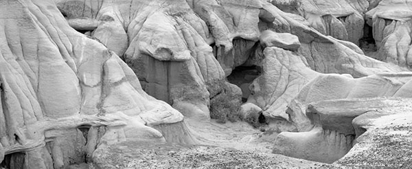
Image before
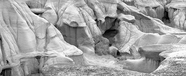
Image after
Tip: Download the images
and put them as layers on top of each other and you will see that the
difference is not only subtle.
You can find George Barr's website here. |