There are plenty of good converters out there
so why bother checking a new one? Okay, this guy walks into the
bar, leans close and offers you a 1500 lens for 150, and swears
it’s legit. Interested? Well, a converter can make that
much difference, for that sort of price difference. So it makes
sense
to check them out once in a while.
Silkypix is a Japanese program
and was released in September 2005. So it’s quite new.
Raw in fact…It’s had
regular bug fixes and improvements, speaks Mac and PC, Japanese
and English
and supports an impressive range of cameras. For example, it
supported the Mamiya ZD and Canon 30D the day they were released
in Japan.
You can download a trial version from: http://www.isl.co.jp/SILKYPIX/english/ As
with another leading converter, you have the options of a totally
free but limited function version, or a fully featured trial
lasting two weeks.
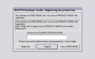
My advice is to get the feel of the program with
the freebie for a time then click on the two-week trial to play
with the
full range
of controls. And they are full! When you open SP for the first
time it’s, well, daunting. But once you learn your way
around, the layout feels quite logical and because you usually
don’t
have to change so many settings to get the desired result, the
workflow is surprisingly fast.
But its real strength lies in its
ability to get great color out of your raw files. I have tested
it on a wide range of cameras,
including Canon 1Dsmk2, 1Ds, 5D and 20D and a similar range of
Nikons as far back as the D1x. In each case, I obtained the best,
most accurate color from any converter yet. And with very little
fiddling. By “accurate” I mean the color that most
closely resembles the subject when it was taken, whatever lighting
prevailed. And it also has the most pleasing levels (unadjusted)
of saturation and contrast. Some photographers claim that any
converter can replicate the effects of any other. I’m not
so convinced. People who argue that, often have to spend inordinate
amounts of
time to make a close copy. I’m too busy for that: if a
converter will do most if it for me, I’m interested.
SP has some useful features, like tilt/shift controls, distortion
correction, dual screen support and ways of speeding up the workflow.
Incredibly, there are over 150 customized key possibilities!
That ought to be more than enough even for the most obsessive
amongst
us.
To access files, as well as the usual “open folder” and “last
used folder” options, you can search for individual files,
with a usefully large thumbnail that appears instantly as you
click on each file:
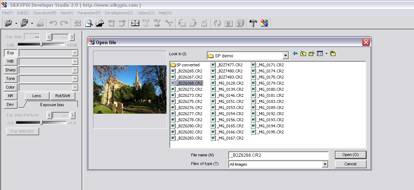
Once opened, the thumbnails for that folder appear
quickly. The size of the thumbs is adjusted via Option, Display
setting,
Thumbnail mode. A slider on the top menu bar would be easier
and faster. The various dialogue boxes can be positioned, or
floated to wherever. If you have two screens, all menus can be
placed on the right hand screen and then the image can fill the
other. Annoyingly, if you use two screens, when you close the
program, and then reopen, it does not remember where you positioned
everything. Fortunately, it will remember if you use a single
screen.
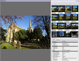
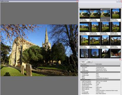
Although there is no official slideshow mode, you can
get a similar effect by selecting View, Outline Preview. This
also allows you
to check each shot and grade it. You can drag the preview screen
to any size, plus you can move the thumbs to the right, and even
have exif info, simple or (incredibly) detailed, showing while
you preview, as below. As you grade each shot, the mark appears
above the thumbnail.
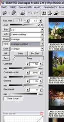
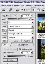
The layout of the main control panel is quite
logical and follows the order recommended for processing. Each
of the boxes on the
left opens further boxes below for detailed control. For example,
clicking on “tone” reveals sliders for contrast,
contrast center, gamma and black level.
Contrast, gamma and black level work in the normal
way but the unusual one is contrast center. This slider dims
or brightens
the image and determines the range of brightness that the contrast
slider affects. The effect is quite subtle and the best way to
see how it works is to play with it and see what happens to the
histogram and image. This is one of those controls that usually
doesn’t have to be touched but can be useful for a tricky
exposure. Incidentally, the histogram, like the tone control,
can be set at any size or screen position.
A neat touch is that
every slider in Silkypix also has a “click
to move it one unit” option. You can use the slider for
speed and large adjustments, and/or the click facility for fine
changes.
As with most other converters, it’s easy to set
the parameters, ie how you want to develop the image, for as
many shots as you
want. Select one shot, set the parameters you want, Ctrl-C (PC),
select the shots you want to apply the parameters to, then Ctrl-V.
You can change individual parameters, or all of them, at any
time on one or all shots in a similar way using “paste
partial parameter”.
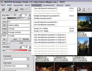
You can permanently save any number of parameters
as your basic setting and apply them with only a couple of clicks
at the start
of a session. You can
also do this to quickly create versions of the same image. A weakness is that
these versions are not saved automatically, but once you get used to doing
it, saving as many versions as you want is as quick as saving the parameters.
There are many controls for affecting color, although I have
already said this is the area where SP really shines and usually
there is not much alteration
needed.
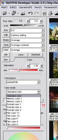 
But if you really want to spend
hours on each shot, this is the place to do it. The screenshots
above are not how you would
normally arrange the various
boxes but they show the full range available. There are no less than five separate
controls for color – the saturation slider duplicates and gives finer
control than the “light, little light, average, little vivid” etc
controls. I suppose these presets are useful if you always dial in, say “a
little vivid” because it’s marginally quicker than remembering
what you always set the slider at but it would be no great loss for most people
if they went missing in a later version. But the other controls are useful
because they give incredibly fine control if you need it. Apart from standard
color, there are 10 more presets that approximate to such film stock (ah, the
good old days) as Velvia, Agfa and Kodachrome. (My view is that we should forget
what film used to look like and move forward to the look[s] we want from digital,
but that’s off topic here and YMMV.) These presets will only change the
color characteristics; they won’t add any other effects such as grain.
Interestingly there are two mono versions to choose from.
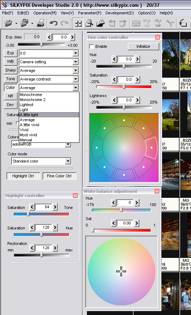
One area that needs
improvement is highlight control. There is a separate box for this, and it’s
easy enough to set all the sliders to the left to control highlights, but
I would like to see their effect increased. They work
well enough on weak to medium areas but are not quite as effective on areas
with real attitude. The SP people are aware of this shortcoming and working
to improve it.
A good feature is the range of noise control available. “False
color” translates
as color noise in English. The default setting is 80 but with most of the
cameras I tested, 30 is strong enough and doesn’t obviously attack
fine detail. The next slider down is “noise reduction” but I
preferred to leave this at zero and use the next couple of sliders: “Noise
level” and “Noise
cancel”. Both are subtle, which allows for easy control, and the effects
can be seen clearly when zoomed in 100% on a subject. I have yet to find
a use for “Geometric control”, can’t see what it does and
the manual recommends that you consult them before using it! Maybe it’s
only to be used on the morning of April 1st
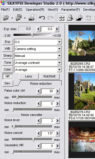
One other control over noise, not immediately obvious, is the “Dev.
Precision” slider in the “Dev” box. The default
is 80, a compromise between speed and development of fine detail,
including noise, but I prefer the maximum setting of 99 (don’t
know why it won’t go to 100!). Although this fully develops
any noise in the image, I prefer to control that with the noise
sliders rather than have the program decide it for me. Conversion
is a little slower at 99 but not a lot.
The final
controls worth discussing are for simulating lens tilt shift
and correcting distortion, including chromatic
aberration. I compared the effect of these in SP and then in
Photoshop for speed of use and quality of image.
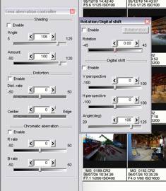
I couldn’t see any difference in image quality but
found them quicker and easier to use in SP. I also found it was
quicker
to make any changes, especially if you have changed many other
aspects such as tone, exposure, etc, in SP. You can simply click
on the enable box to see a before and after comparison. And there
are also the four “cloakrooms” available for an instant
comparison, plus the option to save as many versions as you want.
There
are many areas of this fully featured converter that I did not
have time or room to discuss. It might strike you as
being overburdened with controls, but the reality is, you don’t
often have to change many of them. It’s easy to set parameters,
or change them, and in real-life use I find it even faster than
my previous favorite converter, which is known for its great
workflow.
But it doesn’t really matter what I, or anyone
else thinks about image quality because you’re the one
who has to work the controls. My advice is to convert some images
with your current
converter(s), and then compare them side by side with the Silkypix
version.
Summary
Pros
- Great color and image quality
- Easy, fast workflow
- Great feature set
- Ability to customize
- Free if you don’t want the bells
and whistles.
Cons
- Manual sometimes unclear
- Irritating minor fixes needed
- Output color spaces limited to sRGB and aRGB
- Daunting at first sight
|