Fuji® Velvia® remains a popular
color slide film. It is a slow film -- ISO 50 – that is popular
among landscape, macro, and nature photographers because of its fine
grain and highly saturated colors. Action photographers would have
none of it because of the slow speed, but among most outdoor photographers,
Fuji® Velvia® was a favorite.
When people ask in Internet discussion groups how to get the bright,
saturated colors they associate with Fuji® Velvia® slide film,
the frequent answer is to “boost the saturation with the Hue/Saturation
command.” Many Adobe® Photoshop® actions that promise
a digital Velvia effect also rely on the Hue/Saturation command.
The advice on Internet discussion groups is well-intentioned. It is
a quick and easy solution, and with many images, you can get acceptable
results with a saturation boost that way (especially if you are a novice
to digital photography and have not yet developed a discerning eye).
But there are problems with trying to make colors “pop” with
Hue/Saturation.
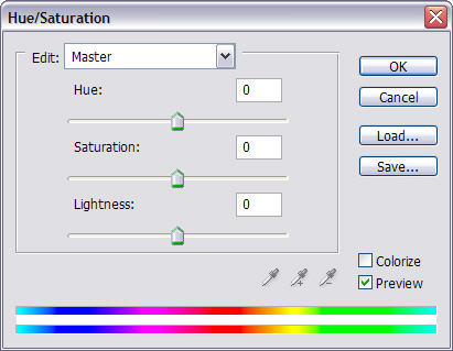
Figure 1. The Hue/Saturation dialog appears to completely separate
adjustments to hue, saturation, and lightness.
A casual glance at the dialog for the Hue/Saturation gives the impression
that it completely separates adjustments to hue, saturation, and lightness.
Unfortunately, it does not. Saturation adjustments can also affect
image lightness. You can get some significant luminosity shifts when
you use the Hue/Saturation command.
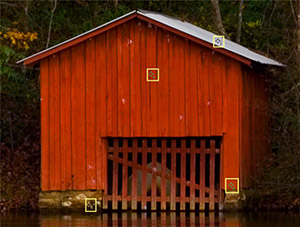
 Figure 2. A crop of a red boat house with four color samplers. Figure 2. A crop of a red boat house with four color samplers.
Figure 2 is an unsharpened crop of an image of a bright red boat house
with autumn foliage reflecting in the backwater to a dam at Desoto
State Park in Alabama. Color samplers were added in four places to
show what happens when Saturation is changed in isolation. Figures
3a and 3b show the results of applying a +10 and +40 Saturation adjustment
to the image. Even for the bright white roof, the luminosity changed.
So did the hue. The change in the “b” channel, a negative
change, means the white roof became ever so slightly more blue. (In
L*a*b, negative numbers for the “a” and “b” channel
are cooler, positive numbers are warmer, and 0 is neutral).
 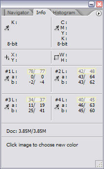
Figures 3a and 3b. The effects on luminosity from +10 and +40 adjustments
to Saturation on the Hue/Saturation dialog. The L*a*b “L” channel
has been highlighted.
The Hue/Saturation command has a couple of additional weaknesses.
If you retouch JPEG images, you will find that significant changes
can emphasize JPEG artifacts. Large adjustments to saturation will
introduce other artifacts, too, like posterization and loss of image
detail.
Applying saturation changes to the individual color ranges will not
eliminate the weaknesses in the Hue/Saturation command. They are inherent
in the tool.
Here We Go! Better Hold On To Your Hat!
A better approach for a Fuji® Velvia®-like effect is to make
a temporary switch to L*a*b mode and apply the Photoshop Curves command
to the “a” and “b” color channels.
OK. You’ve heard that L*a*b is tricky. You’ve read that
even small edits in L*a*b can ruin an image. Both true: to a degree.
Get carried away with changes to the “a” or “b” channel
and your image can turn psychedelic quick. The trick in creating a
digital Velvia effect is to make small, balanced adjustments to the
L*a*b channels
The L*a*b color model separates color and luminosity completely. This
allows us to isolate tone and color manipulations. Neither RGB nor
CMYK can do that. All of the luminosity in L*a*b is captured in the
Lightness channel. The color channels are the “a” and “b” channels,
with the “a” channel placing a color along a magenta/green
axis and the “b” channel along a yellow/blue axis.
If you have read any Internet discussions about converting to L*a*b,
you have likely read that converting from RGB to L*a*b and then back
again can cause your image to degrade. This is very unlikely, especially
with RGB. The L*a*b gamut is wider than any RGB or CMYK gamut.
People who have tried this maneuver will point you to before and after
histograms that show the odd spike or gap. The real test, however,
is the final image. I work at crafting fine art prints, not smooth
histograms. Photographer to photographer, I have yet to see visible
evidence of damage going from RGB to L*a*b for sharpening or for adjusting
contrast and color and then returning to RGB to output the image. I
will not claim it is impossible to damage an image with a single round-trip
RGB-L*a*b-RGB conversion. As soon as I do, someone will produce a severely
challenged image that is ready to fall apart under any retouching.
I simply state that such concerns are overstated in the extreme. Photographers
can safely work in L*a*b, with the benefits greatly outweighing any
quantization errors that might creep in during conversion between RGB
and L*a*b
All Things In Moderation
The changes needed to add “pop” to the colors in your
image can be quite small. Before we move on to a sample image, we need
to pause briefly and make certain that your Curves dialog is set to
work effectively with L*a*b adjustments.
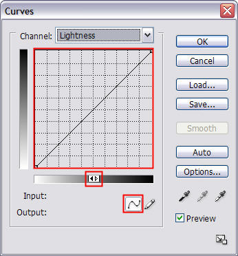
Figure 4. The Curves dialog in Adobe® Photoshop®. If you alt-click
on the grid on a PC (option-click on a Mac), the grid will change from
4x4 to 10x10.
For nearly any photo retouching, it helps to have Curves display a
10x10 grid rather than the default 4x4 grid. You get more precise control
that way. To switch between the two grids, you can alt-click anywhere
on the grid with a PC (option-click with a Mac). You want the highlights
to display on the left. If your highlights display on the right, just
click on the tiny slider beneath the grid. When highlights display
on the left, the units for the Curves dialog are percentages, which
is more intuitive than L*a*b values, which range from -128 to 127.
You want to create a curve by adding points, so make sure the tiny
icon for adding points, which is the leftmost icon below the grayscale
slider, is selected. You can now add up to 14 points when defining
a curve.
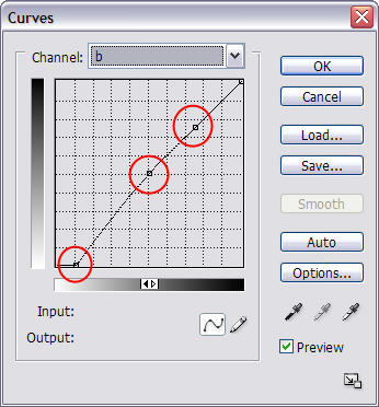
When boosting saturation, we need to adjust only two of the L*a*b
channels: the “a” and “b” channels. Leave the
Lightness channel alone.
Too boost saturation generally, we increase the slope of both the “a” and “b” channels
by the same equal amount and keep the midpoint right in the center
of the grid.
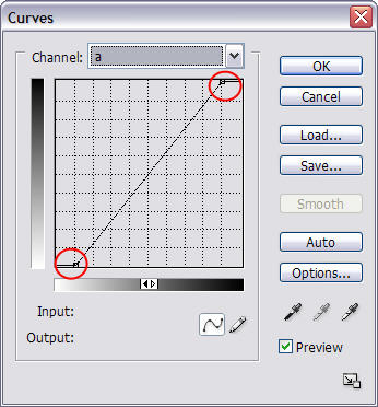 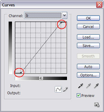
Figures 5a and 5b. The “a” and “b” curves
are made more steep by pulling 10 units at both the highlights and
the shadows.
You can click and drag points at the top and bottom of the Curves
dialog, or you can click on a point on the curve and then adjust the
Input and Output values. To keep the midpoint in the center (and avoid
adding a color cast to the image), make sure the adjustments at the
top and bottom of the curve are equal.
The Curves settings in Figures 5a and 5b were equal 10 unit adjustments:
-
INPUT: 10 OUTPUT: 0
-
INPUT: 90 OUTPUT: 100
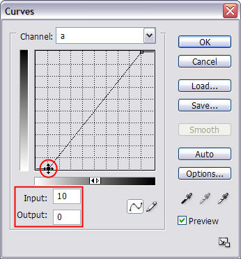
Figure 6. You can finesse the points on a curve by clicking on them
and then adjusting the Input and Output values.
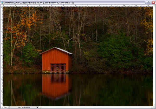
Figure 7. An unsharpened image of a boat house at dusk, prior to a
10 unit saturation boost via a Curves adjustment to the L*a*b color
channels.
A 10 unit adjustment to the Master channel with the Hue/Saturation
command is a very modest increase in overall saturation. A 10 unit
adjustment to the L*a*b color channels is a much more striking increase
in saturation. Just compare the original in Figure 7, which is already
quite colorful, with Figure 8.
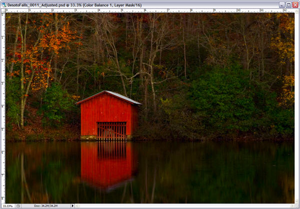
Figure 8. Even a colorful image can benefit from a L*a*b adjustment
to the color channels to boost saturation.
The result is increased saturation without affecting the contrast
of the image. The white roof on the building averaged 75 in L*a*b before
and remained 75 after the application of the curves in Figures 5a and
5b.
If you want a stronger saturation effect, just make the curves steeper
yet. Want a less pronounced effect, just pull less on the ends of the
curves.
More Precise Control
What if we want to select a range of colors rather than just increasing
overall saturation? A little more knowledge about L*a*b and a little
more care with the Curves command is required.
The “a” channel defines color along a magenta-green axis.
If emerald green springs to mind, think teal. The “b” channel
defines color along a yellow-blue axis. Figures 9a and 9b have color
regions superimposed over the Curves dialogs to indicate how colors
shift as you make changes to curves on the “a” and “b” channels.
(Do not look for this feature in Adobe® Photoshop®. The colored
regions were added to the screen captures.)
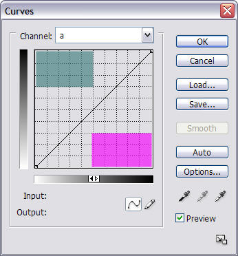 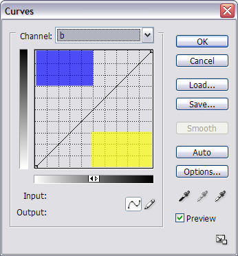
Figure 9a and 9b. Colored regions superimposed over the Curves dialogs.
Returning to our original image, what if we want to boost the reds
in the boat house but not increase the saturation of the green foliage?
Here we need to know a little color theory. When we increase magentas
and yellows, we boost reds. Below is a pair of curves for boosting
reds.
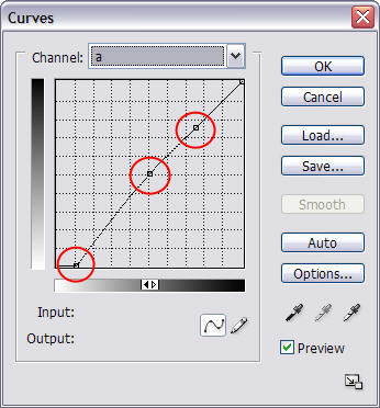  Figures 10a and 10b. To boost saturation in the reds, we need to increase
the slopes for the lower parts of the “a” and “b” curves. Figures 10a and 10b. To boost saturation in the reds, we need to increase
the slopes for the lower parts of the “a” and “b” curves.
We only want to adjust the lower half of the “a” and “b” curves.
So we pin the 50% point on the curves by setting its Input and Output
values to equal 50%. We do the same with the 75% point. This will keep
the upper right portion of the curve fixed in place as we adjust the
lower left corner of the curve.
The same adjustment is made to the lower left corners we made in the
previous example. Input = 10 and Output = 0 in both L*a*b curves. The
result to the reds is quite evident in Figure 11. There is a large
boost in their saturation. The saturation of the oranges also increased
some. The effect on the yellow autumn leaves is less pronounced. The
green vegetation is unchanged.
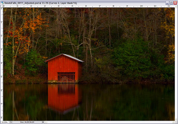
Figure 11. The effect on the image after applying a set of L*a*b curves
that boost saturation of the reds.
Automating the Digital Velvia Effect
Visitors to The Light’s Right Studio site will find a free download
that automates the L*a*b maneuvers described in this tutorial.
http://www.thelightsrightstudio.com/TLRDigitalVelvia.htm
The TLR Digital Velvia action set will run on CS/CS2 and earlier version
of Adobe® Photoshop®. It makes a duplicate of the image, converts
the duplicate to L*a*b, makes the required L*a*b maneuver, creates
a duplicate layer, and copies the result back to the original RGB file.
What About CurveMeister?
CurveMeister (see our review) is a third-party add-in
for Adobe® Photoshop®.
CurveMeister extends the Curves feature of Photoshop. For example,
you can display the composite RGB curve plus the individual Red,
Green, and Blue curves simultaneously. More relevant to this discussion,
CurveMeister
allows you to adjust L*a*b curves while your image is in RGB mode.
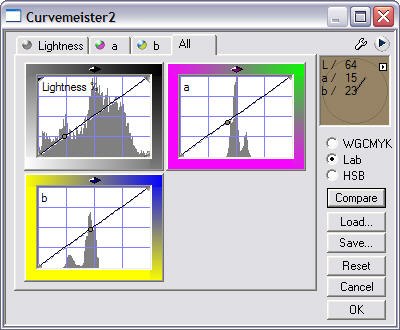
Figure 12. CurveMeister, an add-in that gives you Curves on steroids.
I compared the results of conversion with CurveMeister 2.0 and the
technique described in this tutorial. I used the test image available
from www.BruceLindbloom.com, applying a 2 pixel Gaussian Blur to
even out the patch values for the simulated Macbeth Color Checker
Card featured in the test image.
The test procedure was basic. Duplicate the test image. Convert the
original from RGB to L*a*b, Use the Photoshop® Curves in L*a*b
to increase saturation through equal adjustments to the “a” and “b” curves.
Convert back to RGB. Then make the same adjustments to the “a” and “b” curves
in L*a*b via CurveMeister o the duplicate. I did this for 10 unit and
20 unit adjustments.
The results are nearly identical, whether you used the technique on
this tutorial or the CurveMeister add-in. Here are the RGB triplets
for the 20 unit adjustments to the Red, Green, Blue, Cyan, Magenta,
and Yellow patches in Figures 13a and 13b below:
|
RGB-L*a*b RGB |
RGB CurveMeister |
|
|
|
Red |
181, 4, 32 |
182, 3, 32 |
Green |
5, 140, 37 |
5, 140, 37 |
Blue |
2, 0, 146 |
2, 0, 146 |
Cyan |
4, 103, 145 |
4, 103, 145 |
Magenta |
184, 4, 129 |
186, 3, 129 |
Yellow |
224, 191, 0 |
224, 191, 0 |
|
|
|
 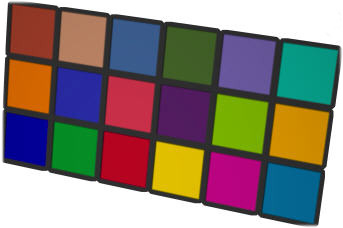 Figures 13a and 13b. Crops of the test target from BruceLindbloom.com.
The results of converting from RGB to L*a*b and back to RGB are on
the left, the results from CurveMeister 2.0 are on the right. Figures 13a and 13b. Crops of the test target from BruceLindbloom.com.
The results of converting from RGB to L*a*b and back to RGB are on
the left, the results from CurveMeister 2.0 are on the right.
The only differences are minor. Just one or two units. Visually, the
results are identical.
There is a lot to recommend the CurveMeister add-in. But you can easily
obtain the benefits of making L*a*b adjustments to saturation and color
balance without anything other than Adobe® Photoshop®.
Concluding Discussion
The Hue/Saturation command is a quick and easy way to boost saturation.
Unfortunately, there is no way to adjust saturation in RGB or CMYK
without also affecting the overall lightness of the image. Adjustments
with the Hue/Saturation command can also make JPEG artifacts more apparent.
The L*a*b color model completely separates luminosity and color. The
trick in creating a digital Velvia effect is to make small, balanced
adjustments to the L*a*b color channels. Not only can you add “pop” to
an image, you can also reduce the effects of haze.
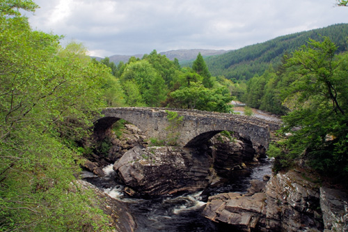
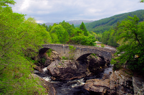
Figures 14a and 14b. Not only can a quick, balanced L*a*b adjustment
via Curves add “pop” to an image, it is also an excellent
tool for cutting through haze.
If you want to focus on a range of colors, the Curves command can
be used with scalpel-like precision. This requires just a little knowledge
of color theory. You can adjust greens or magentas with careful adjustments
to only the “a” channel. For adjustments to yellows and
blues, you need to focus your adjustments on the “b” channel.
Reds benefit from adjustments to the lower halves of both the “a” and
the “b” curves. Cyans benefit from adjustments to the upper
halves of the “a” and “b” curves.
At first, switching to L*a*b is intimidating. Practice on a few images,
and you will find that making saturation adjustments is easy. Just
pull both ends of the “a” and “b” curves by
an equal amount: 5% for a small effect, 10% for a moderate effect,
or 20% - 30% to add lots of “pop” to your images without
the degrading artifacts that accompany the Hue/Saturation command.
f you want to learn more about the advantages
(and challenges) of editing images in L*a*b, I suggest you
read Dan Margulies new book, "Photoshop LAB Color:
The Canyon Conundrum and Other Adventures in the Most Powerful
Colorspace." Dan describes this same saturation adjustment
and offers lots more helpful advice on using the L*a*b colorspace
to quickly (and safely) edit your images.
|