Sometimes it’s pretty obvious where the centre of interest has to go and there really aren’t a whole lot of choices. If the main subject basically fills the frame, then that’s pretty much the end of the discussion. It’s hard in a head and shoulders portrait to place it at the side without looking very odd. Should the portrait be more environmental, then your options open up considerably.
The standard advice in that case is to place the subject at the 1/3 position of the image, and certainly, if you have no ideas of your own, it’s still pretty good advice, but surely you can do better than that?
Think of the Arnold Newman Portrait of Stravinsky, one of the strongest most imaginative portraits made, certainly no rule of thirds here, yet so perfectly expressing the composer. Brilliant!
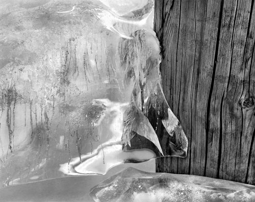
There are times when the rule of thirds works very nicely. In this image of ice against a post, the ‘beak’ of ice is two thirds of the way to the right, and one third from the bottom and seems ideally placed. In fact the original 4X5 negative did include a bit more so I really did have choices and felt this was the strongest option.
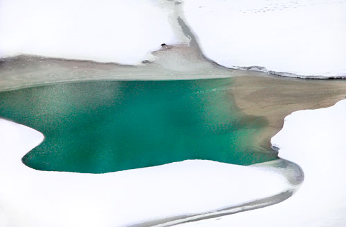
Other times you just have to go with the centre of the image. In the case of Lake Louise, the shapes formed round the lake are important to the composition and would have been spoiled by placing the open water anywhere but in the centre.
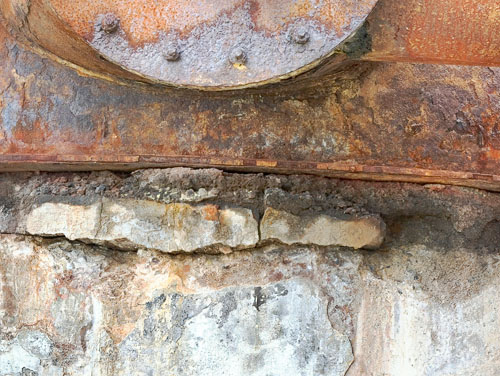
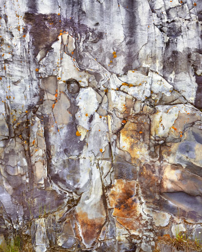
In the rust and foundation image, it’s strongly centred left and right, then divided in halves top and bottom - the rust on top and the foundation on the bottom, which is important to the message of the foundation holding up all this time, despite adversity, time and corrosion.
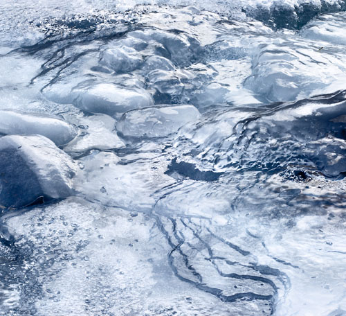
The Ice image is interesting in that there are main features at the centre top and bottom, and centre left and right, with relatively little going on in the middle. This provides a sense of balance which is important for this image. That there’s not a nude at the centre, or something of great interest, certainly doesn’t bother me, though if someone wants to volunteer....
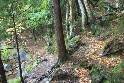
Sometimes a strong divider up the middle can be interesting, as is used here with the central tree, the birches and scattered leaves to the right and the path to the left.

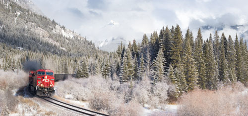
At times it can pay to put the centre of interest well off to the side, just as Newman did. In this case the train will follow the tracks to the centre of the picture and presumably keep sweeping to the left as it gets closer, crossing in front of all that lovely scenery, so placing it entering the image and well off to the side works. This also raises the question of whether it’s better to be on the right looking left or the other way round. Below is the flipped image - anyone have any strong preferences and more importantly - if you do, why, and how is that going to impact your own work?
Some images are so complex that there really isn’t a centre of interest so all of the above is moot. The question then becomes a matter of can the eye make sense of the image, move around in patterns that match what the photographer wanted to show, and most importantly, not wander off.
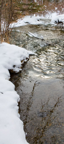
Sometimes it pays to break all the rules when placing the subject. I certainly felt like I was doing something illegal when I placed the edge of the stream right down the middle - it’s just so conventional to have the whole stream, both banks, but this was clearly the stronger image and though a rule breaker, is well liked by the general public, suggesting that most people don’t need rules, they just need the image to work.
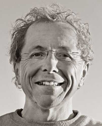
In this head and shoulders portrait, it’s really not possible to place the subject anywhere but the centre, certainly not if I want to frame it as tightly as I did. it does have a couple of things going for it. Note the head is nicely framed by the sweatshirt collar at the bottom of the image. Note too the slight angle of the head which is so much more interesting and expressive than perfectly aligned. And last, note the view point - the camera is considerably lower than the head. In truth this was done to give me a clear background (the sky), but in fact I think enhances the image.
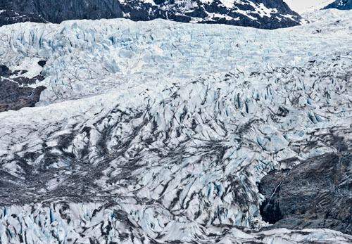
Sometimes the main subject ‘flows’ all over the map, which may or may not include the centre of the image. In this case, it’s how it ends that is more important than where it is centred. In the case of the glacier, it’s the curves it makes around the rock outcrops that defines it, even though it does lie over the middle of the image.
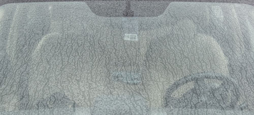
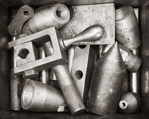
At times the whole image is equally important and you can’t isolate any one or more parts that are important. Not only is there no centre of interest, there aren’t even islands of interest. This applies to pattern images like the rain covered windshield with hinted details of the car interior scattered throughout but really secondary to the rain pattern. The same can be said of dunes images in which there is a ripple pattern throughout, or when there are so many objects that discussing a centre of interest is rather silly.
I’d like to think that this has given you a bit more to think about than simply telling you that barring any originality on your part, go for the thirds rule. It has it’s time and place, and like all rules, is sometimes meant to be smashed to bits.
|