Notes by Uwe are in italic.
All photographers know that perfect light is rare. There are two
main lighting situations for nature and landscape photographers:
a) strong sun
b) cloudy or overcast
The perfect light often would be a very, very light overcast like
a huge soft box. If the sun is strong digital cameras hardly can
master the dynamic range of the photo. In overcast the image tends
to
be to flat and also lacks the brilliance the sun light can provide.
We personally try to photograph in overcast as the California
sun is hard to master. That is why we like that Mitch covers the
topic how to get the best out of your overcast shots.
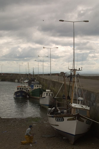
Let’s begin our discussion on improving problem images with
a look at a typical problem image. The photo to the left was taken
at the Linn of Dee in Aberdeenshire, Scotland. My wife and I spent
a week in Scotland during May and the weather was against us. The
weather was rainy and dreary. 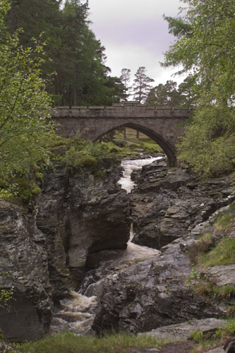 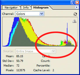
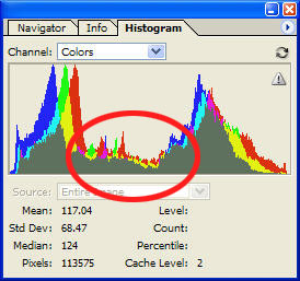
Figures
1a and 1b. A “low key” photograph and its histogram.
The histogram in Figure 1b tells the tale here. Nearly all of the
pixels in the image are dark tones. A few shadows and middle tones:
predominantly three-quarter tones. Few pixels are brighter than middle
gray.
Histograms are graphs of the pixels in an image. They plot the tone
of the pixel, from dark to light (left to right) on the x-axis and
the number of pixels with that tone on the y-axis. Histograms in Photoshop
also contain other useful information. For example, the median value
for the image is 72. Half of the pixels in the image will be lighter
than the median and half
will be darker. Since the individual data values in any RGB image can
range from 0 to 255 (black to white), a median value of 72 means half
of the information falls in the three-quarter tones and the shadows.
This is consistent with the somber colors we see in the image.
The term of art for an image with a large clump of dark pixel and
few bright pixels is low key. Low key images tend to look dim, flat,
and uninteresting. They are sometimes described as muddy. This picture
of water shooting through the rocks should be inspiring.
The opposite is evident in the histogram for the image of a freshly
molted ghost crab. The crab is hard to distinguish from the sand and
shell fragments on the beach. Wonderful camouflage for the crab, but
it will be a challenge to make the crab stand out against the background.
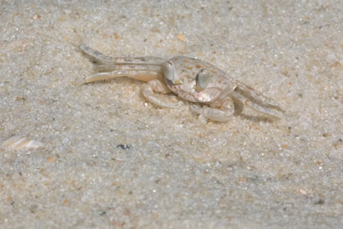
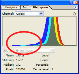
Figures
2a and 2b. A “high key” photograph and associated
histogram.
Nearly all of the pixels are brighter than average. A few middle tones
and lots of one-quarter tones and not much else. The median of 172
indicates that one-half of the information is in the quarter-tones
and highlights. High key images often appear washed out rather than
muddy. The effect is again a dull and uninspiring image.
Sometimes an image can have lots of information in the highlights
the shadows and still appear dull and muddy. Dreary, overcast days
can drain an image of middle tones. You need more than high contrast
to make an image interesting. Just look at the image from the Bay of
Firth, Scotland in Figures 3a and 3b.
Figure 3b has plenty of what we look for in an image: plenty of tonal
range, plenty of contrast between shadows and highlights, plenty of
saturated colors. What the image does not have plenty of is “pop.” The
highlights would improve with a bit of careful brightening, but it
is those flat middle tones drain all of the interest from the image.
Figures 3a and 3b. Flat midtones can leave the interest for an
image equally flat.
Getting Our Terms Straight
Ansel Adams codified his Zone System in the 1940s. It divides an
image into 11 zones. Sometimes his zones are referred to as tones,
although
it would be more accurate to say each zone is a discrete range
of tones. (See especially, The
Negative by Ansel Adams)
Zone 0 is the darkest shadows: maximum black with no evident detail.
Zone X is the brightest highlights: white with tone but no evident
detail. Zones I through IX represent tones with detail, going progressively
from very dark to very light.
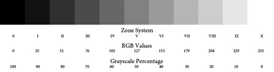
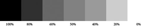
Figure 4. A grayscale wedge with corresponding values
Zone V is middle gray (127 in RGB, 50% in grayscale). It was the key
measurement in Ansel Adams’ Zone System. Zone V represents
normal tones under normal lighting. With film photography, you typically
set the exposure so middle tone objects are exposed according to
the meter. If you need to preserve highlight detail, you compensate
by subtracting stops or reducing the length of the exposure. This
keeps the highlights from “burning out” and reduces the
brightness of the rest of the image. If “stopped up shadows” was
the likely result, you added stops or lengthened the exposure. This
increased brightness not only for the shadows but for the rest of
the image as well.
With typical camera metering and auto exposure, the subject is rendered
as a middle tone. A brighter than middle tone subject will be darkened
unless exposure compensation is applied. Highlights, like snow can
become a dingy gray, without positive exposure compensation. Darker
than middle tone subjects need negative exposure compensation to avoid
lightened shadows.
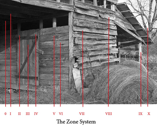
Figure
5. The zones identified in a B&W image.
Ansel Adams urged photographers to previsualize how the photograph
will appear prior to making an exposure. This forces the photographer
to be deliberate during exposure.
While digital photography can still benefit from many of Ansel Adams
insights, the way light affects photoreceptors on a CCD or CMOS imaging
chip is not the same as how light affects photographic emulsions. This
is especially evident in Ansel Adam's advice, "Expose for
the
shadows and develop for the highlights." Michael Reichmann argues
that with digital photography it is important for photographers to
expose for the highlights and develop for the shadows. "Expose
to the Right" ensures
the best signal-to-noise ratio.
I find that you have to use the Expose to the right very, very
carefully. Read my article "Watch
your Histogram"
Film photographers, especially slide film photographers, are accustomed
to underexposing images to increase saturation and avoid burning out
highlights. Digital photographers have one enormous advantage unavailable
to film photographers (unless they shoot Polaroid film). Digital SLRs
provide the photographer with immediate visual feedback about their
shot.
I am not referring to the tiny LCD preview of the image. Lighting
in the field and LCD displays do not mix well, especially when trying
to make fine determinations about exposure. Digital SLRs and the better
digicams also provide a histogram of the exposure values, and those
histograms are a critical tool for “postvisualizing” your
digital images while out in the field. If we stick to Ansel Adams meaning
of previsualization, which occurs before exposure, then postvisualization
is the process of imagining how the image will appear once we get back
from the field and start to work with it in our image editing software.
Did we expose correctly? Do we need to shoot again?
With Expose to the Right (ETTR), you aim for a histogram that approaches
the right edge of the histogram but does not clip any highlights. You
are exposing for the highlights.
Previsualization is an essential step for most DSLRs and digicams
when using ETTR. Current digital cameras typically measure only average
luminosity for the three channels rather than displaying each channel
individually. It is therefore possible to clip a single channel and
see no evidence on the histogram or a highlight warning. So, care is
required in the application of the technique: especially with highly
saturated colors in bright light. You either need to back away from
the right a bit or bracket your exposures.
ETTR is a technique that brightens the image. This is critical for
reducing noise in digital images. While CCD and CMOS imagers are linear
devices over most of their operating range, noise is a common problem,
especially in deep shadows. Slight differences in sensitivity among
the photoreceptors become increasingly noticeable under low light conditions.
If you magnify the shadows of many digital images, you will see evidence
of luminosity noise. It is sometimes described as blotchiness
ETTR reduces noise, but once you have exposed for the highlights,
you then need to develop for the shadows. This is done during photo
editing, typically through adjustments to tonal range, contrast, and
brightness.
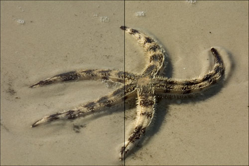
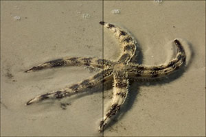
Figure 6. Reduced tonal range typically results in a flat, dull image.
Dynamic range is the difference between the darkest tone that a photographic
medium can capture and still hold detail and the lightest tone that
can display detail. To capture detail, tones need to be distinct.
The left half of Figure 6 above shows less tonal range than the right.
The tonal range of a particular image is just the numeric difference
between its maximum highlight and its minimum shadow. Extending the
tonal range makes the darkest pixel darker and the lightest pixel lighter
and moves all of the intermediate pixels corresponding amounts to fill
out the new tonal range. Details in the sand stand out more from the
background as a result of a quick adjustment in Photoshop with the
Levels control. The starfish has more “pop.”
There are exceptions, like the black cat in a cave or a polar bear
on the snow, but having a full tonal range is generally a good thing
for photographs. The darker the darkest areas, and the brighter the
brightest areas, the more contrast the image will have. A full tonal
range ensures that the image has the fullest possible overall contrast.
Images that are almost exclusively highlights and/or shadows, while
posing special challenges, are the exception.

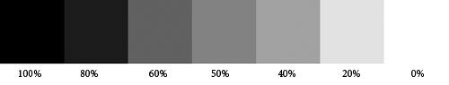
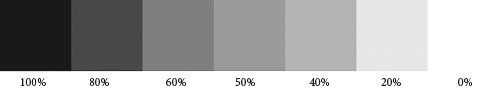
Figures
7a – 7c. A grayscale wedge before/after contrast adjustments.
Contrast is a related concept. When you increase contrast, dark pixels
become darker and light pixels become lighter. Middle gray is unaffected.
Since the human eye finds details by looking at differences in luminosity
and color, increasing contrast nearly always makes fine details more
evident.
Figures 7b and 7c show the result of increasing contrast to a grayscale
wedge. This was done with the Photoshop Brightness/Contrast control.
Figure 7b is the result of a +20 increase made to the Contrast slider.
Notice how the 80% patch has darkened and the 20% patch has lightened.
Figure 7c is more extreme: a +40 increase to the Contrast slider. Both
the 80% and 20% tone clipped. The 80% tone became indistinguishable
from the 100% tone, and the 20% became indistinguishable from 0% tone.
It is also important to notice that the 60% and 40% tones were only
slightly affected by even the aggressive +40 contrast adjustment. The
tonal range for the image would remain exactly the same. Lighter shadow
tones and darker highlight tones tend to disappear when contrast adjustments
are overly-aggressive. This causes the highlights and shadows to posterize,
leading to a loss of detail.
Controlling contrast is critical to image editing. For an image to
appear life-like, it must contain a wide range of brightness values.
Place two versions of the same image side-by-side, most people will
prefer the print with higher contrast.
I learned from Thomas Knoll that it is just a fact that if you
watch the same image with different contrast the higher contrast
image will always grab your attention. That does not mean it is always
better. In figure 6 (excellent example) the optimum may be somewhere
in the middle. Look also at you image by itself and not only in comparison
to stronger contrast variations. Also keep in mind whether your printer
can even handle the contrast of your image. We mostly print on matte
papers and here the contrast is limited by the paper itself.
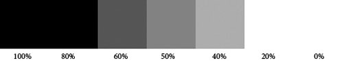
Brightness is another related concept. When you adjust brightness,
you affect every pixel equally. When you increase brightness, all of
the pixels lighten – dark and light pixels alike. Highlights
can clip, if you are careless when increasing brightness. When you
decrease brightness, all of the pixels darken. Shadows can stop up
when decrease in brightness is extreme.
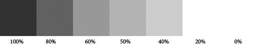
Figures 8a -8c. A grayscale wedge before/after brightness adjustments.
“Linear” is the jargon for a change that affects every
pixel in the same way. Brightness takes the existing histogram and
slides it to the right when brightness is increased and to the left
when brightness is decreased. “Nonlinear” changes affect
some pixels more than others. They compress some of the information
displayed in a histogram and/or expand some of it.
All of the pixels in Figure 8b brightened, except for those that were
already 0%. Those pixels had no additional values to assume. They were
already at maximum brightness. The Brightness slider was set at +25.
Figure 8c has clipped highlights. A more aggressive +50 setting for
the Brightness slider caused the 20% tones to clip completely. Once
highlights (or shadows) clip, their information is lost forever. You
can move a wide range of pixels to 255, but they will move back from
255 as one large clump. Clipping compresses all of their previous information
into one single value. Protecting highlights and shadows from clipping
is an important consideration when adjusting tonal range, contrast,
and brightness.
Where Do We Go From Here?
When faced with a dull, muddy picture, you might be tempted to reach
for the Brightness and Contrast control. Most pros advise against its
use altogether. I tend to agree. The only time I can recall using them
is the simple adjustments for this tutorial. They are not part of my
digital workflow. The Levels and Curves tools give you more flexibility.
Not only can you adjust brightness and contrast, you can also adjust
the overall tonal range, middle tones, color balance, and even adjust
the highlights separately from the shadows.
The rest of this tutorial series will explore the wide range of options
in Photoshop CS for handling problems with tonal range, contrast, and
brightness. The next tutorial will discuss the features in Adobe Camera
RAW II for making basic adjustments to tonal range, contrast, and brightness.
|