Note by Uwe Steinmueller (Editor):
Ed Wolpov sent in an entry for our RAW
contest #21
"LightZone contest #1". Even if all our readers
can see all editing steps that were performed by Ed it seemed to be
nice to also understand the motivation for all editing operations.
We thank Ed Wolpov a lot that he wrote down his personal ideas while
editing
this picture (the picture is ©Bettina + Uwe Steinmueller). The rest
of the text is by Ed Wolpov.
I'm always amazed at the ease
and infinite variety of intuitive options I have at my disposal when
I modify photos in LightZone. Instead of trying to decipher numbers,
curves, levels, and histograms as I would in Photoshop, LightZone allows
me to work in a more visual, natural-feeling environment – much
like I did in the darkroom.
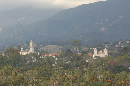
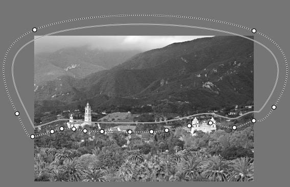
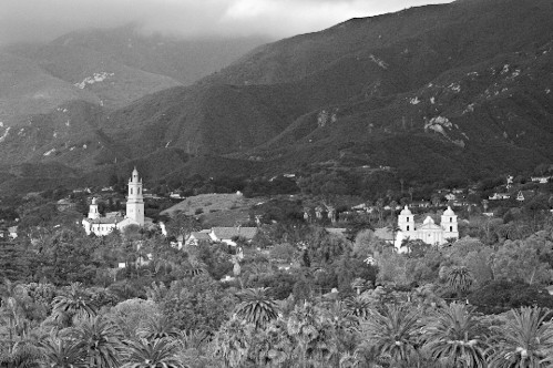
Before beginning a project, I take a few moments to look over the
original image and plan out a course of action. In the original
photo I see
a number of things that appeal to my aesthetic senses. There's
the foreground foliage, the two large buildings, the near mountain
range,
the receding mountains, and the clouds/haze. All of these areas
can easily be worked on independently if I wish, but what I actually
do is the result of an iterative process… things will develop
as the image takes shape.
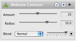
I often start by applying a mid-tone contrast enhancement
layer. I do this by adding a Sharpness layer across the entire image
(re-labeled
as Midtone Contrast). By setting the Amount to a value of 20
and the
Radius to 50, the depth of the lower mid-tones is increased
without actually affecting the sharpness. This technique works equally
as well in Photoshop through the use of the Unsharp Mask filter.
The
values
given above are just a starting point, so feel free to experiment… just
remember that the relatively large Radius amount is what makes
this technique work. You'll note that this technique has no
effect on
the upper mid-tones or highlights.
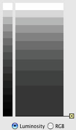
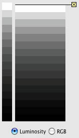
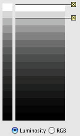
My second layer is almost always an adjustment to the shadows. By adding
a ZoneMapper layer (I call it, Shadow Adjustment) and running the cursor
through the lower zones of the step-wedge, the ZoneFinder's yellow
highlight shows the first area representing the lowest (darkest) zone.
I then move to the next lower zone in the ZoneMapper and pull it down
to the bottom. This brings the lowest zone to the bottom of the scale
and spreads out the remaining tones above it. Looking at the results
in the image window, I see an increase in depth to the entire photo.
Region used for ZoneMapper
I've pretty much got my foundation looking the way I envisioned;
now I can concentrate on the mid-tones and highlights. In
this case I'll
add another ZoneMapper (Mid-Highlight Balance) and adjust
the mid-tones and highlights by pulling down various zones to help
balance the
near mountain range, the receding mountains, and the clouds/haze.
In order
to affect only the upper portion of the photo to confine
my
adjustments, I first set a Region with a moderately wide "feather" around
the area of interest.
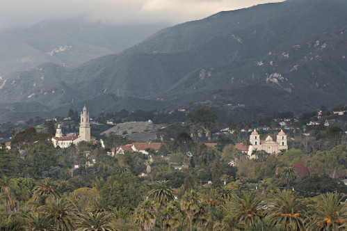
result so far
Satisfied with the way things are progressing, it looks like
I can finish up by adding a Sharpen layer across the
entire photo. My settings
are an Amount of 121 with a Radius of 1.8. This gives
me a modest amount of sharpening without going overboard.
Done. Well, not
quite.
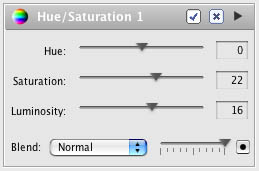
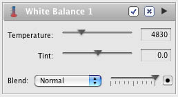
Spending
a little time looking at the "final" image, I ask myself
if there's anything I can do to improve the feel or mood of the shot.
Maybe a little more saturation and a bit more luminosity would do it
some justice, so I add a Hue/Saturation layer and pump things up until
it looks "right." Okay, just one more tweak,
the color is just a little too warm for me. The whites
are not
cool enough,
and
the distant mountains could be bluer. I add a White
Balance layer and adjust the temperature until I feel
comfortable
with the
overall color.
That's it, much better!
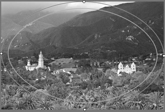
Back in the days of yore, when I spent my weekends in the darkroom
(remember the darkroom?), I would often do a little
edge burning or corner burning to a print in order to surreptitiously
bring the viewer's
attention to the main theme of the photograph. To
do this in LightZone, I first add another ZoneMapper (and call it
Darken Corners). Then all
I have to do is select an oval-shaped region over
the entire image with the Region tool, invert my selection, and drag
out the feather
to smoothly blend the effect. By selecting the highest
(lightest) zone and dragging it down slightly, I'm able to darken
the corners. A little
goes a long way; so I darken until it's just barely
noticeable, then back off a bit.
Just when I thought this version would be my entry
into Outback Photo's Contest #021, I realized
that I'd probably
have a
better chance of
being unique if the image was in black & white.
Back to the drawing board!
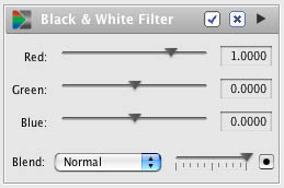
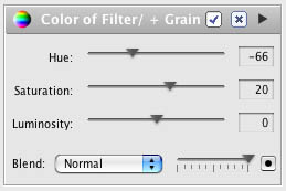
In order to accomplish my black & white conversion, I use a technique
of applying two layers; one Channel Mixer layer (I call it Black & White
Filter) and one Hue/Saturation layer (called
Color of Filter/+ Grain). To use this technique,
in the
Channel Mixer, I
set the red channel
to a value of 1.0 and the green and blue
channels to 0.0. Now, in combination with
the Hue/Saturation
layer,
as I
change the
Hue, it
acts like a
colored filter that allows me to swing through
the entire
spectrum of colors. By looking at the image
and adjusting the hue, I
was able to achieve the effect I wanted.
Pumping up the saturation increased
the intensity of the filter effect and added
a grainy look to
the image. This rendition of the photo was
the one I used to enter
into the contest.
It was pointed out to me that there were a few
areas of pure white in my final image, so
it's important
to at least do a cursory check
of the highlight values. In LightZone, I
was able to look at the numeric values in the highlights
by
entering the Sampler (Command 2 on a Mac)
and placing the cursor over the suspected
areas. Because the highlights were at a value of 255,
they would have printed as pure paper white.
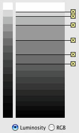
By adding a new ZoneMapper (Highlight Touch
up) I was able to globally bring down this value
to a more
respectable 243. I did this by anchoring
the second highlight from the top of the
step-wedge and slightly dragging down the very top zone
until my measured value was 243.
Although the steps necessary to accomplish the
final photo seem complex, in actual practice
it only took
me about an hour to complete. The beauty
of using LightZone is the ease at which
I can quickly make aesthetic judgments on the fly and
see the results;
much in the same way I would
if I had been working on a print in the
darkroom. It's a visual, almost tactile way of working!
|