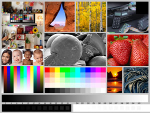
Outback Print recently introduced a new Printer Evaluation Image.
First off, a special thanks to Bill Atkinson for allowing the use of many of the image frames from his original test image. It would have been easy enough for us to assemble a test image using different frames, but many of us have been using Bill’s test image for so long that we are familiar with how these specific patches will react under a variety of conditions. Since we already know from experience what to look for, it would have been akin to a re-invention of the wheel to create a test image with different image patches.
What I look for
Usually, the first thing I look at is the gray ramp. Here I want to see a smooth transition from the full black to full white without notable banding or color casts.

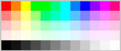
Next I’ll look at the gray squares in the RGB patch. Here, with the gray patches more separated in tonal value, it is easier to see color shifts that move away from neutral gray; in a perfect print these should appear perfectly neutral when compared to their immediate neighbors.

Next I look at the bottom patch ramp, specifically noting the minimum black and maximum white patches discernable. Note these are surrounded by full black and paper white, and that a colorimeter can likely read differences beyond what you can see, especially in the black patches. For my own use, I typically base my comparisons on what I can I can detect with my naked eye, since that is how I view prints. However, this becomes somewhat subjective and others may want to measure those values so they have a more empirical data point. Note too that the white point goes off the edge of the test image. This is done on purpose to evaluate printers that lay down gloss or other clear overcoats.

Also note that there is a full black patch in the upper right corner of the evaluation image, large and conveniently placed to more easily read and measure dMax when using a colorimeter.
Next I look at the gamut ramps. These are the colored stripes in the lower left of the test image. Here the transitions should be uniform. If there are issues with the profile, they will show up as banding or even inversions along these ramps. Note that almost all printers and profiles will usually generate some banding somewhere along these color ramps, but it should be relatively minor. More critical is an inversion, where the brightness first increases then decreases before increasing again. I also confirm that the first three primary colors actually appear as Red, Blue and Green to my eye and not some iteration or approximation of those primaries. The most common problem with inkjet prints is the Blue, which will often appear a bit purple.
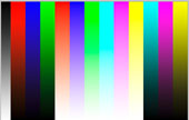
In the RGB patch, I look for separation between the adjacent hues. Many printers or their profiles (and most monitors) have difficulty distinguishing between some of the greens and cyan and that issue shows up here. These can also be read with a colorimeter if you want the empirical data.
Next I look at the skin tones in the Kodak test patch. If the profile is off, you will know it right away because the skin tones will look wrong. Notable issues are:

- the Asian girl’s skin gets too yellow or too pink;
- the very pink-skinned baby gets too pink or goes blue (he is naturally pink already, but believably so);
- the black baby goes green;
- the olive-skinned baby goes yellow.
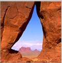
Moving up to the top center, I look at the sky gradient in the tear-drop arch shot. This sky is actually a bit cyan – which is why we use it – and with a problematic profile it will quickly go too cyan and look pretty bad.
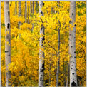
The aspen trees give us an area of bright yellow leaves that should have pleasant tonality as well as really fine, higher-contrast detail in the trunks.
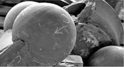
The CD player shows both shadow detail and the handling of metallic tones in the reflections from the CD. Also note there is a very subtle reflection of the circuit board in the front flap on the CD player. I typically need a loupe to see this reflection, but it should be there and the colors of the diodes should remain discernable even in the dimness of that reflection.

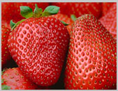
The strawberries should look like you want to pick them off the paper and eat them; if the printer has issues with red, these strawberries won’t look appealing at all.
The saturated orange sunset generates a halo and gradient that can cause a banding issue with a bad profile.

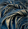
The lava rock has both deep shadows and a metallic-bronze highlight. The highlight should look bronze-metallic, not green or yellow. You can use this patch to compare the shadow performance from different profiles or printers by looking inside the lava folds with a loupe.
Last is the black-and-white image in the center. This patch contains the full spectrum of grays from full black to fully-blown paper white, while the curved surfaces have smooth gradations of varying lengths and show how the printer handles gray transition areas with a real image.
|