Notes by Uwe are in italic.
In the previous tutorial, we took a brief look at the features in
Adobe Camera Raw II (ACR II) for adjusting tonal range, contrast, and
brightness. For some images, all you need are a few adjustments with
ACR II and your global adjustments are complete. You can even do capture
sharpening and noise reduction in ACR II.
Some images present greater challenges. The Gerber Daisy in Figure
1 is an example. I took the shot in bright sunlight. I was afraid of
burning out the saturated yellows, so I underexposed the image: rather
severely, it turned out. I should have paid more attention to the histogram
and less to the image on my Canon 10D.
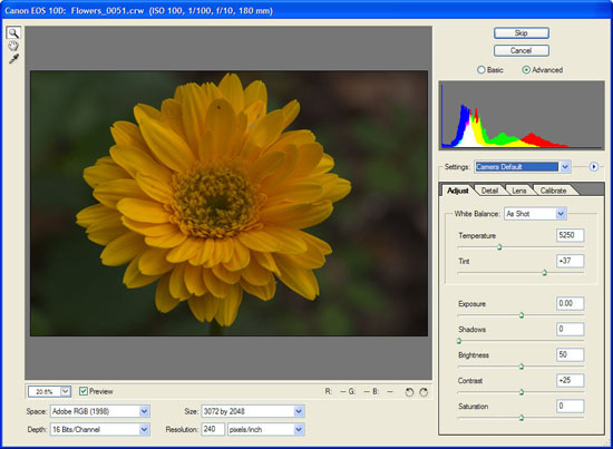
Figure
1. The RAW image of a Gerber Daisy prior to basic adjustment with ACR
II.
Believe it or not, there is a bright yellow Gerber Daisy just aching
to emerge from Figure 1. Take a look at Figure 2. Replace color was
not used to substitute those bright yellows for the reddish, orange
colors in Figure 1.
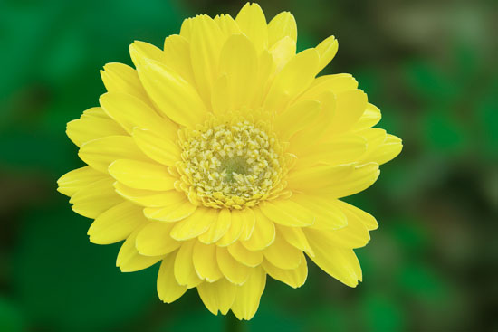
Figure 2. The Gerber Daisy after some global adjustments in ACR II
followed by some
basic adjustments with Levels, Curves, etc.
It Helps to Start Right
I began my adjustments in ACR II. The only adjustments I made were
basic ACR II adjustments to white balance and exposure on the
Adjust tab.
I started with a white balance adjustment, lowering the temperature
from 5250K to 3250K. The Tint slider was moved from +37 to -20. Exposure
was increased +1 1/3 stops. This stretched the tonal range slightly,
brightened the image considerably, and moved the flower blossom quite
a way in the direction of yellow.
I left myself headroom for editing with Levels and Curves. The tonal
range could still be extended in the direction of the highlights.
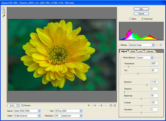
Figure 3. The same Gerber Daisy after quick adjustments to the White
Balance and
Exposure sliders.
Some photographers might be content with the result in Figure 3. Compared
with the unadjusted RAW image in Figure 1, the image above is a marked
improvement. We can do better, however, with a little more effort.
Using Levels to Adjust Tonal Range, Contrast, and Brightness
The Levels dialog is Photoshop is a powerful tool for adjusting your
images. You use Levels to transform existing pixel values (Input)
into new output values (Output). The Input values allow you to
adjust contrast and brightness and to stretch the tonal range.
The Output
values compress the tonal range and also affect image contrast.
To get the most from the Levels dialog, crop out any unnecessary black
or white borders. If you leave a border, it will have a strong influence
on the display of the histogram.
The first step with the Levels dialog is to set the white-point and
black-point. Working with 16-bit images is a big advantage when you
stretch and/or compress the tonal range of an image. If you work in
Photoshop CS, you should also use a Levels adjustment layer for your
work. That way, you can easily tweak the settings later.
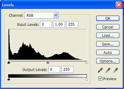
Figure 4. The Photoshop Levels dialog.
The black and white Input sliders adjust image contrast. You can pull
the appropriate slider or you can enter a number directly in the appropriate
box for any Levels value.
The white Input slider takes pixels below 255 and converts them to
255. As you move it toward the center, pixels to the right are converted
to 255 and values to the left stretch all the way to 255. Similarly,
as you move the black Input slider toward the center, pixels to the
left are set to zero and pixels to the right are stretched toward zero.
Because you are stretching tonal values with the Input sliders, gaps
can appear in the histogram. Wholesale Levels adjustments, especially
if you work with 8-bit images, can result in visible posterization.
So, be careful.
For tonal adjustments, you typically adjust the RGB channel. For color
correction, you do most/all of your work on individual channels. When
you adjust the white-point using the RGB channel, your image highlights
will be neutral. Same result for the shadows when you adjust the black-point
using the RGB channel.
What if you do not want neutral highlights (or shadows or midtones)?
In that case, you need to adjust the endpoints for the each of the
color channels separately. If you have a nice warm cast from early
morning sun, you can keep that warmth by working on the separate color
channels.
(Another way to adjust the tonal range, contrast, and brightness without
affecting the color of the image is to convert the image to L*a*b mode
and use Levels on the Lightness channel. L*a*b conveniently separates
lightness from color components. If you want to make this sort of maneuver,
it is definitely best to work with 16-bit images.)
Finding the white-point can be a challenge on a computer monitor.
Photoshop makes it easier. Hold down the Alt/Option key while dragging
the white Input slider and the image will turn black. This is the Photoshop
clipping display. As you continue to move the slider toward the center,
part of the display will turn white (or another color if just one or
two channels clip at that point). This is the brightest highlight in
your image. Release the Alt/Option key. This will set the white-point
to the brightest point in your image – which is often a specular
highlight. Specular highlights are those tiny, bright highlights that
you are likely to see on shiny objects like glass, chrome, water drops,
etc.
If you can identify a feature on the image that should be bright white,
you can instead click on the white eyedropper and then click on that
point on your image. Photoshop will read the value of the underlying
pixel and set the white-point accordingly. If you aim wrong, just click
on another image feature.
Adjusting the black-point is a similar operation. Here you are selecting
the darkest pixel and making it 0. Holding down Alt/Option as you pull
the slider toward the center will help in identifying the shadow point.
This time, the clipping display will turn white. As you pull the slider,
features of the image will begin to appear in black (or another color,
if only one or two channels clip at that value). Stop pulling the slider
and release the Alt/Option key and you have your black-point. If you
can identify a feature in the image that should be neutral black, you
can also use the black eyedropper.
What if your brightest pixel should not be 255? Instead, it should
be some gray tone. If you print this pixel value as white, your image
can look splotchy. Or, perhaps your darkest shadow was not pure black.
You need a slightly lighter tone. The Output sliders compress the tonal
range so it does not extend from 0 to 255. If you know your brightest
highlight should be 242 (5% gray), setting the Output white value to
242 will keep the highlight from going totally white. You can do the
same for your shadows.
Most printers cannot reproduce distinct tones all the way from 0 to
255. Depending on the combination of printer, paper, ink, and environmental
conditions (e.g., humidity), your printer may not be able to print
distinct tones between 0 and 8-10 or between 242-250 and 255. You can
adjust the Output black and white values to reflect your printing limits.
Doing so avoids stretching the data unnecessarily and ensures your
grays are all reproducible. If your image does have specular highlights,
however, you need to allow those pixels to “blow out” to
the color of the paper. Not all the way to 255, but slightly past the
limit of your printer.
The gray Input slider is for the gamma setting. Sometimes photographers
refer to this as the midtone slider. Moving the slider to the left
will lighten the image; moving it to the right will darken the image.
The white-point and black-point are unaffected by changes to the gamma
slider. When you adjust the gamma slider, you are telling Photoshop
which Input level to make midtone (128). Adjustments to the gamma value
for the RGB channel determine what should be midtone gray (50% gray).
If you can identify a feature in the image that should be 50% gray,
you can use the gray eyedropper to set the value.
Be careful with the gamma slider. Extreme changes invite posterization.
You can wind up stretching one part of the tonal distribution a lot
and compressing the rest.
After a bit of Highpass Filter capture sharpening, my retouching began
with two separate Levels adjustment layers. I wanted to increase the
contrast between the flower and the background, and I wanted that contrast
boost to be independent of the adjustments I wanted to make to the
background and to the blossom. I made a mask to control where the two
Levels adjustments were applied. Figure 5 shows the result.
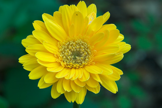
Figure 5. Two separate Levels adjustments, one for the background
and another for the yellow Gerber Daisy.
I brightened the yellow flower blossom by adjusting the gamma slider
from 1.0 to 1.15. Pulling the highlight slider from 255 to 232 also
added a perceived increase in brightness.
I did not extend the tonal range for the background. I left it unadjusted.
With a bright yellow daisy, I wanted darker greens and blacks for the
background. Remember, contrast increases as the perceived difference
between lighter features and darker features increase. The only change
was to the gamma slider, reducing it to 0.85, which darkened the background
a little more,
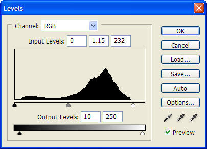 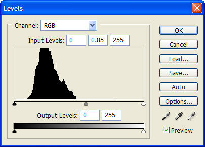
Figures 6a and 6b. The Levels adjustments for the flower and for the
background.
Creating a mask to separate the flower and the background was quite
simple. The yellow of the flower and the greens and blacks of the background
were distinct.
• Their color contrast was so great that the Magic Wand was
the ideal tool. I set the Tolerance to 50 and was able to isolate the
background with just a couple of mouse clicks.
•
I switched to Quick Mask mode and used a 1 pixel Gaussian Blur to feather
the edges of the selection. I prefer Quick Mask and the Gaussian Blur
filter for feathering selections rather than guessing with the Select
| Feather menu item.
•
After feathering, I left Quick Mask mode, went to the Channels palette,
and saved the selection as an alpha mask.
•
I then inverted the mask by using the Duplicate Channel command and
selecting the Invert option.
This gave me two masks. I loaded each in turn as a selection and added
new Levels adjustment layers: one for the flower and one for the background.
Each selection was automatically converted to a layer mask.
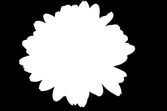
Figure 7. One of the masks used for separating Levels changes for
the flower and the
background.
Intermission
This is an article in a series about tonal range, contrast, and brightness.
So far, we have focused on tonal adjustments, leaving color correction
for a future discussion.
The bright yellows evident in Figure 2 could not result just from
adjustments to the tonal nature of the image. Some quick and basic
color adjustments were also required. Some readers may find it helpful
to get a feel for the overall workflow for correcting an image like
the one in Figure 1, so I’ll digress a bit. If you prefer, jump
ahead.
After the Levels adjustments, I made a new layer by selecting the “Create
a new layer” icon at the bottom of the Layers palette. The new
layer was filled with transparency. Pressing alt-ctl-shift-e (option-command-shift-e
on the Mac) merged all of the visible layers into this new layer. I
used the Healing Brush tool to correct damaged petals and other distractions.
I also used the Lens Blur Filter on this layer. The mask for isolating
Levels changes to the background served as a Depth Mask. The Lens Blur
Filter helped to soften the background slightly, focusing more attention
back on the flower itself.
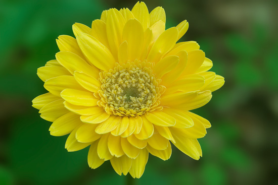
Figure 8. The image after quick adjustments with Color Balance and
Hue/Saturation.
The color adjustments were accomplished by two adjustment layers:
a Color Balance adjustment layer and a Hue/Saturation adjustment layer.
• The adjustment for Color Balance set the Color Levels slider
for Yellow/Blue to -55 for the Midtones. Preserve Luminosity was also
checked.
•
The Hue/Saturation adjustment was limited to the Yellows. Saturation
was set to -15 and Lightness to +10.
To be candid, I considered stopping at this point. I also wanted to
discuss Curves adjustments in this installment. So I decided to press
the envelope a bit and further brighten the Gerber Daisy with a Curves
adjustment.
Using Curves to Adjust Tonal Range, Contrast, and Brightness
Many photographers new to Photoshop feel intimidated by the Curves
dialog. It is a complicated looking dialog.
Curves is the ideal Photoshop tool when you want to affect selected
tones in an image. Levels sets the tonal range for the entire image
and can also make global adjustments to contrast and brightness. Curves
lets you isolate specific tones, like the midtones or the highlights
and affect them in different ways. You can, for example, increase contrast
in the midtones while keeping the highlights and shadows unaffected.
You get five points to adjust with Levels. Curves gives you up to
sixteen. You can toggle between working with tonal values (0-255) and
dot percentages (0-100) by clicking the tiny triangles on the Curves
dialog (highlighted in red below). You can change between a 4x4 grid
and a 10x10 grid by Alt/Option clicking on the graph itself.
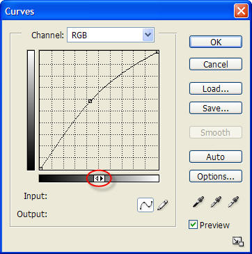
Figure 9. Curves dialog for the Gerber Daisy image. The red highlight
indicates where
to click to change between tonal values (0-255) and dot percentages (0-100).
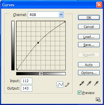
The Curves dialog starts out with a diagonal line. You can add points
along the diagonal to keep the line fixed at particular points. You
can also pull the line to a new position and cause it to curve (hence
the name, “Curves”).
The classic example is an “S” curve to increase contrast.
Figure 10 shows one possible high contrast “S” curve. I
started by fixing the line at 126. Then I pulled the highlights up
and to the left and the shadows down and to the right. To be precise,
a tonal value of 50 was set to 25 and a tonal value of 202 was set
to 228. This brightens the highlights and darkens the shadows while
not affecting the midtones at all. In fact, midtone 126 cannot change.

Figure
10. A classic “S” Curves setting to increase image
contrast.
Adjusting just one point in the Curves dialog affects not only that
tone; it also affects adjacent tones. The more extreme the change,
the stronger its effect on adjacent tones.
As Mitch says this is already a strong S-Curve. More on S-Curves
can be found
here.
The typical solution is to add a set of anchor points. This keeps
the number of affected adjacent tones to a minimum. (Compare Figure
11a and 11b.) There are limits to that solution, however. First, the
Curves dialog only supports a small number of points. Second, because
we are adjusting a curve, it is possible to get some twists and bends
from extreme changes that can cause some of the adjacent tones to posterize
or undergo other severe changes.

Figures 11a and 11b. Adding anchor points is a technique for keeping
Curves
adjustments limited to a narrow range of tones.
I used the mask for isolating changes to the blossom as a layer mask
for the Curves adjustment, since I wanted Curves to affect only the
flower and not the background. Masks are one solution for limiting
the effects of Curves adjustments. I’ll be addressing some other
techniques in future tutorials in this series.
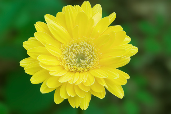
Figure 12. Almost complete. Just some finishing touches remain.
The upward curve in Figure 9 brightened the flower, affecting the midtones
more than the one-quarter and three-quarter tones, and affecting
those more than the shadows and highlights. I pulled the input value
for 108 up to 147. Pulling the line in Curves downward and to the
left would have the opposite effect and darkened image features.
The result of the Curves adjustment is a bright yellow Gerber Daisy!
A Few Final Touches
I considered the result in Figure 12 to be nearly complete. I decided
to apply a bit of localized sharpening in the center of the flower.
The Canon 180mm “L” Macro is a great lens. Tack sharp
from center to edge. Wonderful contrast. Great bokeh. To emphasize
the sharpness, I applied some clocalized sharpening.
Localized sharpening is easy for an image like this Gerber Daisy.
I created a new layer. The alt-ctl-shift-e (option-command-shift-e
on the Mac) shortcut merged all of the visible layers. Setting the
blend to Luminosity avoided any color shifts during the sharpening.
Paying attention to the center of the flower as I adjusted the settings,
I applied Unsharp Mask Filter (350, 0.70, 2). A Conceal All layer mask
added to the sharpened layer hid the sharpening effect temporarily.
I grabbed the brush tool with a soft edge, white foreground, and 100%
opacity to paint the sharpening back into the central portion of the
flower. I decided to tone down the sharpening effect a touch by reducing
the opacity for the layer to 75%.
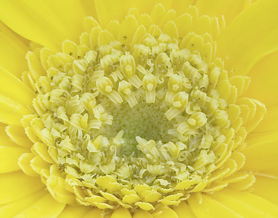
Figure 13 is a 100% crop of the center of the Gerber Daisy.
Localized
sharpening makes is obvious why I chose an f/10 aperture for the
image. I wanted sufficient DOF to reach right down into the stamens
at the
center of the flower and pull out lots of detail. Localized sharpening
lets you apply an extra round of sharpening right where
you need it without over-sharpening the rest of the image.
After localized sharpening, I decided to apply a quick round of dodging
and burning. I had used a Photoflex 5-in1 reflector to provide more
even illumination for the shot. The flower was standing in broad daylight,
however. The silver reflector reduced the shadows and highlights. It
did not remove them.
I prefer to use an Overlay layer filled with 50% gray for my dodging
and burning. Then I can use a soft edge brush and black or white at
low opacity to build dodge and burn effects over successive brush strokes.
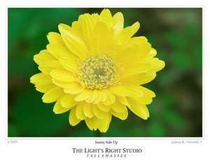
The only remaining touch was to add a gallery print effect. Voila!
I had the result in Figure 14.

Figure 14. The final result. A severely challenged RAW image emerges
as a bright,
colorful image of a Gerber Daisy.
Upward and Onward
This tutorial has covered the basics of the Levels and Curves dialog.
It has been a quick introduction. Hopefully it will encourage you
to use both tools if you’ve been reluctant. I’ve also
shared a bit of my workflow for an image of this sort.
If you are new to Photoshop, I hope this tutorial will encourage you
to work and rework images you consider hopeless. If you started with
the RAW image back in Figure 1, you might be tempted to abandon it.
Photoshop is a great tool for extracting the numerous possibilities
waiting inside each RAW image.
|