This essay is part 3 (part 2 can be found here) of Chapter 5 in Alain’s second book
Mastering Composition, Inspiration and Personal Style
7 - Saturation
To see in color is a delight for the eye
but to see in black and white is a delight for the soul.
Andri Cauldwell
Saturation is both an important and an overused aspect of color. In short, it is just too easy to over saturate a photograph, either globally or locally, in order to make it more colorful or more interesting.
Certainly, it can be said that over-using the two other variables of color is just as bad. Making a photograph too light or too dark is not good either. And having too many different hues in an image is a sure recipe to make it look gaudy. Similarly, reducing the hues to a minimum may remove interest in the image altogether.
None of these are good, and all of them are symptoms of image maladies, a concept we will explore in depth in the chapter of the same name later in this book. But right now I want to address saturation specifically, because I believe that this subject needs a little discourse now followed by a few remedies later.
The problem with saturation starts with raw files. Raw files are by nature desaturated. This is simply one of the aspects of capturing photographs in raw format. Therefore, in order to make them look “normal,” whatever this might mean to each of us, we have to increase their saturation level. This is often the source of problems with color photographs.
There is nothing easier than over saturating an image. Why? Simply because I think that saturation is addictive. More is better, or so it seems. Since I started teaching digital photography, which goes back to 1995, I have seen very few photographs that lacked saturation. However I have seen countless photographs that were over saturated. Some were slightly over saturated and many were greatly over saturated. In just about all instances, the photographers, the artists, were not aware that their images were oversaturated.
Over saturation is easy. Just drag the slider to the right and there you are: instant interest. And certainly, the majority of the public likes saturated color images. In fact, if you want to quickly create a popular image, simply over saturate the colors and increase the contrast. While you may not achieve a sophisticated image, you will achieve an image that will please a less demanding audience.
It’s a little like cooking. If you can’t achieve a dish that has enough flavors, add salt. If that doesn’t work, add pepper. Salt and pepper are to unrefined cooks what over saturation and high contrast is to unrefined photographers. They work, but they do so superficially. Furthermore, go one step too far and the dish is inedible or the photograph gives you a headache when you look at it. The line is easily crossed and most do cross it. Finally, twenty years of overly salty and peppery food, or of overly saturated and contrasty images, will cause you to lose your appreciation for properly seasoned cuisine and properly processed fine art images. There is a risk. I mention it here so that if you decide to take this route you know what you are getting into.
So how do you prevent over saturation? Simple. The first thing is being aware of the risk, something we took care of in the previous paragraph. The second thing is acquiring a taste for how much saturation is enough. This is best achieved by comparing your work to photographs that you consider to be properly saturated. These are photographs that you like, that you admire, and that you want to use as models for your own work.
You can do this by comparing your images on screen to images found on the Internet. Or, you can do this by comparing your prints to reproductions in books or magazines. However, the very best approach is to compare your fine art prints to original fine art prints of the images you want to use as models. Why? Because everything else besides an original print is, well, a reproduction. And reproductions are not as good as original prints. Something is missing and the quality is lower than that of an original. That is why they are reproductions, and that is why reproductions cost less than originals.
The photographs below show the same image subjected to a range of saturation increases and decreases. In this example I chose to divide saturation in 5 categories: normal, lower than normal, total desaturation, higher than normal and maximum saturation. It is possible to create finer differences between each category, and you may want to do so. Here I wanted to keep things simple for the purpose of this example so I limited myself to 5 categories.
These examples are provided as a study guide. You may want to create your own examples using your own photographs. Finally, keep in mind as you look at these images below that the only change made to the photograph is saturation increase or decrease. No other modifications were made.
Global color saturation levels examples
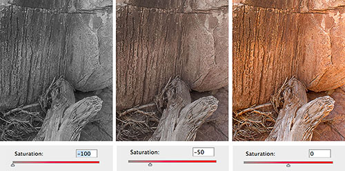
No saturation Lower than normal saturation Normal saturation
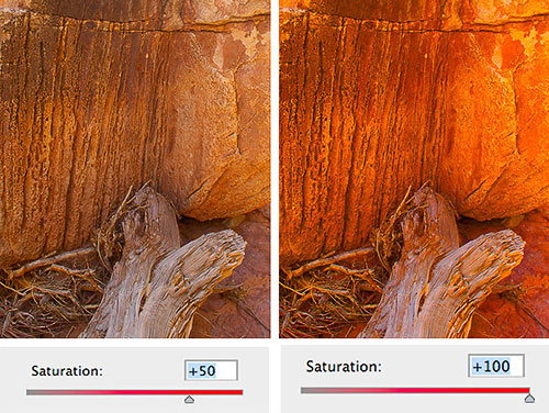
Above normal saturation Maximum saturation
Global and local saturation
The next thing to do in learning to not over saturate your photographs is learning to differentiate between global saturation and local saturation. Global saturation is saturation increase or decrease applied to the entire image, to all the colors in the photograph. Local saturation is saturation increase or decrease applied to part of the image, to some of the colors in the photograph.
Usually, when converting a raw file you will start by increasing global saturation, working on the saturation of all the colors in the image. You need to do this while being careful to not over saturate colors. As I mentioned, you can use another photograph as a guide to determine if you are going too far or not.
As you study the results of this saturation increase you may notice that one or several colors have increased in saturation more than the other colors. In other words, you may find that one or several colors are oversaturated. If this is the case you will need to do a local desaturation by working only on some of the colors in the image.
Local over saturation often occurs with distant objects or features in the landscape. Things that are far away in a landscape are by nature less saturated than things that are close to us. This is because atmospheric haze, as well as dusk, vapor or other particulates in the air, reduce saturation. This means that the further an element is from us, the less saturated it will be.
If, in a photograph, a far away element is more saturated than a nearby element, the photograph will not be believable to the viewer. That may be fine if such is the intent, but if it is unintentional it will cause the viewer to lose interest in the image. Of course, viewers will not come to you and say “I really enjoyed looking at your photograph until I realized that the mountains on the horizon were more saturated than the flowers in the foreground at which time I lost interest in the image because I found it to no longer be credible while your attempt is clearly to create believable representations of the landscape.” This will never happen, or hardly ever I should say (never say never, there’s always someone to prove you wrong when you do!). It won’t happen because you are supposed to know all of that. You are expected to have control over your medium and you are expected to be aware of the effect you intend to create with your work.
The solution to local over-saturation is to lower the saturation of the afflicted color. Usually, blue is the color that over saturates the most in landscape photography. To cure the problem, simply lower the saturation of the blues and the problem will go away. We will see how to cure this malady in greater detail when we get to the Image Maladies chapter.
8 - Color Seeing Aides
In my photography, color and composition are inseparable. I see in color.
William Albert Allard
Zone VI Filter
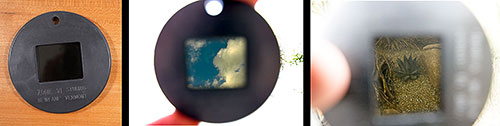
Zone VI filter Zone VI filter in use
There are a number of tools that can specifically help you see and compose with color. In this section we are going to take a look at these tools, in no particular order.
The first tool is a color-viewing filter that was made by Zone VI. Zone VI is no longer in business. It was bought by Calumet Photo who may still offer this viewing filter (I have not checked if they do). Zone VI also made a black and white viewing filter that I describe in the next chapter: Composing in Black and White.
The goal of a color-viewing filter is to show the contrast and color balance of a specific film. I am not sure which film the Zone VI filter was designed to emulate but it does increase the contrast of the scene and it does make it look bluer. Maybe it was designed to emulate Ektachrome since this film had a color balance shifted towards blue.
I have always had mixed feelings about color viewing filters. We see in color, so why use a color-viewing filter? After all, it will show us the world in color, something we could see without the filter! The contrast increase and color shift are helpful to a point but the filter also makes things darker, which makes composing more difficult than without the filter. I never used this filter much, certainly far less than the black and white viewing filter.
In film days the goal of a color filter was to duplicate the contrast and color of a specific film. With digital capture, color viewing filters have become far less useful since contrast and color can be adjusted at will. Since the filter can only show one contrast and color combination, one is better off looking at the LCD screen on the digital camera.
LCD Screen
With digital capture using your LCD screen to visualize the color in your photographs is much more effective than using a color viewing filter. Color viewing filters were all we had prior to digital. Today they are passé to say the least.
There are a few things to keep in mind though when you use your LCD screen as a visualization tool.
First, colors on the LCD screen are based on the color balance setting you selected on your camera. Changing this setting will change the color balance of the photographs displayed on the LCD screen.
Second, this color balance can be changed in the raw converter later on with no penalty or loss of quality (see color balance above and in the Image Maladies and Remedies chapter). Therefore, the choice of color balance in-camera is not final.
Third, the image on the LCD screen is generated from a JPEG that is itself generated from the raw file. The conversion settings used to create this JPEG are based on the settings on your camera. This means that the quality of the image on the LCD screen may not reflect the full potential of the raw file.
Fourth, your LCD screen can only exhibit some of the colors in the raw file. This of course is dependent on the quality of your LCD screen, but the quality of the LCD screen is not as good as a calibrated, large gamut monitor for example and definitely not as good as a Fine Art Print.
Fifth, if exposed correctly the image on the LCD screen will appear too bright. This is due to an approach called exposing to the right, which calls for overexposing digital captures to record more bits of data. Inversely, in instances where you wish to preserve extremely bright highlights, the image on the LCD screen may appear too dark. In either case, images that are overly bright or dark make for poor color evaluation. In these instances, which are common with digital capture, I recommend that you take a photograph for the sole purpose of viewing it on the LCD screen. When the capture was exposed to the right this viewing image will have to be underexposed, and when the capture was exposed to preserve highlights it will have to be underexposed.
Sixth, keep in mind the goal is not to do “LCD art.” This means that the image on the LCD screen is only an evaluation image and not the final artwork. Don’t go too far in making it look good! You’ll waste valuable time better spent capturing other photographs while the light is great. Instead, do only what is absolutely necessary to have an LCD image that you can evaluate properly, then use what you learned from looking at the LCD screen to refine your composition.
Nigrometer
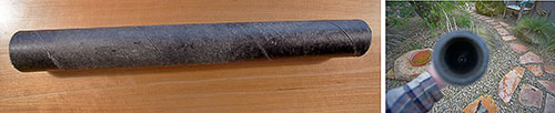
Nigrometer Nigrometer in use
Another useful tool used to study color is a Nigrometer. This tool is very simple in design. It consists of a tube with a 1/4 inch hole at each end. You use it by looking at a specific area of color through the tube.
No light reaches inside the tube, making the inside black. When you look at a specific area through the Nigrometer, the color of that area is isolated from other surrounding colors. This allows you to study a single area of color, something that we cannot normally do because we cannot narrow our sight to the size of the opening in the Nigrometer. As a result, through our eyes alone we see several areas of color at once and we cannot isolate a single area of color.
A good exercise to conduct with the Nigrometer is to look at the same object under different light conditions. For example, if you look at a patch of grass in direct sunlight and in the shade, you will see the grass take on two very different colors. The grass will be a low saturation light yellow-green when it is in the sunlight and a high saturation darker green when it is in the shade.
Doing this exercise with a variety of subjects and lighting conditions will teach you a lot about color and light.
I am not sure if you can buy a ready-made Nigrometer. I have always made mine from simple supplies. All you need is a narrow poster tube with a plastic cover at each end. Make a hole with a paper punch in both plastic covers, and paint the caps as well as the inside and outside of the tube with black spray paint (the black color is necessary to neutralize colors). Finally, glue or staple the caps to each end and you are ready to go.
Munsell Color Tree
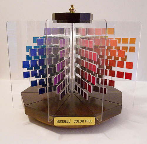
GretagMacbeth Munsell Color Tree
The Munsell Color Tree is a 3D model of the Munsell Color System. I previously discussed it at length in the section on the Munsell Color System, so I only want to mention it briefly here. This device is sold by Gretag Macbeth and I bought mine from their website. A slightly different version is available from Munsellstore.com.
Priced around $300 this is not a cheap tool. However, I find it to be extremely valuable to study how the Munsell Color System works, and to study how hue, saturation and lightness work together in changing specific colors. I use it when I want to visualize how a specific color will look if I make it darker, lighter, or more or less saturated. I also use it to determine the color palette of a specific image.
One of the nicest aspects of this tool is that the color patches are actual prints and not reproductions. In fact, each patch is glued by hand to the sheets of Plexiglas. This means that short of printing these patches yourself on your own printer, these colors are as close as they can be to the actual color. As I mentioned before, the only original is a fine art print and everything else is a reproduction. These patches are originals, not reproductions, and this most likely accounts for the cost of this tool.
Color Meters
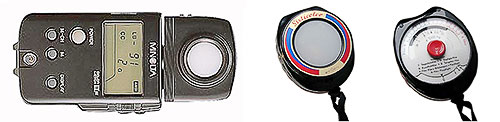
Minolta IIIF color meter Gossen Sixticolor color meter
A color meter is an instrument that measures the color of the light. Because light color is measured in Kelvin degrees, which I described previously, a color meter gives measurements in Kelvin degrees.
Above are two types of color meters. At left we have a Minolta IIIF and at right a Gossen Sixticolor. The Minolta is one of the most sophisticated color meters, not only giving the temperature of a light source but also indicating which filtration is necessary to correct this light source for a specific film type.
The Gossen Sixticolor is a much simpler type of color meter that also gives the temperature of a specific light source. The Sixticolor uses a galvanometer instead of a battery and is much less costly than the Minolta IIIF. Both of these meters are no longer produced but can be found on eBay or in used camera stores or websites.
Today, with digital capture being the norm, we no longer need to filter the light to color balance a specific film type. However, knowing the temperature of the light is still useful when making an assessment about the quality of the light and when considering which color the image will be.
However, this is also something that we can find out by looking at the image on the LCD screen. Changing the color balance setting on your camera will change the color of the photograph. By playing with the color balance settings, and by comparing how the color of the photograph changes with different settings, you can estimate the temperature and the color of a specific light source.
Grey Cards and WhiBal
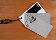 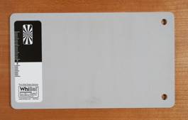
Small WhiBal Large WhiBal
Balancing color is a challenging endeavor, as we saw earlier and as we will see again later on in the chapter titled Image Maladies and Remedies. However, there are a number of tools designed to help you. Above is one of them, called WhiBal, which is designed and produced by my friend Michael Tapes.
The predecessor of the WhiBal was the Kodak grey card that was designed to be used with film. The Kodak grey card was middle grey and to use it you took a photograph with the card in it prior to taking the actual photographs. By using the same lighting conditions on the grey card and in the actual photographs, you could use the grey card to color balance the prints.
The same approach is used with the WhiBal except that WhiBal includes black and white surfaces in addition to the middle grey surface. On top of that, the middle grey surface is optimized for digital (don’t ask me how this is done, ask Michael) making it ideal for color balancing digital captures.
You use the WhiBal just like you would use a grey card, by taking a photograph with the WhiBal in it followed by the actual photographs, all under the same lighting conditions. Later, in the raw converter, you use the color balance eyedropper and click on the grey WhiBal to set the color balance. If you also want to use the WhiBal to set the black and white points, you can use the black and white eyedroppers in Photoshop to click on the WhiBal black and white patches.
This will let you set the color balance for the photograph, and alternatively the black and white points. Personally, I set the white balance in the raw converter and I adjust the black and white points in Photoshop using separate curve adjustment layers for the black and for the white points.
What you need to keep in mind is that while setting a neutral point is very important, when doing creative photography it is not always necessary to have a pure neutral grey point in the image. For example, if you photograph at sunset or sunrise, the sunlight has a warm color that you should keep in the final image. This means that color balancing the image to a pure neutral grey will not work since doing so would remove the warm glow of sunrise or sunset.
Similarly, you may want to add a colorcast to a photograph on purpose, for example to express a particular feeling or emotion. A snow scene with a bluish color balance will look colder than with a neutral color balance. Similarly, a slightly magenta color balance will make the image look warmer than a neutral color balance. Other situations may call for different color shifts, based on your personal ideas, goals, inspiration and personal style.
Macbeth Color Chart
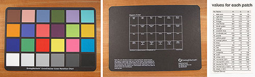
MacBeth Color Chart – front Back Patch Values
Another way to study color is to use a Macbeth color chart. This chart was designed to be photographed or scanned, either by itself or by including it in a photograph, very much like you would use a gray chart or a WhiBal.
Photographing a MacBeth color chart gives you more information about the color of the light than photographing a gray card alone. This is because the color chart gives you16 color patches and 3 shades of gray in addition to black, white and middle gray. Photographing these color patches lets you see how different colors react to different light temperatures.
On the back of the chart you have the names of each color, and on the accompanying values chart you have the RGB values for these colors.
This chart is very useful to test how colors change with exposure. How to conduct a test showing how color changes with over and under exposure is described in the exercises section of this chapter.
This essay is part of Chapter 5 in Alain’s second book Mastering Composition, Inspiration and Personal Style. You can find more information about this book, and sign up for Alain’s pre-announcement list, at this link.
Alain will be teaching composition and color at the Digital Fine Art Summit this fall in Zion National Park together with Uwe Steinmueller and R. Mac Holbert. A detailed description of the Summit, together with information on registration, is available at this link. |