Perhaps what you’d really like to know is just how good can
black and white inkjet prints be, and do you have to feel guilty for
not spending hours in the dark with smelly chemicals. Do you need pyro
stained hands to be a ‘real’ photographer?
Of course, I
can simply tell you, no you don’t need to, that
black and white inkjet prints can hold their own, that they do compare
to silver prints and do deserve to hang in galleries, be sold, collected
and generally admired. Problem is, it’s only my word, and there’s
lots of respected traditional black and white printers who regularly
announce they have never seen an inkjet print to equal a silver print.
Mind you, they have a huge investment in time and reputation based
on silver printing, so perhaps they have a viewpoint no less biased
than my own. Those of us who have invested thousands in fast computers,
Photoshop, colour profiling, and high quality printers clearly do
have a vested interest in inkjet being top drawer.
So how do you the
reader interpret this? In an ideal world you could
look at prints made both ways, each by an expert in his field,
all from the same negative or file. Regrettably, for many that isn’t
practical. You don’t have ready access to top quality prints
of either medium for comparison. You can rely on experts, but which
ones - they don’t all agree. You can look at images on the
web, but what’s that got do do with print quality?
If what
you are wanting to do is produce quality prints and you don’t
have a darkroom, why not give digital black and white a try.
Listen to advice from the experts, perhaps follow some of the
tips I am
discussing here - and see if you like the results. If you are
already an accomplished
wet darkroom printer and you are wondering about switching, the
good news is your skills in the wet darkroom translate quite
easily to Photoshop
and with a little help you can be up and printing digitally in
no time. Either the inkjet prints are going to be better than
your wet darkroom
prints or they are not. If they are better, then your problem
is solved. If they aren’t, and you have got past technical
issues, then you either try harder or you abandon inkjet and
go back to
your wet
darkroom in the confident knowledge that you are producing the
best prints you can. I think you may be surprised to find that
if you
have good printing skills already, it won’t be that difficult
to produce inkjet prints that you are happy to hang next to your
silver prints.
Once behind glass and hanging on the wall, it’s darn hard
to spot which prints are which. In hand the prints currently
look different
because of the differing surfaces but where inkjet may be weak
in the depth of the shadows, it is strong in the complete lack
of glare from
the matte print surface, image colour can be controlled better
than in the darkroom (warm, cool, selenium, somewhere in between
- just let
me know) . It’s all very well having really deep shadows,
but if you can’t see them for reflections 99% of the time,
and if behind glass you can’t see them at all (compared
to matte inkjet paper), then what’s the big deal? You think
metamerism was invented with inkjet - then you haven’t
seen the sometimes subtle yellow highlights of silver images
(which
goes just lovely with the purple
shadows after selenium toning).
Anyway, on with the show - part
two of a discussion on how I produce what other people think
are very nice prints (and pay
for them,
display them, and publish them). In this episode, I’m going
to show you how I get the image looking good on the screen -
95% perfect. Next
time I will discuss separately how to get that last five percent,
and the final installment will discuss printing.
I’m not
going to get into computers except to say that I currently use
a Mac G5 dual 2.3 with 4.5 gig of memory and 750 of drive. I
use
Photoshop for my editing and have absolutely no experience using
other software so I can’t compare, I can only tell you
what works for me, from the school of hard knocks.
I have only
ever used Camera Raw for converting my raw images. Since version
3, I really haven’t felt the need to use any other but
it’s possible I’m missing something - still, life
is tough enough becoming an expert with one set of software (kind
of like learning
to use only one film developer combination). Most of what I talk
about from here on will have an equivalent with other raw developers.
Uwe
tells me I maybe missing something by not using the
other raw processors, but I’m 56 and i don’t have
that much time..., besides, I’d rather be out shooting.
Having
selected an image in Bridge upon which to work, I open it in
Camera Raw and the first thing I do is double click on
the magnifying
glass to view the image at 100%. No point on spending hours working
on a terminally fuzzy image. Camera Raw has a setting at the
bottom of the screen which allows me to set the output file size
as normal
(ie. the same pixel dimension as the sensor), or 1/3 bigger or
smaller, or even more change. Through experimentation I have
found that I
get
the most detail and the best sharpening if I use one size up
from normal then use a bit more aggressive sharpening later in
the processing.
Is this uprezing (which I have slammed elsewhere - I guess I’m
guilty but would argue that doing it right from raw is somehow
better, and the test is in the print - my 1Ds2 produces 16X20
prints that can
be inspected from 8 inches away, without sharpening artifact
visible). I do not let Camera Raw do any of the sharpening for
me (sharpen preview only). I almost never use the saturation
setting in camera
raw to convert the image
to black and white, preferring to save the ability to ‘filter’ the
colours later.
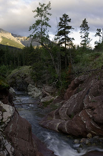
The image as it comes out of camera raw.
Most images can be adjusted in
Camera Raw using the exposure, shadow, brightness and contrast settings
to get a workable image. I do not however try to
produce the best looking image on screen at this point. In working in
16 bits, I
am more concerned that the image file sent to Photoshop has all the detail
in
the highlights
and shadows that I will need - if it ain’t there to start with,
there is no way to get it back. If this means a muddy looking image without
much
in the
way of good blacks and whites, well, it’s only the start.
If I find
that it’s not possible to show both really detailed shadows and
highlights, I will use Russell Brown’s place-a-matic routine
to blend two versions of the raw conversion of a single exposure in
layers,
one for the highlights
with exposure slider moved left (darker), the other for the shadows
(exposure slider to the right, shadow setting protecting all the shadow
detail
(even if this means no deep blacks in the image - I can create those
later. There are
newer Photoshop plug ins which can do something similar and even use
32 bit hdr imaging in Photoshop to blend the entire image into a single
layer. So far I
haven’t needed to do this but it is something I am looking at,
complements of the suggestions of Uwe and his various articles. It
may be that tone mapping
will be the answer in the future (I’m now experimenting with
it) but I have a suspicion that raw holds more information than can
be sent
to photoshop
in one go if there are a lot of details at both ends of the curve,
shadows and highlights. Now if tone mapping worked directly from the
raw file...
From here on in, you have to know where you are going -
that you know
what a good image looks like, that you can recognize when things
aren’t
right - you can be a good driver but if you don’t know the
destination... It’s
not possible to show that in a short article such as this. Probably
workshops are the best way if in fact the instructor is known for
his or her printing skills.
I don’t think it really matters whether the instructor is working
in silver or silicon, the pathways are similar. That said, I wouldn’t
go to a workshop which has darkroom work as part of the curriculum.
I have been very happy attending
Bruce Barnbaum workshops even though all his work is wet (well, you
know what I mean). If you can’t afford a workshop with a good
printer, then try to see good prints and failing that buy books of
photographs. Reproduction these
days is so far ahead of 20 years ago that you can learn a lot about
the qualities of rich highlights and shadows from books. Let me strongly
recommend subscribing
to Lenswork magazine - it’s printing is absolutely superb.
I had occasion to reprint one of my images for a customer after she
had
seen the image in Lenswork
- I had to work darn hard - and I had the original file I’d
sent Brooks Jenson, the editor.
I sell my photographs at a local Farmers
Market. I have noticed that
often someone will come in to the market with an slr around their
neck. They
seldom stop to
look at my prints, yet I’d bet I’m selling more than
they are. Even if they were to look at my images only to find fault,
that would be a useful
experience. They don’t even do that, they just walk by. I
don’t
understand. Photographers. even if they do stop to talk (and lots
do); very rarely buy images.
I find my market elsewhere. You could do a lot worse than buy a
few good prints, but don’t buy them based on the image on
the net.
Right, back to the topic at hand. My routine once the image
is in Photoshop is to blend layers if need be, do basic contrast
adjustment
with a
curves adjustment layer, convert to black and white, then do
local adjustments
using more curve
adjustment layers with black masks into which I paint white at
varying
opacities to get the effects I want in the locales I want.
The
very last thing I do is dodge and burn, but that’s a topic
for the next time.
In making those first general contrast adjustments
with a curve
layer, there are five things I am looking at - the white
point (how close
do the darkest
pixels in the image come to pure black), the white point
(ditto), the shadows, mid point
and highlight parts of the curve.At this point I’m
going to digress and discuss why I don’t simply use
burning and dodging on the image as my only manipulation
. Well, I
quickly found that if I set the undos to 20 (seemed like
plenty), I frequently couldn’t go back to the beginning
of working on one part of the image - remember that 20 undos
is 20 strokes of your pen or mouse
and often in burning and dodging I’d use hundreds of
light strokes - clearly I couldn’t rely on undo. I
could simply save multiple copies of the image - but boy
that sure
eats up disk space quickly and besides, remembering which
version had which adjustments becomes a pain.
The second problem
with dodging and burning is that once a given pixel is
driven to pure white or pure black, it no
longer
contains
any relevant
information
about the image. Gone is gone. With a curve adjustment
layer, I can lighten or darken
without pushing the most extreme pixels over the edge (unless
I adjust the black or white points). So, the answer is adjustment
layers. They can be saved within the single image. They can be
thrown out at any point, they
can be
toned down
using the layer
slider, they can be masked and adjusted at any future point
before finally flattening
the image. they don’t eat away at the image.
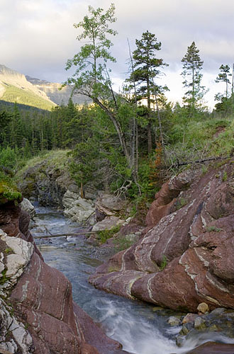
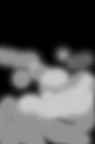
A curve layer to balance the image before converting to black
and white.
There are various ways to use layers to adjust
your image, curve adjustment layers just happens to be the one
that works
best
for me. I don’t think I’d
use it if I were a commercial photographer having to edit
dozens of images a day - I frequently take several hours
to get a single image right - just as much
time as it took in the wet darkroom (but at least it doesn’t
have to be continuous time). I use a mouse for my brush strokes
(it’s all I have)
and Uwe tells me I’m doing it the hard way - that an
overlay layer is much easier. He mabe right,
but I wasn’t aiming for easier.
That said, I have reasonable drawing skills and have LOTS
of practice with a mouse. Were I a commercial photographer
preparing dozens to hundreds of images
for client selection and perhaps a dozen images the client
actually pays for, then I’d want a much easier way
to do things. Uwe has a number of tools which help in this
direction and if you are all thumbs with a mouse, you might
well find a better way than mine, but this is my article
about how I make my
prints - take it for what it’s worth.
Photoshop offers
several different ways to convert to black and white, from
converting to grey scale to desaturating
the colour, to working with channels. Early on I learned
about another Russell Brown trick - he creates an action
which creates two new hue/saturation adjustment
layers. The first layer is set to colour instead of normal
(upper left in the layers palette). The second is left as
normal but the saturation slider is set
to the far left to remove all colour for the image. You then
use the hue slider of the first (lower) layer to effectively
alter the colour of the image before
it is desaturated and this has the effect of lightening some
colours and darkening others and you can simply play with
the slider till you get the effect you want.
You can even adjust the saturation of the lower layer to
modify the intensity of the effect.
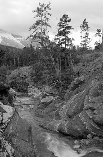
image without any ‘filtering’
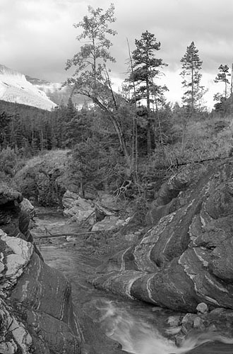
image with ‘filtering’ by
adjusting hue slider
I highly recommend spending some time at
russellbrown.com and view his quicktime tutorials.
I next work on
parts of the image, using adjustment curves and black masks to limit
the effect to where I want. I
use a round
brush with
it’s fuzziest
setting (so I don’t leave telltale signs of my
work. I use the 1 to 0 keys to set the opacity of the
effect.
I can use black or white to paint with depending
on whether I want to undo some of the effect or correct
for going over edges with the brush. Some of my images
have as many as 25 adjustment layers. Sometimes
I have to flatten the image part way though working on
it just to reduce it’s
file size. I don’t generally save the unflattened
version and occasionally regret not doing so when I find
I need to go back before the flattening - that’s
life - I could be better organized, I could be an accountant,
I‘m not,
I’m a photographer.
If I don’t think an effect
is strong enough after painting into the mask, I double
click on the left of the layer and up comes the curve
again and I can
adjust the curve and watch the image to see the effect.
Other times I just add another layer and curve on top.
this is the painting into the black mask - lighter shows
more of curve effect
In general, the curves I create tend
to have some basic shapes. S shape increases contrast. A sagging
curve darkens
the image,
increasing
the
contrast and
separation of the highlights while dumping the shadows
together into the dark. A simple
curve that is high in the middle lightens the image,
separates the shadows and compacts the highlights. You
can of course
create compound
curves
but the odder
the shape and the more extreme the variation from a simple
smooth curve, the more likely you are to muddy some
part of the image.
Very occasionally
I will
adjust the black or white point of the curve - usually
dropping the white point so that in the areas revealed
by the mask
there won’t be anything too bright
- typically something in the background of an image that
is distracting. Large areas of this are almost certain
to be distracting, but used carefully...
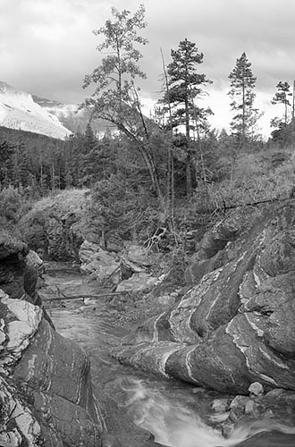
the result of the first masked curve
I’m aiming for an image
that has strength, yet shows good detail in the shadows. It should
look rich, creamy, bold and subtle, all at the same time.
Even Ansel Adams went though phases of printing lighter
and darker but this was done between highlight and shadow, not
messing with either end. The amount of
ambient light in the room can affect what kind of image
you like on screen - we often tend to sit in darkened rooms with
only the screen lit - not generally
a good idea - avoid glare on the screen by all means,
but don’t work in
a cave. Don’t even think of working on a laptop
screen. They are a lot better than they used to be and
Apple’s are the best, but a laptop LCD
screen is not the same thing as an Apple desktop LCD
screen (which I find is fine for editing photographs).
I know photographers who use PC’s
yet use an Apple display screen.
Not all images have to have a pure black or pure white
anywhere - but you’’d
better have a good reason for doing so - fog perhaps?
At
this point I have the image looking pretty good on
screen, it might even be exactly what I want, but usually
I have
some highlights
that
I want to
sparkle, some shadows that are a little weak, and I
will finally use dodging and burning
to polish the image, then sharpen, adjust for printing
and voila - 4 hours later
I have a print, the first one, of several, before I
get it right, before I am satisfied. See you next time.

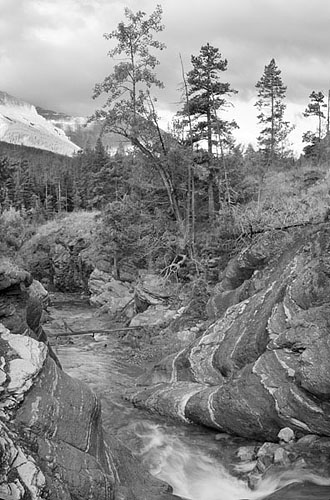
The real, three image stitch, after all adjustments
A note on RAW
Developer by George Barr
I have been writing a four part article
on black and white in the digital world, and wrote that I have only
used Camera Raw. Uwe Steinmuller, for whom I was writing this article
(above) had recommended
I check out
Raw Developer (available for Mac only from).
I had argued that fussing with more software
takes me away from my camera, but it's been pouring rain all day so
this evening I
decided I had to have a look - boy, the images sure do look different
from
Camera Raw which has a distinct painterly look to it when making
big prints. Raw Developer images do appear to hold low contrast
detail
better. If you only look at high contrast edges there is no advantage
to Raw Developer, but if you study the lower contrast areas, there
seem to be significant advantages to Raw Developer. That said, the
smoothness of the Camera Raw image is in some ways more appealing
and although painterly, doesn't look as 'grainy' as the Raw Developer
processed image.
Frankly, this is a hassle, I
don't want to deal with two raw processors. I know that for normal
size prints (300 dpi of real pixels (not upsized) Camera Raw is great,
for images larger than this, everything is a compromise and I think
it comes down to what kind of compromise do you want - do you want
the smoothness of the Camera Raw image or the fine low contrast detail
of Raw Developer but which leaves the image looking 'grainy'. Sigh...
Camera Raw
RAW Developer
You can find George Barr's website here. |