After over five years photographing digitally
in California we felt that making a book to reflect this timeframe
would be a nice idea. You probably know that there are two options:
- Finding a publisher
- Self publishing
Finding a publisher is hard if you are not really famous
or your work is very commercial. Traditional self publishing would
be very expensive but there exist now methods that are quite more
reasonable (see Michael Reichmann's new book "Bangladesh").
This article will talk about our own journey towards making a book.
What is the book about?
The first thing to note is that a book is not just a collection
of photos. What is the difference?
- Need for at least some text
- Coherent theme
- Layout
- High quality print
All of this while watching your's or your publisher's budget.
Quite a few things have to be thought of before you even think
to get a publisher.
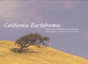
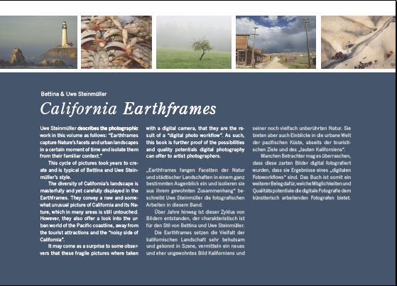
1. The theme: "California Earthframes"
Our photos of the last 5 years were taken to
about 95% in California. On the other side these photos are not
typical for travel guides or even introductions to California.
In early 2003 we started calling some of our pictures "Earthframes"
(actually our friend George Cattermole coined the term when we
had a brain storming session to find a good word):
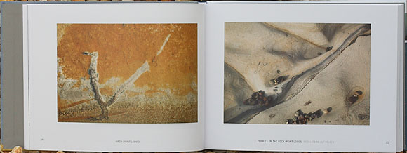
Earthframe #1
Originally we limited the term
Earthframes to abstract nature photos. Over the time we felt
that most of our pictures could be called "Earthframes" and also
include urban elements (the name was our creation anyway). So
we came up with a title "California
Earthframes". We think the title does not mislead expecting
a travel guide and yet gives the book a context. Overall we feel
that
this book is a homage to California.
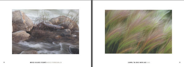
2. How many pictures?
Clearly 10 pictures hardly make
any book but having too many will also mean too much repetition.
To find about 80 pictures that keep a certain level of quality
is not a simple task (we ended with 78 which had more to do with
layout and a fixed book
limit
of
144
pages).
3. How to group them?
We thought it maybe not that good
to have just a book with 80 pictures and no structure. In the
ned we used a very simple yet effective structuring:
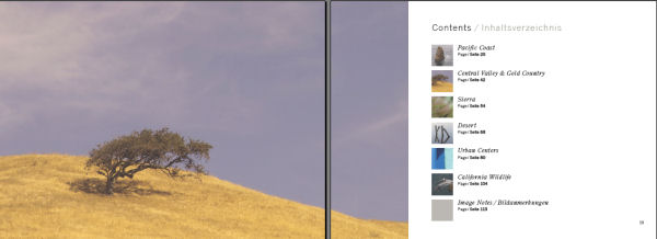
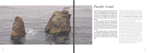
- The Pacific Coast
- Central Valley & Gold County
- Sierra
- Desert
- Urban Centers
- California Wildlife
We had some controversial thoughts about including "Wildlife".
Our main photography is by no means birds and wildlife. On the
other end we love both in California. So we included
six pictures into the book (we just love pelicans and other creatures).
4. Even a photo book needs text
For us and probably many other photographers this is the hard
part. Our language are photos and often not text. We came up with
a nice compromise. We have now the following text elements:
- Forewords by Dr. Ellen Rudolph and George Cattermole
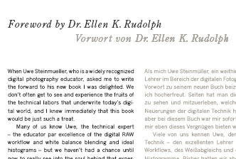 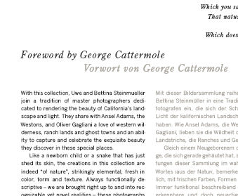
We are actually very surprised how well both could
describe our intentions (better than we could express them ourselves).
Ok, they may praise our work more than we deserve but we think
they both write what they honestly mean. We know Ellen from her
long trip through
Australia (read our article "The
real Outback"). George has become a friend over
the years because he really cares about preserving nature and also
as mentioned he coined the term "Earthframes" for us.
To be very honest we think the book would not work without these
two forewords.
Ellen & George thank you very much.
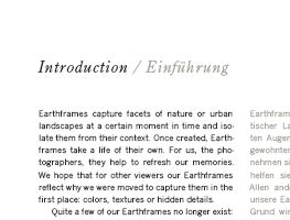
- Short introductions to the book and the six sections
- Credits with a thank you to a few people that helped us most.
We should have also included our friend and co-author of our
technical books Juergen Gulbins as he suffered in the end a
lot to get the book printed
(Sorry, Juergen)
- About Bettina & Uwe Steinmueller
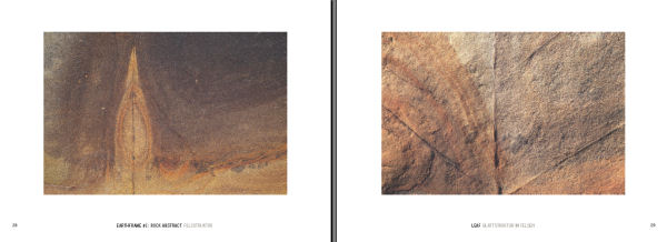
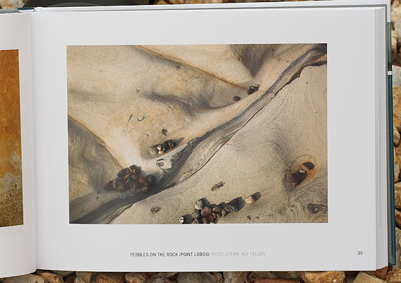
Each image got a short title in English and German.
The image notes tell a little detail or story about
each image. We wanted them to be separately from the images as
otherwise
you would need a longer text and the text still may distract from
the photos. We find this approach very effective and nice.
5. Layout and type
A good book wins from a thoughtful design. Here
Anna Rossbach did a great job to make a design that helped the
book to live on it's own.
Note: All the work was
done in Indesign.
The draft structuring was actually done by
ourselves but Anna transformed it into something way more beautiful.
Especially
here we thank again Juergen to bring in his vast experience
on how to use type and managing the transition to the printer. 6. Did we mention that we needed
a publisher?
Once we had the idea of the concept and also some
first image selection we asked our German publisher Gerhard Rossbach
(dpunkt in
Germany, our technical books are quite popular in the German market)
whether he would help us publishing the book. He came back to us
in a short
period
of
time
and offered
us to
publish the book at dpunkt. He felt that showing the artistic side
of his technical authors maybe a nice thing to do. Without Gerhard's
help this book would have taken much longer and given us way more
problems.
7. Dual language
We are German photographers who live and breathe
in California. This means a book without English text would not
be
an option. On the other side German is still our main language.
So having a dual language book feels very natural. Actually we
think that photography is the first language of this book and
English/German complements them.
8. Cover design
Anna also designed a very nice cover and back for
the book. Sounds more trivial than it is. A good cover design
is very important because the cover has to
serve
many purposes:
- Should be pleasant
- Grab some attention
- Fit best for the theme
- Work with the text and logos

Front
Back
9. Budget considerations
We all love coffee table books.
But they also cost quite a bit more to produce. We ended up with
a size of about: 9.5x7". We think it just works fine with
our more subtle pictures.
Overall we think the pictures have
a good size to fully appreciate them.
9. Printing
The printing was done by a very
good German printer and our friend Juergen Gulbins was on location
while printing to check the color matching. The book actually
got an extra 5th color to print the thin German text without too
much rasterization. As you can imagine this was/is
an exciting ride. We want to thank all the people involved for
their great support.
10. Where to get the books?
- All readers in Europe can buy the book here at dpunkt.
Also
amazon.de will carry it in Germany.
- We will get a shipment of books the next month or so (no
experience how long it will take). We plan to sell mainly signed
copies and also bundle them with prints. As of this writing
the book is printed and our friends in Germany have it in their
hands. We have not received a printed copy yet but the full
PDF (see below).
Hope you enjoy our new book and
our personal journey towards our first photo book.
You can download a free PDF sampler
from here.
12/14/2005 Update: Got our first
sample books 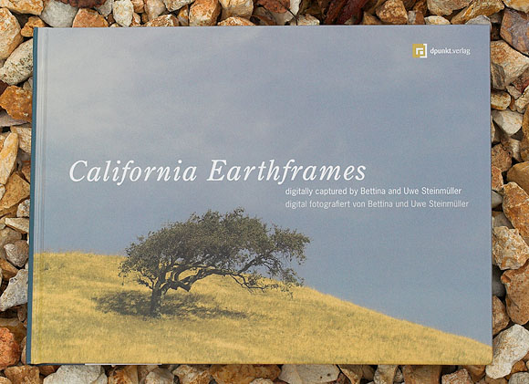
We think the print quality is even better than we expected.
We expect a shipment of books any day now. We
keep you posted.
1/8/2006 Printed Book now for Sale
1/21/2006 Some statistics
The book contains 78 photos.
Years when the pictures were
taken
| 2000 |
2 |
| 2001 |
9 |
| 2002 |
7 |
| 2003 |
20 |
| 2004 |
31 |
| 2005 |
9 |
- 2000: Our first digital year starting
with the D1, a lot to learn and RAW converters in their infancy.
Also the 2.7 MP
of the Nikon D1 resulted in lower resolution than we are
used
today.
- 2001: With 6MP of the Nikon D1x digital
started challenging film and we had more experience. The
D1x served us very well.
- 2002: End of 2002 we switched 100% to
photography. The Canon 1Ds opened a new era of high quality
digital SLRs
(our main camera for the next 2 years)
- 2003: We focused mainly on our original
Earthframe photos and RAW converters got mature: Capture
One and Camera Raw 1.0.
- 2004: For quite a few photos we used the
Canon 1D Mk. II and at the end of 2004 we got the 1Ds Mk.
II. Overall 2004 was a very productive year for our photography.
- 2005: We only included a few pictures
from 2005 because only about the first 4 months were available
while we produced the book. At the end of 2005 we added a
Nikon D2x as a second system. We made quite a few excellent
photos with the D2x but these pictures came to late for
the book.
You also may want to read our DSLR review history. Cameras used
Canon 300D |
2 |
Canon 10D |
1 |
Canon 1D |
1 |
Canon 1D Mk. II |
9 |
Canon 1Ds |
29 |
Canon 1Ds Mk. II |
9 |
Canon 350D |
2 |
Canon G2 |
2 |
Nikon D1 |
4 |
Nikon D1x |
8 |
Nikon D70 |
1 |
Olympus E1 |
2 |
Kodak SLR/n |
2 |
Kodak 760 |
2 |
Sigma SD10 |
1 |
Leica Digilux 2 |
3 |
|