Composing with Color
-- Part 1 --
by
Alain Briot
This essay is part of Chapter 5 in Alain’s second book
Mastering Composition, Inspiration and Personal Style
1-Introduction
The prejudice many photographers have against colour photography comes from not thinking of colour as form. You can say things with colour that can’t be said in black and white… Those who say that colour will eventually replace black and white are talking nonsense. The two do not compete with each other. They are different means to different ends.
Edward Weston
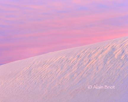
Color is all around us. And yet when we photograph in color we rarely consider color as an element of composition. Certainly, we do see the color in the scenes, the objects, and the elements that we include in our images. However we do not, at least not without training, see color as an element that changes the composition of our photographs depending on how we use it.
This attitude regarding color contrasts sharply with the attitude of photographers who work in black and white. Photographers working in black and white make a significant effort towards developing an awareness of black and white tones. They want to know how specific colors will look in black and white and which shades of grey these colors are going to be. They want to know which areas of the image will be the darkest and the lightest. In short, they want to visualize the image in black and white prior to taking the photograph. To this end they use black and white viewing filters and they meter specific areas of the scene with the goal of learning how different brightness areas will translate into shades of grey and how these different areas will relate to each other in terms of black and white.
We will see all this in detail in the next chapter, Composing with Black and White. I am mentioning this here now because I want to contrast the approach of black and white photographers with the approach of color photographers.
Certainly, there is not just one approach and methodology but as many approaches and methodologies as there are photographers. However, what I am talking about here is what could be called “the commonly used practices” that most people follow when photographing in black and white and in color.
Certainly, it can also be said that there is more of a need for visualization in black and white than there is in color because we do not see the world in black and white. Therefore, to photograph well in black and white one must first find out how the colors in the scene will translate into black, grey and white tones.
Good point. However, the same point can be made, in reverse, about color photography. While we do see in color, there are significant differences between what we see and what the camera sees. These differences do affect how color is represented in photographs. I cover a number of these differences in the chapter titled The Eye and the Camera and I will cover a few others in this chapter. For now, suffice it to say that just because we see in color is not enough to give us the ability to create stunning color photographs. Indeed. Fact is, we all see in color. Each and every human being on Earth sees in color, except those who are visually impaired, who are color blind, or who for some reason do not see color. Yet, give everyone a camera and you will not have everyone create great color photographs. In fact, we don’t really need to conduct this experiment. All we have to do is look at the photographs taken by friends, relatives and other photographers. Having color vision is far from being enough to take great color photographs.
The same could be said about any natural physical ability. The fact that we all can run does not qualify us to be sprinters, long distance runners or athletes. The fact that we all can talk, does not qualify us to be singers or orators. The fact that we can crack jokes does not qualify us to be comics or actors. Clearly, learning and training are required in order to turn a natural ability into a profession. Athletes are athletes because they train and study in order to develop their natural abilities. Singers are singers because they train and study in order to develop their natural abilities. Comics and actors are comics and actors because they train and study in order to develop their natural abilities. Color photographers are color photographers because they train and study in order to develop their natural abilities.
In short, just because we have a natural ability does not make us an expert in that field. Training, study, practice and perseverance (especially perseverance) are required. This is something easy to forget when talking about something that is all around us, such as color. It is therefore important to remind ourselves of this fact every once in a while.
When working in color with the goal of creating stunning color images, one must be an expert in color. One must know more about color than people who do not have the goal of creating stunning color images. Why? Because knowledge of color is necessary in order to get color to do what we want it to do, in order to control color instead of being controlled by it.
2-The Three Variables of color
A good color image is a good black and white image.
Bill Burt
Controlling color, in photography, is controlling the three variables of color. These three variables are hue, saturation and brightness.
Hue represents all the colors we can see: red, yellow, green, blue, magenta, etc.
Saturation represents how intense each individual color is. Saturation goes from total desaturation (grayscale) to full saturation (maximum color intensity).
Lightness represents how light or dark each individual color is.
3 – The Munsell Color System
Who first described the three variables of color is cause for debate. My goal is not to enter this debate here. Instead, my goal is to describe how we can understand and control color in our photographs.
I like to think that Albert Munsell first described these three variables around 1920. At least, it is by reading his books that I first learned about these variables in a way that made sense to me. Munsell presents this information in a way that is both simple and coherent. Our eyes perceive three values: hue, saturation and brightness. The Munsell color system is designed to represent graphically how our eyes see color. It is a visual representation of these three values.
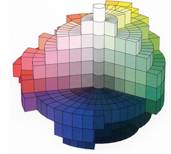
Below is a diagram representing the Munsell Color system. This diagram shows the three variables of color in a simple and effective manner:
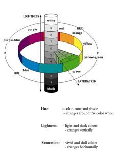 
The Munsell Color System Munsell’s A Grammar of Color (1921)
At right above is the cover of A Grammar of Color, the book in which Munsell presents his theory of color. This is the cover of my personal copy of this book, published in 1921 by the Strathmore Paper Company. Besides presenting Munsell’s theory of color, the book explains how to harmonize the different shades of colored paper produced by Strathmore. In fact, Munsell’s text and illustrations about his color system occupies only half of the book. The other half consists of actual Strathmore paper samples of various colors.
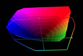
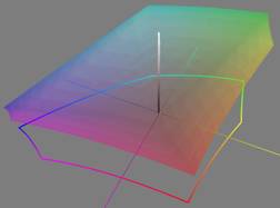
One of the most interesting aspects of the Munsell Color System is that it closely duplicates how color spaces are currently represented. Below are several three-dimensional graphs of a large color space widely used in digital photography: ProPhoto RGB. These graphs were created in Chromix ColorThink. From top to bottom, first to last, these views show the color space from the top, from the side and from the bottom. At bottom right is the graphical representation of the Munsell Color System that I described previously.
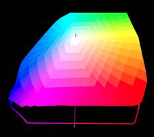 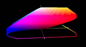
Top view Side View
Bottom view
In these 3D graphs the center represents the lightness values, which is white on top and black at the bottom. Around the center are the hues –all the different colors-- found in this color space. Finally, as we move away from the center and towards the outside of the color space, the colors become more and more vivid. This represents saturation. Colors are more and more saturated as they move away from the center and towards the outside of a color space.
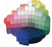
This is exactly how Munsell represented his color space in 1921. The diagram I showed before, next to the book cover, is a representation of what I just described. This representation can be considered a “skeletal” representation. However, in the same book, Munsell, still in 1921, also provided a solid, “full bodied” representation of his color system
:
Again, we can see how closely this representation resembles a contemporary color space representation. In fact, if we were to map the Munsell color system with Chromix ColorThink instead of using the historical drawing above, we could not distinguish it from other color spaces representations used in digital photography today.
So far we have been discussing color, color spaces. To contrast with these, below is a visual representation, also done in Chromix ColorThink, of a black and white color space. Black and white is color (more on this in the next chapter, Composing in Black and White), but without hue and saturation. Therefore, in a black and white color space only lightness is left as shown below:
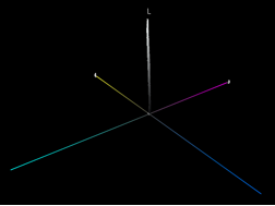  
In the diagrams above, the vertical L axis represents lightness. The four horizontal colored lines indicate the directions in which yellow, magenta blue and cyan would be found if hues and saturation were present. However, since they are not present only the lightness values are being displayed on the graph. These lightness values are being represented as a vertical, tube-shaped color space. There is nothing else to display because black and white is color without hue and saturation. Therefore, in a black and white color space, the only variable that is represented is lightness.
To make visualizing a black and white color space easier, at center above is a close up of the central tube that forms a black and white color space. As you can see this tube is comparable to the black and white tube in the Munsell color system representations that we saw previously. At right above is another projection of a black and white color space, this time superimposed onto a color, color space, in this case sRGB. The black and white color space is the vertical tube in the middle of the sRGB color space. This is how small a black and white color space is. The solid line at the bottom of the graph is the projection of the sRGB color space. The projection of the black and white space is also present but hardly visible since it is no larger than the diameter of the central tube that represents the black and white color space.
Below is a third representation of the Munsell Color System, this time using a physical, three-dimensional model called the Munsell Color Tree. This model is made and sold by Gretag McBeth. This particular model is the one I own.
This model consists of 10 transparent panes of acrylic on which are glued squares of color. These squares represent the range of colors found in the Munsell Color System. The image at right below shows all 10 panes photographed individually. Each pane shows one color, as indicated under each pane, together with the variations in saturation and lightness within that color.
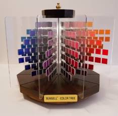 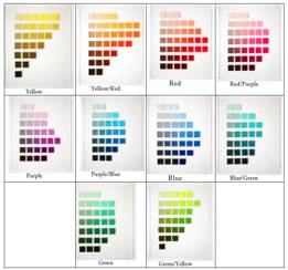
3D model of the Munsell Color System All 10 color sets of the Munsell Color System
This physical model is made of wood and is mounted on a rotating base. This makes it possible to rotate the model to see each pane. The empty space between the panes allows the user to see the colors in each pane from the center to the edge of the color space.
The design of the Munsell Color Tree was chosen for practical purposes. In reality, there is no space between the panes. Instead, there are solid colors all around the model, from the center to the edges. The image below is the 3 D drawing of the Munsell Color System as it actually is (we looked at this drawing previously). This drawing is open in the front, meaning some of the colors were removed, so that we can see all the way to the core. One of the problems of representing color spaces is showing the inside of the color space. Since color spaces are continuous, meaning the colors touch each other, the only way to show the inside is to either do a crosscut, remove part of the colors in order to show inside the color space, create a wire frame model, or create a semi-transparent model.
This essay is part of Chapter 5 in Alain’s second book Mastering Composition, Inspiration and Personal Style. You can find more information about this book, and sign up for Alain’s pre-announcement list, at this link.

Alain will be teaching composition and color at the Digital Fine Art Summit this fall in Zion National Park together with Uwe Steinmueller and R. Mac Holbert. A detailed description of the Summit, together with information on registration, is available at this link. |