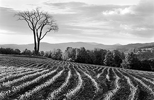
I left you last time
with the image looking great on screen and then I output sharpened
to compensate for dot gain - the spread of ink on paper. Now we have
some issues - what printer, what paper, should I use a RIP and if so
which one, should I use dedicated monochrome inks and how to get the
best possible print?
In this area even more than the preceding
segments of this article, I am simply speaking from my own experience.
Also,
as this is being written
June 19, 2006 I have not yet had a chance to try any of the new 'f'
surface papers which promise the Holy Grail of inkjet black and white
printing,
an exact replacement for glossy dried matte photographic paper. That
said and pending such experiments, there is a lot to be said for a
good matte paper and the results I am getting have been generally excellent.
Just
tonight Michael Reichman of Luminous Landscape has released his review
of the new Canon printer - but no matter how wonderful that
printer turns out to be, only time will tell whether images stand
up to age testing
and real world use but it looks promising and if nothing else will
push Epson to try harder.
So:
Since every subsequent decision is
based on the choice of inks, I will discuss that first. I went with
MIS dedicated monochrome inks
in their
various iterations for a year or so but after fatally clogging
my third printer abandoned dedicated inks. Mind you this was
around the time
that I started selling my work, 2/3 of which was colour, so I
needed the flexibility
to do both and couldn’t afford two printers. Had I only
been working with black and white, I might still be using dedicated
inks. The results
I got from the MIS inks were excellent. I was particularly happy
with the ability to 'dial in' the warmth of the print without
worrying
about
metamerism and a greenish tinge sneaking into the warmer images.
Originally
the Epson 3000 was the printer of choice for dedicated black
and white ink systems and while clogging was an issue,
it wasn't too
frustrating. When I converted my Epson 2200 to dedicated monochrome
ink, I think I made a mistake - this printer has relatively small
jets with
the result that compared to the 3000 and that ilk, clogging
is a major and sometimes unfixable problem.
Were I to go back
to dedicated inks, I would pick up an older printer again, one with
large jets. I would print every day,
even if it's
just a test print and I don't know what would happen were I
away for three
weeks at a time. I know that with the PC and Windows it's possible
to schedule an automatic printing on a daily basis so barring
any paper mishandling, you could expect the printer to merrily
keep printing
daily
while you are away. Perhaps by now they have similar software
for the
Mac.
The problem of using colour printers
for black and white prints has been twofold - first getting a neutral
black, and then
keeping it
under different
light sources. Non pigment ink printers have done a fairly
good job doing both but as the prints are only archival
with dedicated
resin
coated
glossy paper, this wasn't remotely a possibility for me.
Pigment ink prints made with Epson’s usual drivers are subject
to metamerism, the change in colour of the print in varying
light
sources. Prints tend
to be pink under fluorescent and green with north light
- a not impossible condition to experience in a single room and
therefore
precluding sales
of such prints.
When I purchased my Epson 4000 printer,
I checked out and bought the very expensive Imageprint
RIP. It
certainly produced
neutral
prints
which didn't change colour at all in various lighting
sources from mercury
vapour to north light and everything else in between.
I didn't like having to save every image every time I wanted
to print
and I didn't like spending more money to get the version
that would print directly from Photoshop. I also didn't
like
the
crashes that
happened
with the Imageprint Browser (software was v.6)
I learned about Roy Harrington's Quadtone Rip - for 1/20
of the price. This was substantially better and although
there
were
some bugs at
the beginning and even now I have to be careful to let
colour printing finish
before I order a black and white print, the software
does every bit as good a job as Imageprint in terms of
metamerism
free
results and
good
blacks and is now my standard method of producing black
and white prints.
I did pick up a 2400 printer and tried out Epson’s
new dedicated monochrome driver for Ultrachrome inks but
I prefer the results
from my 4000 with Quadtone Rip (less green in the warm
tone prints).
For paper, I have been using Moab Entrada
Bright White for over a year and am generally very pleased with it.
The supplied
profiles
have been
quite accurate and I like the clean white paper. I recognize
it has
optical brighteners but am not overly concerned as virtually
all photographic paper has had brighteners for 50 years
or so. (see
my article on Optical
Brighteners on my blog).
The occasional sheet will have
a small spot defect but
the paper is a bit cheaper than Hahnemuhle and overall
I come
out ahead.
The 300
gm.
weight paper has a moderately rough surface but the
190 weight paper has a finer texture and that is my standard
for 13X19
and smaller.
Profiling does a wonderful job of matching
colours but I have been consistently disappointed with issues
of
brightness
and
contrast.
As I don't have
a GretagMacbeth EyeOne or other way to profile my
prints, I use a 'printing adjustment curve layer' before printing.
This curve was
acquired the hard way,
making lots of prints from both step wedges and images
until I got a curve which resulted in a print which looked darn close
to
what I had on the monitor. You
need one
for each paper
you are
using but it isn't difficult, just a bit tedious.
But it saves $2000 on profiling
equipment.
I do think that no matter how well profiled,
how careful you are and what tricks you use, nothing
beats making
prints and
quality
prints
requires making trial runs and fine tuning the
image based on each itration
of the image. There are subtleties in the print
which just don't show on screen and yet which are important
to the quality
of
the result.
It's often helpful to live with a print for a few
days, looking at it repeatedly to see if it is
right.
Well, you have made several prints, some
have been pinned to the wall for a few days and you have
adjusted and
perfected. With a little
luck
you have an image of which you can be proud.
Of course a few
months from now you will be even better at digital
printing and may decide
to start
over from the beginning - welcome to real life
for all of us who care about the quality of our
images.
Good
printing!
You can find George Barr's website here. |